
Today, I’ll be spotlighting another Pokemon card artist, Artia Mitsuhiro (view his work here). After my last spotlight on Morii Yuka, I got lots of appeals for more Pokemon artists to cover, and I had to go with another total classic.
Arita Mitsuhiro is one of the main Pokemon card artists who’s been in the game since the beginning. Since Base Set. After Sugimori, he’s probably the most iconic creator to visually depict the franchise. So let’s look at his 25+ years of wonderful art and see how his style has evolved.
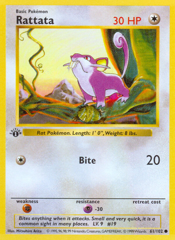
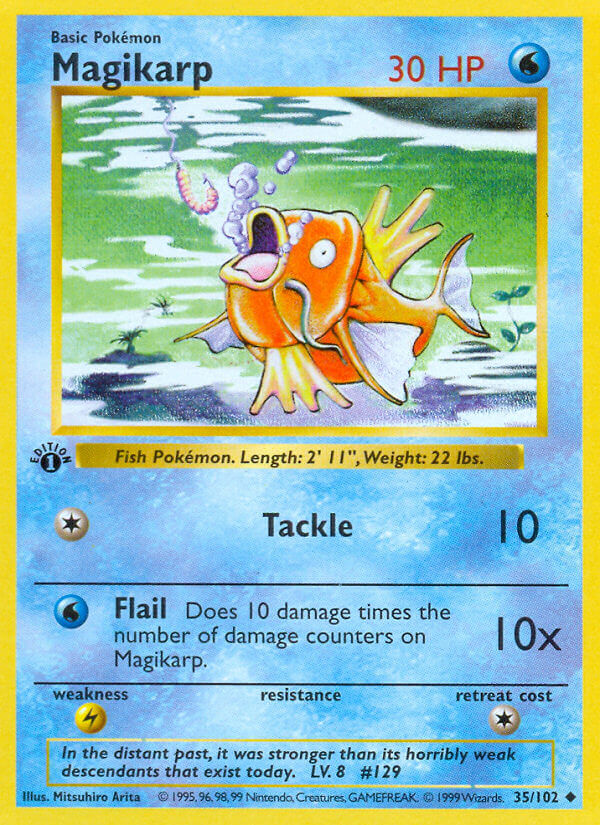
First off, this was my very first Pokemon card:
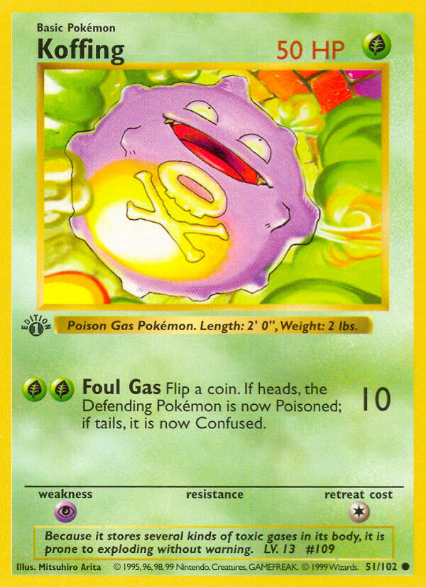
From the best of my memory of twenty-plus years ago: A classmate gave this to me and I had to hide it from teachers all day. Then I had this card, and only this one, for ages, until my house burnt down. Then my parents kept buying a billion cards for my brother and me to keep us occupied and happy. For some reason, even if this was 2002, you could very easily find cards from Base Set, from Gym Leader Challenge, from all the Gold & Silver sets… It was very odd just how prolific packs from all sets were at the same time, especially today when these kinds of packs are hundreds of dollars each.
I love this Koffing still. It’s a cool mix of purple, yellow, and green. It’s a fun pose, as much as a single circle dude can be, drawn at a really dynamic angle. Koffing’s flying through a sewer or something, I guess? Where’s this dude going?
Arita Mitsuhiro’s other early work instantly cements his style–cool poses, great color palettes.

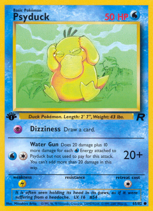
Let’s look at a bunch more of his artwork from Base Set, Jungle, and Fossil:


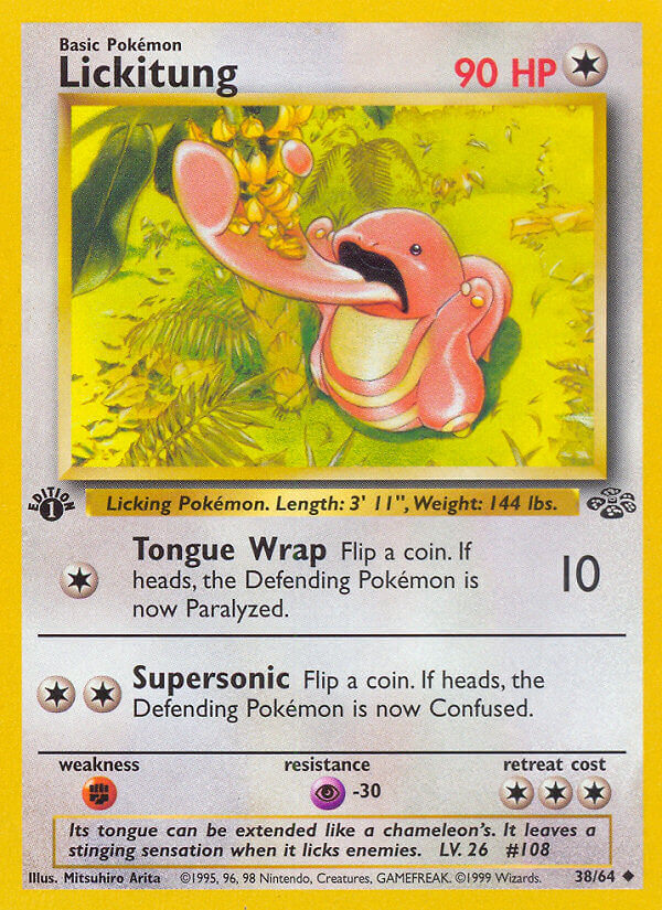
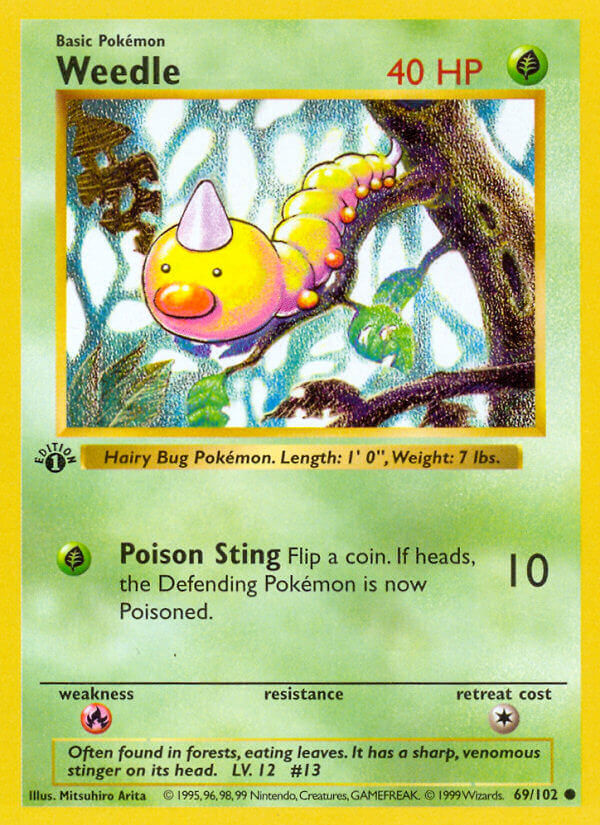
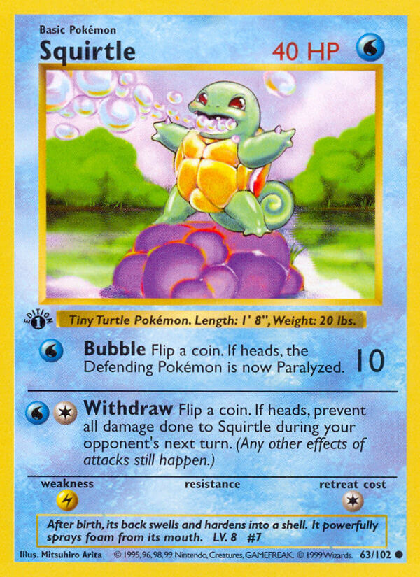
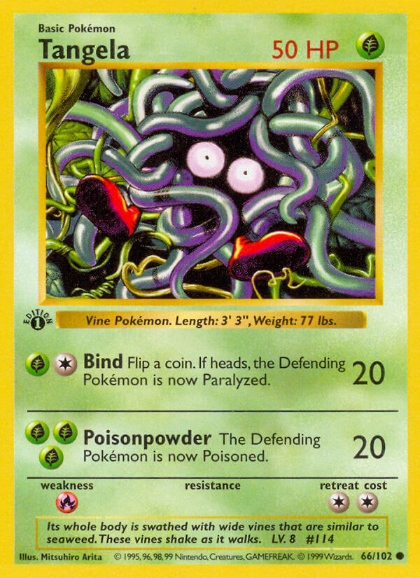


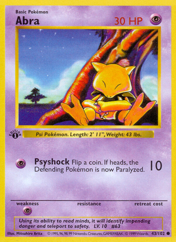
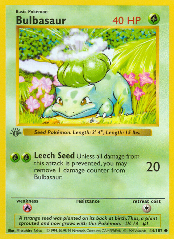
The arts all have very strong colors, and even stronger poses. There’s so much action, so much doing. These are characters in motion, characters living in a real world, and that’s such a great way to make the Pokemon appealing. They’re not just sprites or 3D models sitting around… They’re intelligent animals roaming around.
One card I especially love is the original Fossil Grimer.
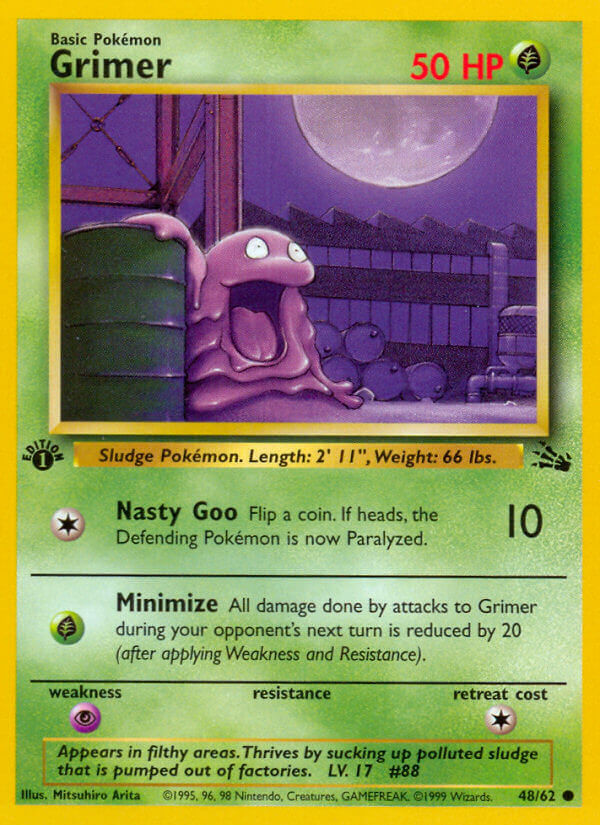
This single Grimer, slurping around in an empty industrial zone at night, all the wonder of the world facing it. What’s it gonna do? What’s it gonna muck up? The picture is all shades of purple, except that green in the corner which helpfully reminds our eyes that Poison type Pokemon are Grass in the card game.
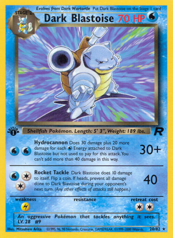
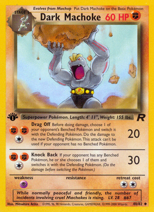
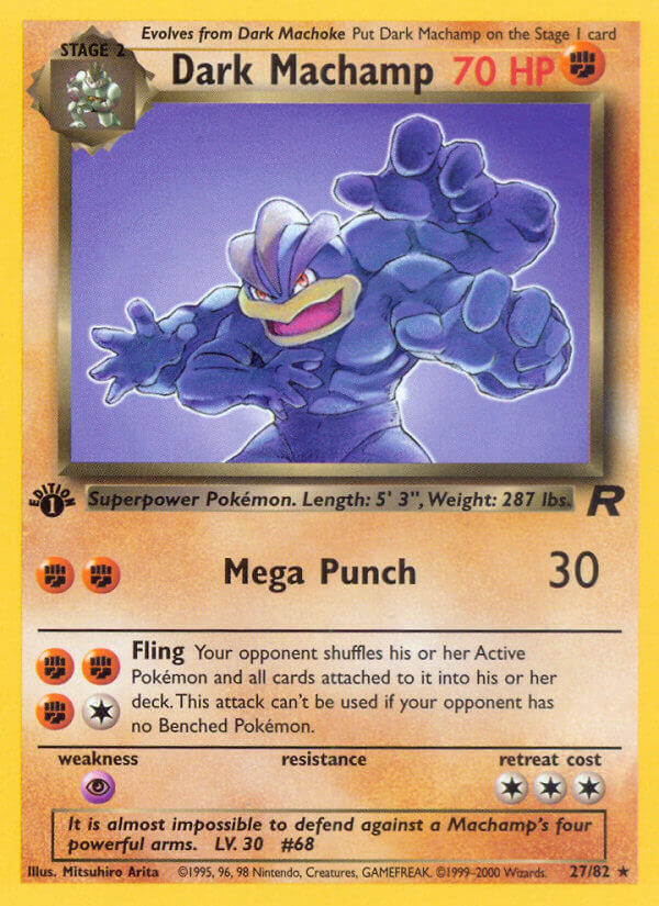
After proving himself with the original run, Arita clearly went all-in on the dynamic poses side of thing. Because his work from Team Rocket through the Gold and Silver sets is insane. (Interestingly, he didn’t have any cards in the Gym Leader sets; two expansions missed, and he STILL gave us all this great stuff.) (Actually, after writing that, I found out the real reason why: Sugimori Ken OBLITERATED those two sets; just 57 cards out of 252 were done by artists other than him, and *30* of the remainder was done by Nishida Atsuko, a future card spotlight subject.)
First, the Team Rocket cards:

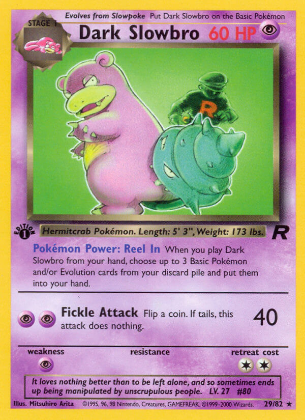
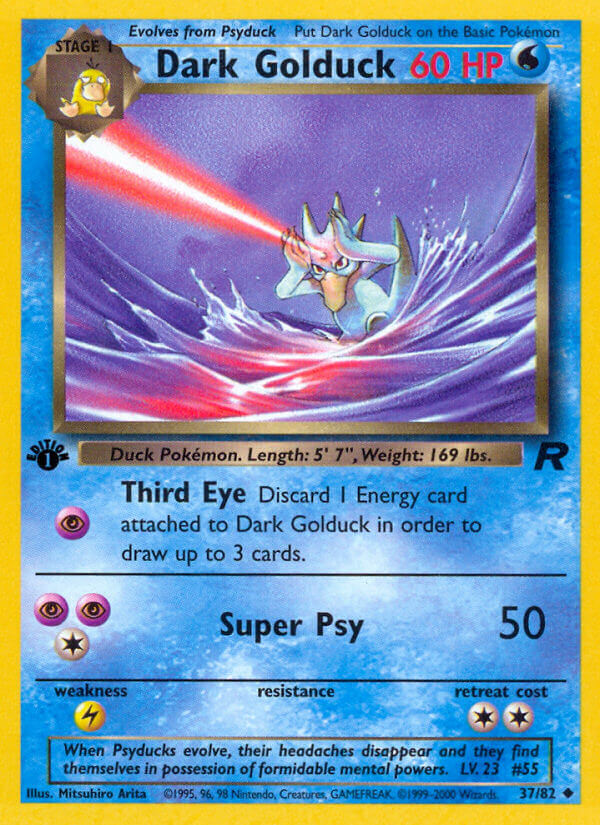
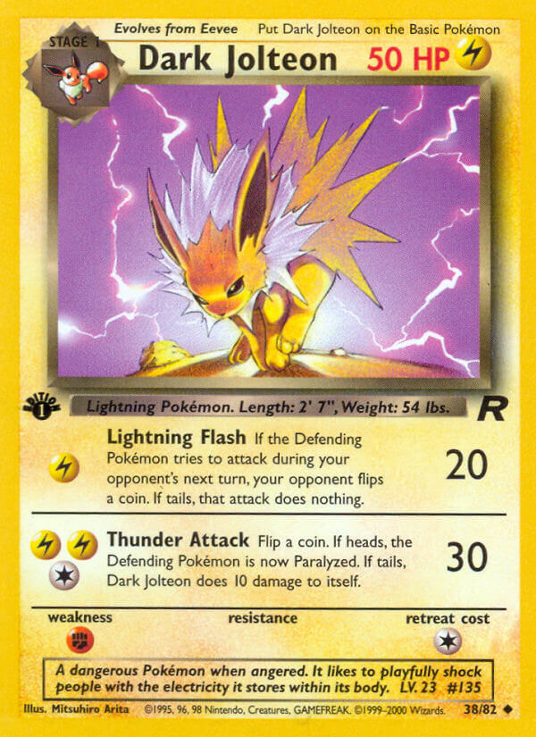
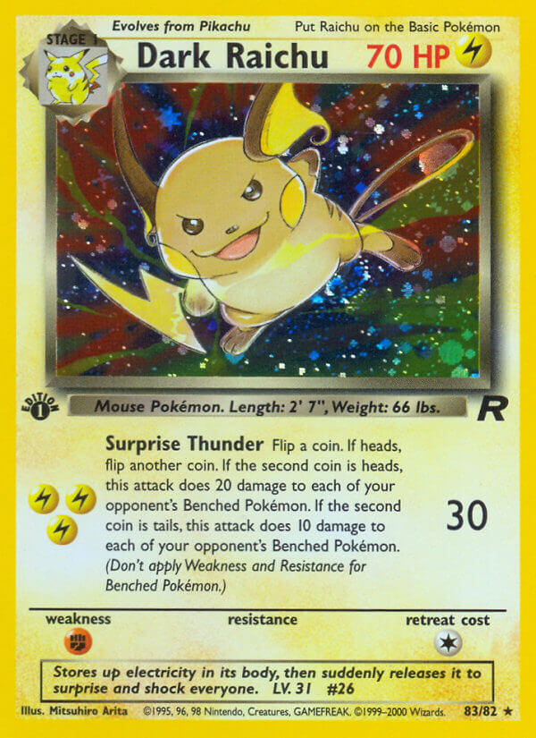
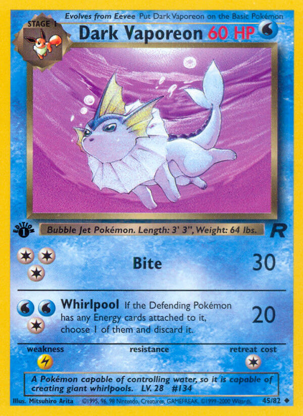

Geez, I love these!
These are supposed to be dark, aggressive, evil-controlled Pokemon who are not to be messed with. Heck, their Pokedex entries are downright frigtening. And seeing them in action makes me wish we got a full-on action oriented Pokemon movie without the kid characters involved. Also, I am 12 years old when I say that.
That Dark Blastoise in particular has been stuck in my head for over twenty years.
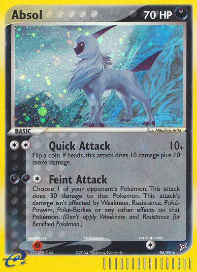
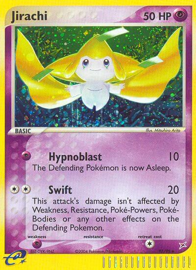
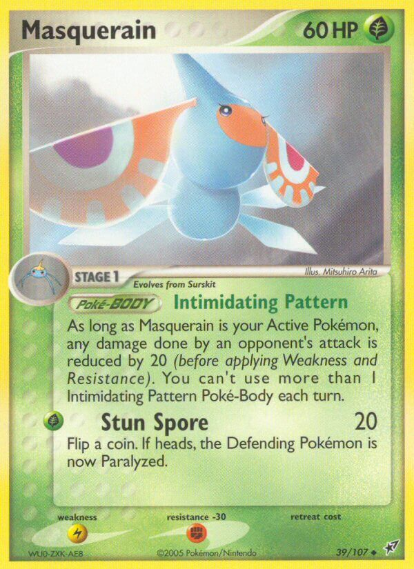
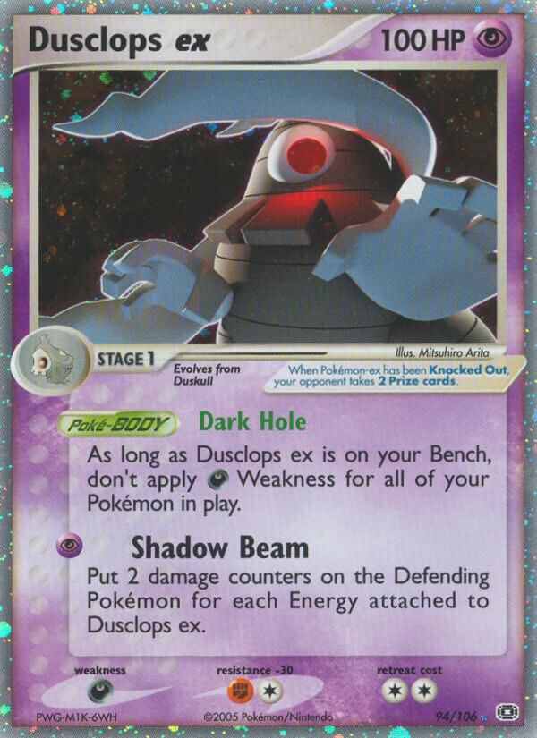
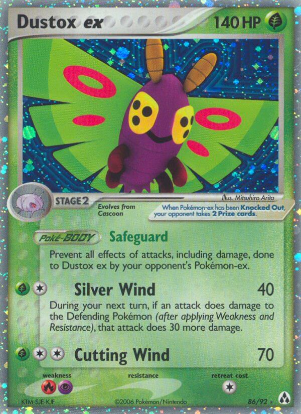
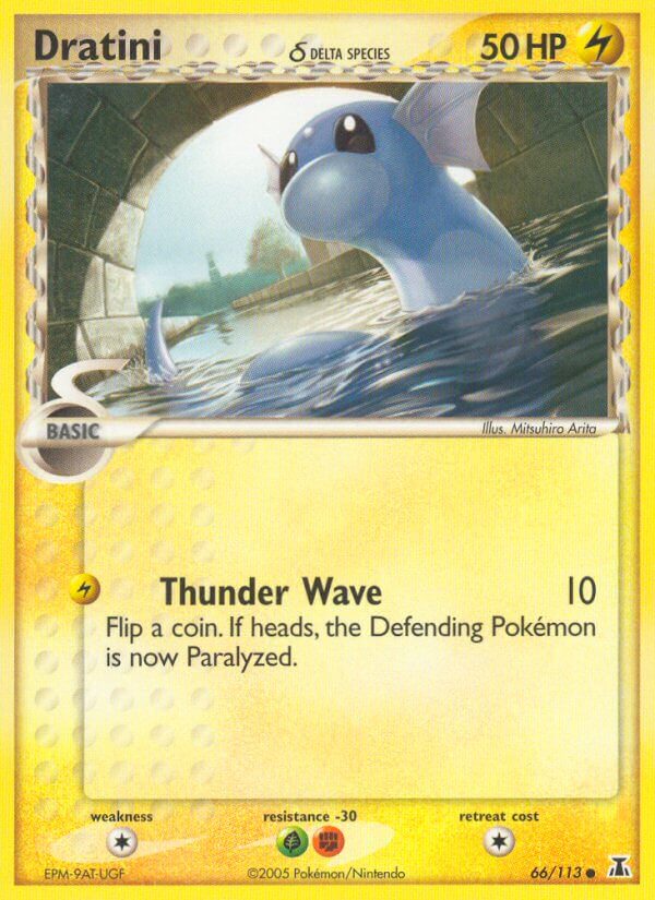
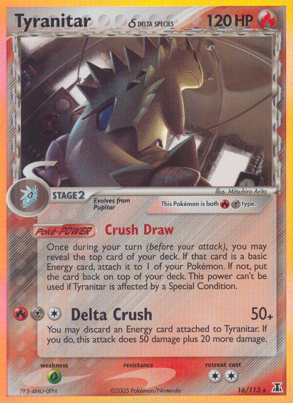
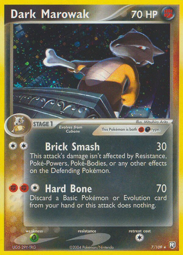
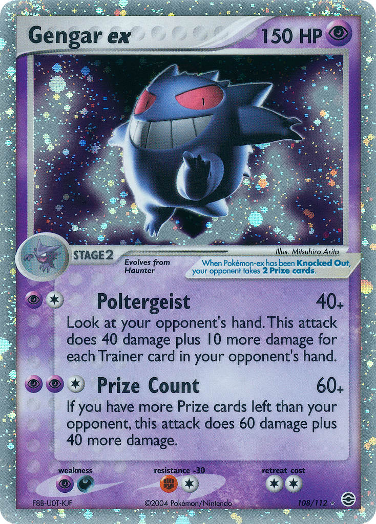
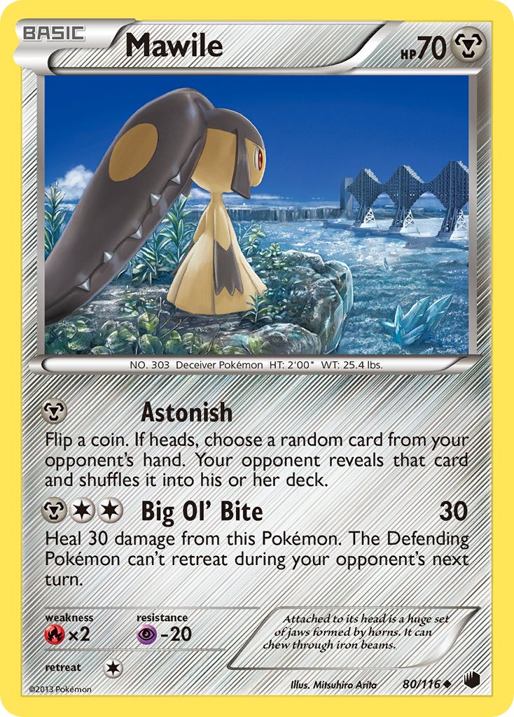
Next, the Gold and Silver era triumphs of cool design:
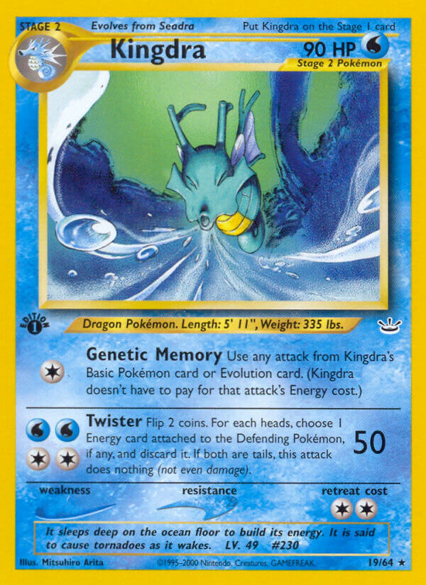
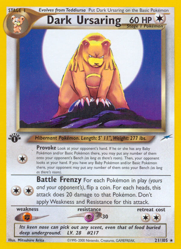
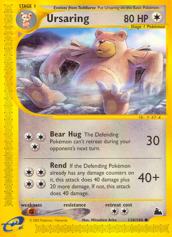
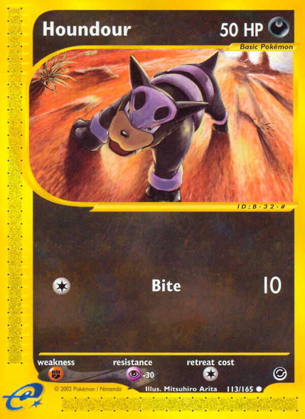
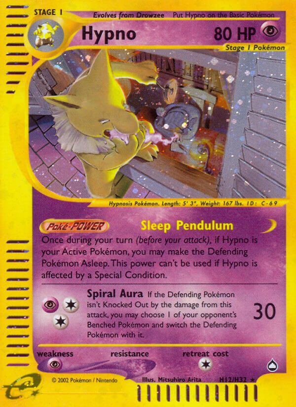
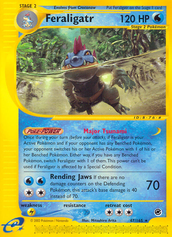
Arita Mitsuhiro really, really leaned into the dynamic poses. The strong themed color palettes faded a liittle bit as he dipped more into realism, but it didn’t hurt the art one bit. You see that Feraligatr coming at you, and you run.
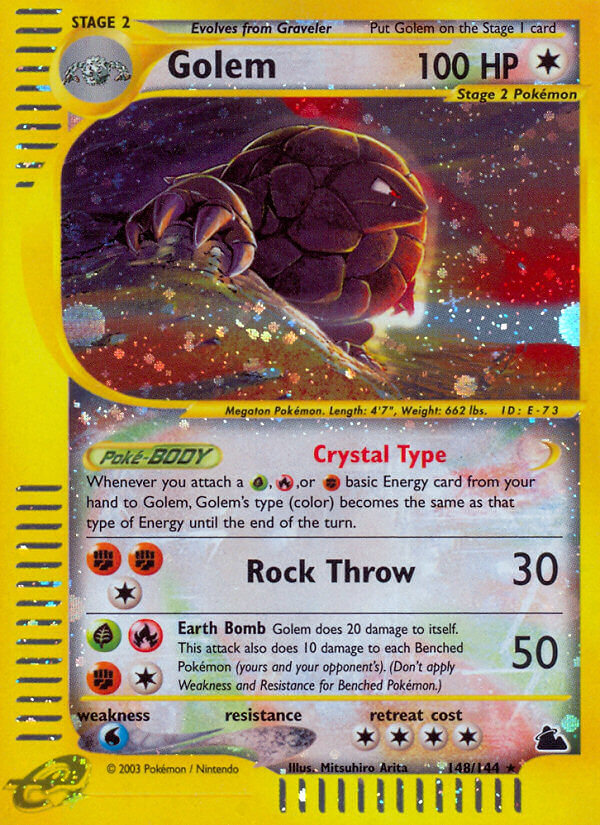
The extra realism really sells cards like this gem:
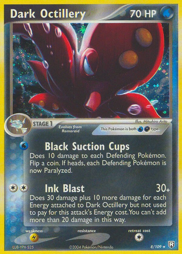
Something shifted once the Ruby & Sapphire era came, though.
The emphasis on dynamic poses stayed, but digital art really changed Arita’s style:


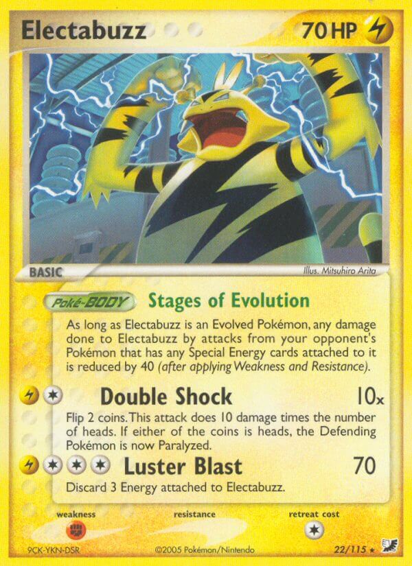

If you pay attention, you’ll notice just how much his art style shifted, like he was consciously trying to experiment with it all. But you’ll also notice that he’s doing a lot of 3D CG cards. It’s not always, but from here on out, his art would always be a mix of 2D and 3D together.
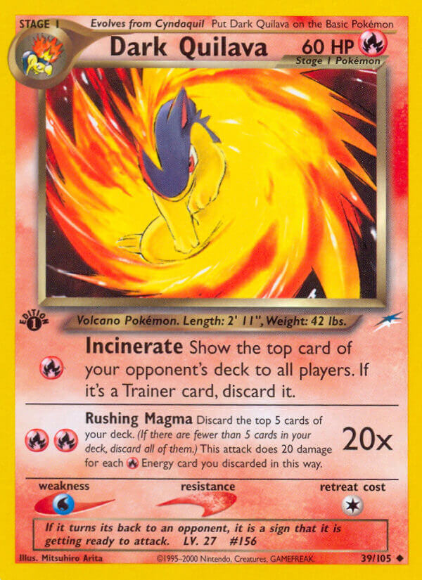
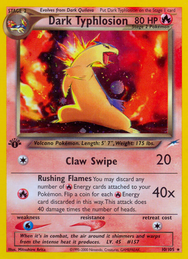
I’m overall not as big a fan. But I do love a lot of these, especially in his run on the set Team Rocket Returns:

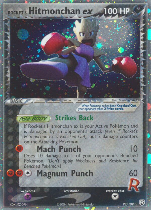
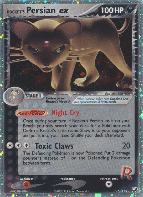
I dunno what it is about this man, but he can make an evil Pokemon like no one else.
His 3D work from around this time is typically just as exciting and dynamic as the 2D work, and in some cases, the colors are much more fun to me.
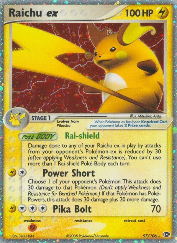
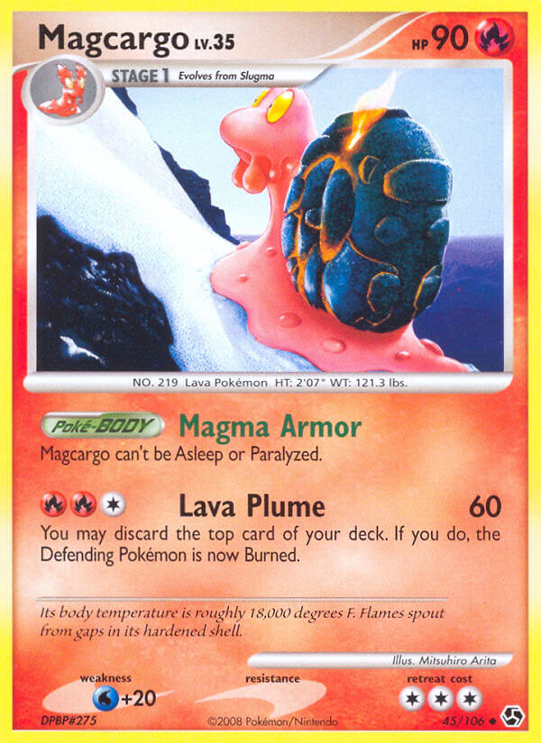
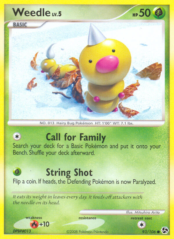
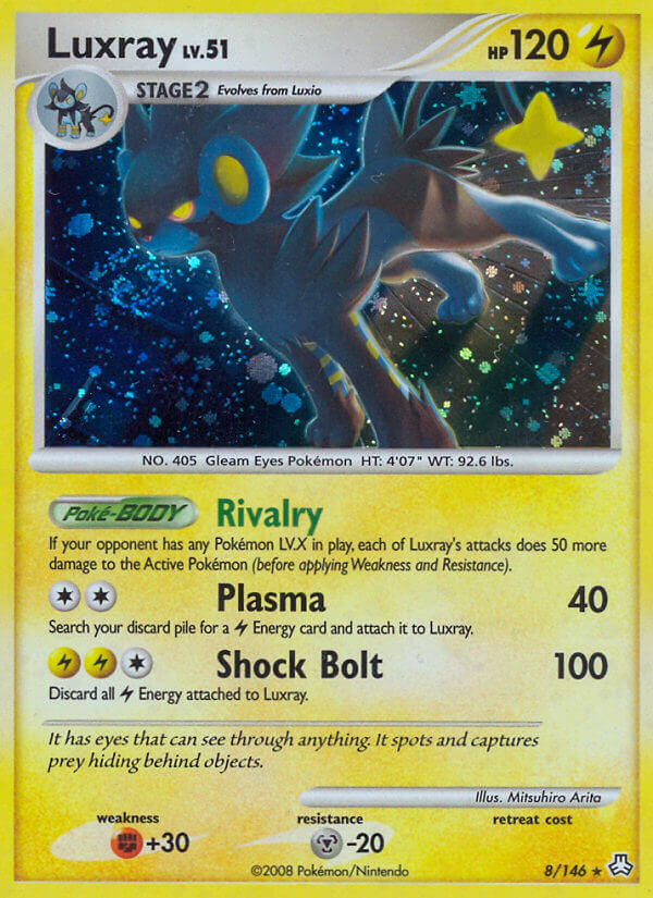
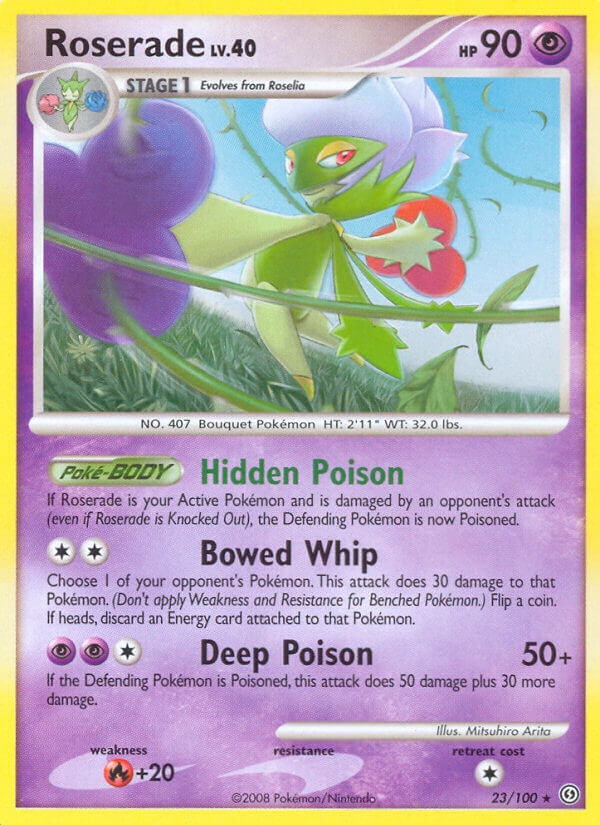
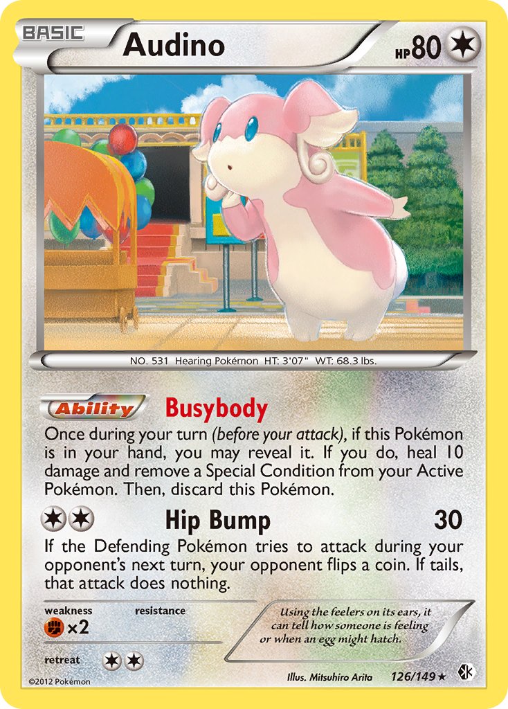
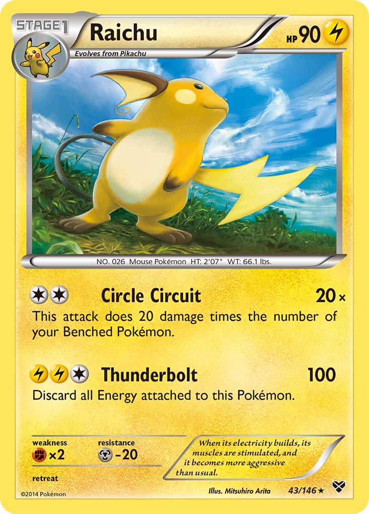
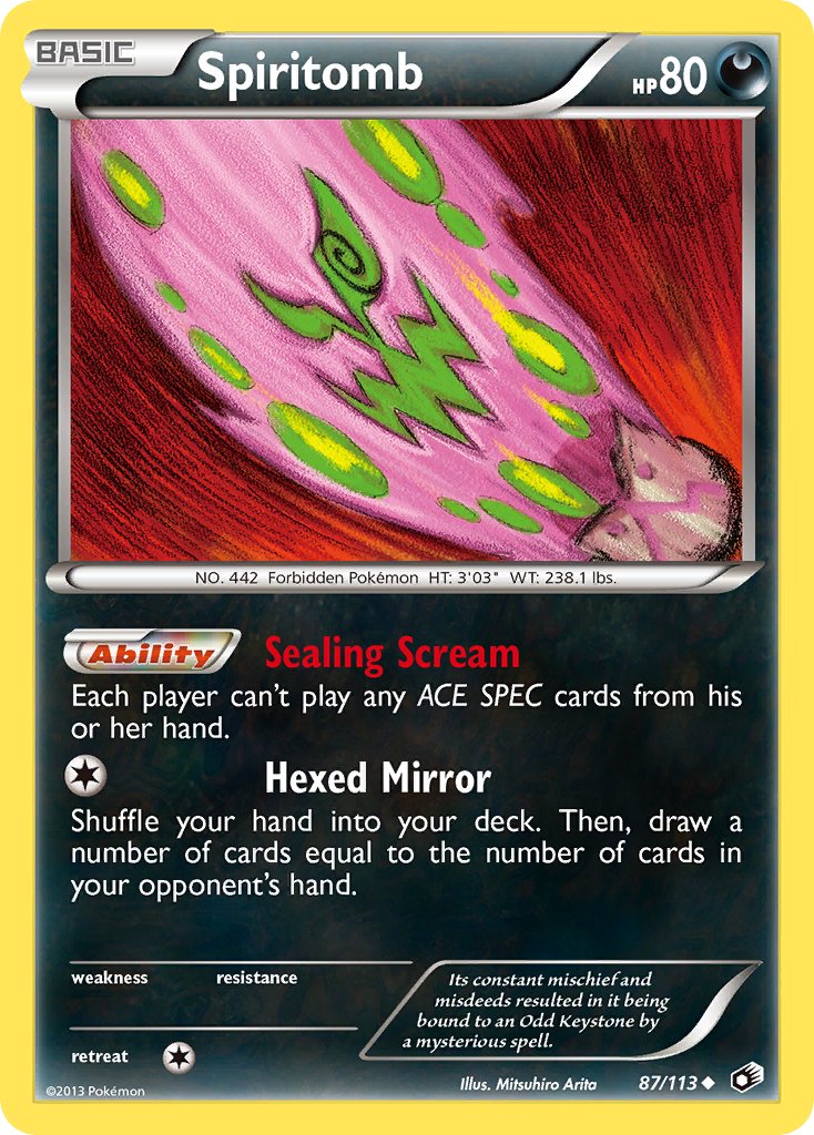
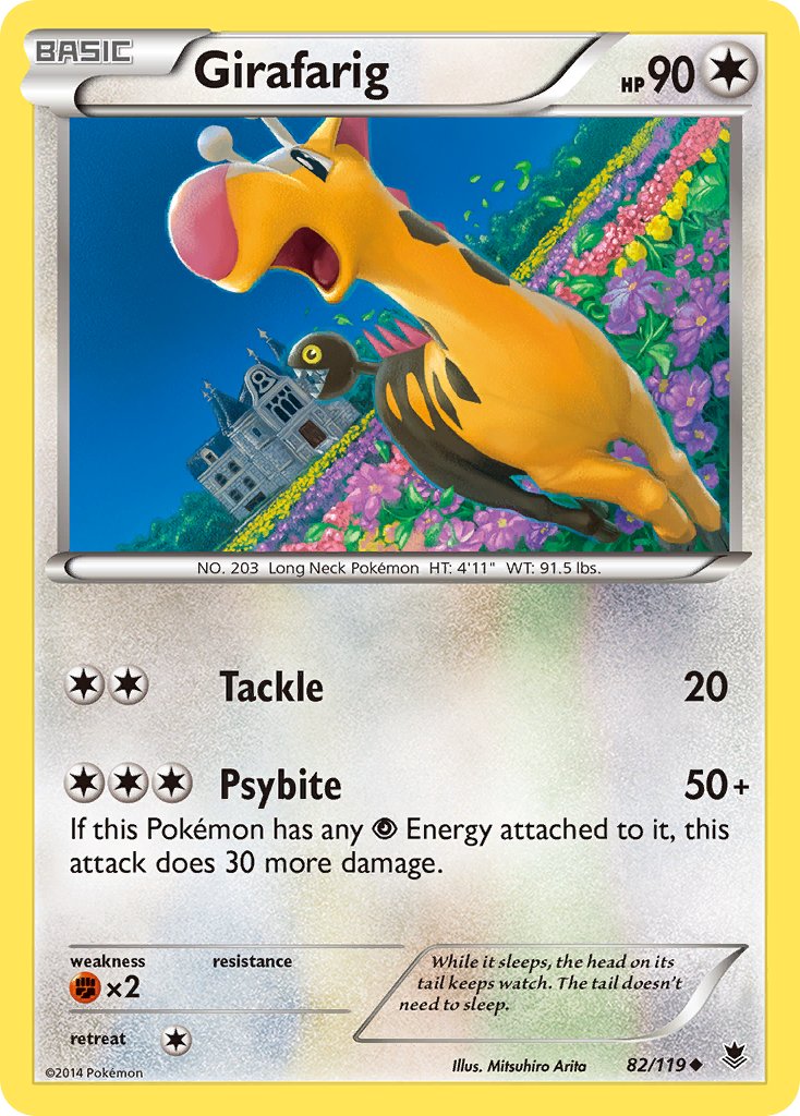
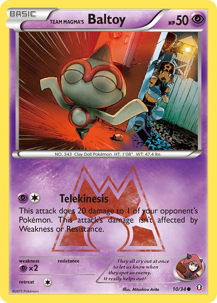
Unfortunately, I’m not a big fan of Arita’s cards during most of the Diamond & Pearl and Black & White eras.
His focus on realism really solidified around this period, and the cards as a whole feel a lot less energetic. The motion is a little bit less exciting, the actual poses less interesting. It’s all very well made, but it doesn’t capture me in the same way. Maybe Pokemon Company was trying to unify the House Style more strictly around then, just like Magic the Gathering started doing around the early 10s? I can’t say.
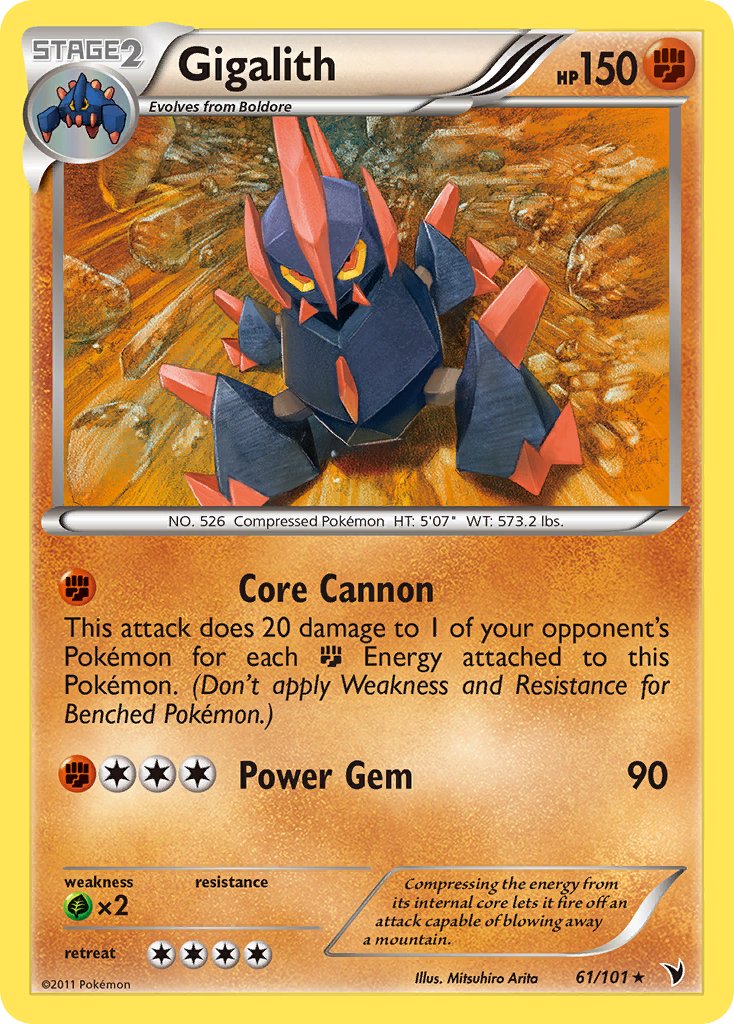
There’s still plenty of standouts:
…But it’s a lot fewer “wows” from me than those magical first ten years.
Some of the cards here are just… Sort of alright.

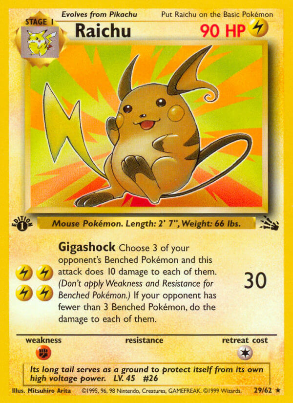
These anniversary type cards kind of show it best for me.
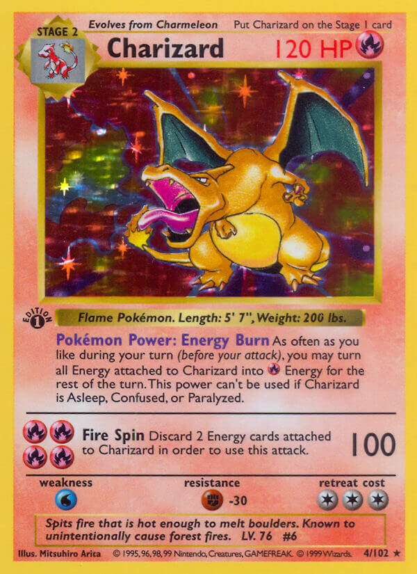
Charizard:

And Pikachu…
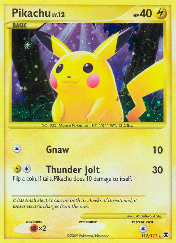
They’re certainly more vibrant and shinier, but they’re just not the same. And I don’t think it’s just my crumudgeonly grandma nostalgia at play, either.
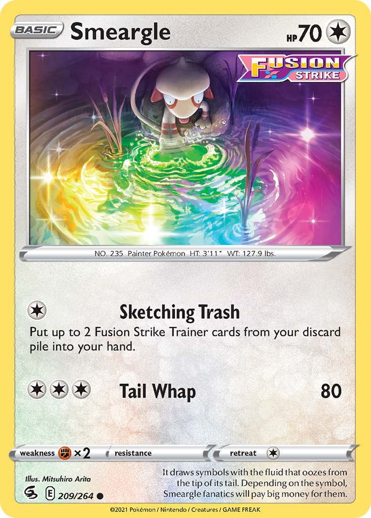
Without the extra context, I can’t say why Arita’s art stopped being as amazing to me. But what I CAN say is that, starting in the X & Y and Sun & Moon eras, something happened, and these cards got a whole lot more energetic, and mixed styles even more than before:

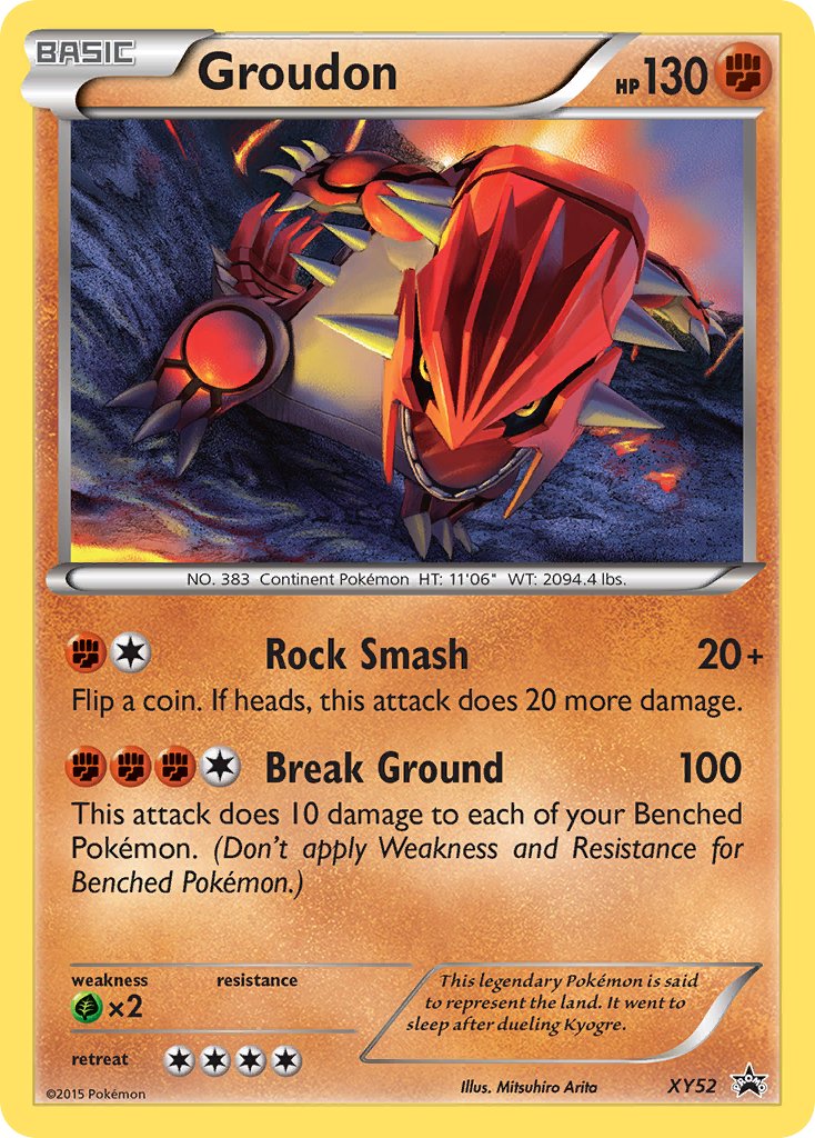


These are some shockingly dynamic cards! And they came in a rapid-fire quick succession, with far less boring cards in between. Arita’s style changed, permanently, with the advent of digital artwork. But that doesn’t mean he doesn’t have a huge amount of skill pouring into every illustration.
I’m not enough of an art student to know any of the right terms for all this, but I know it when I see it, and I see some really big changes in Arita’s output sometime around 2013-2014, all for the better.
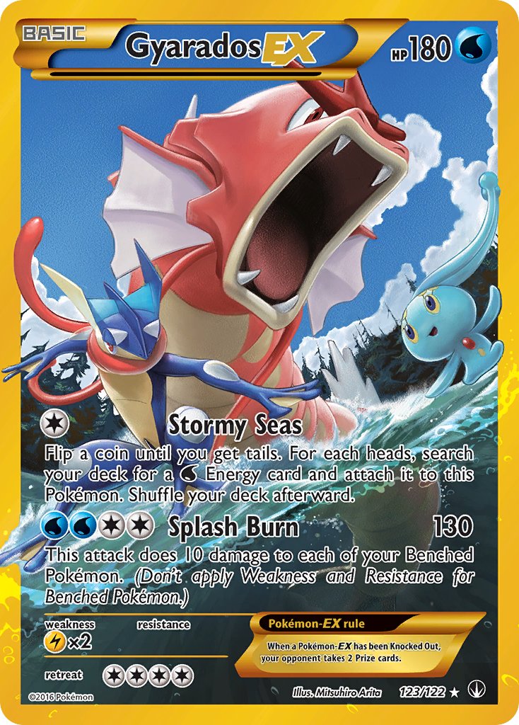
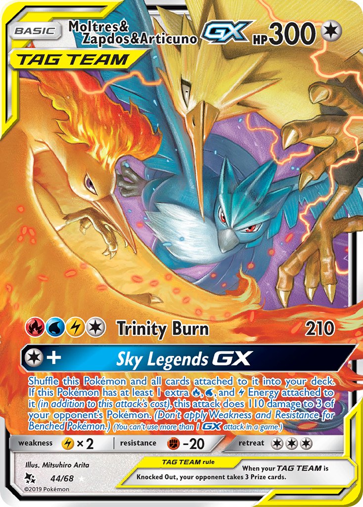
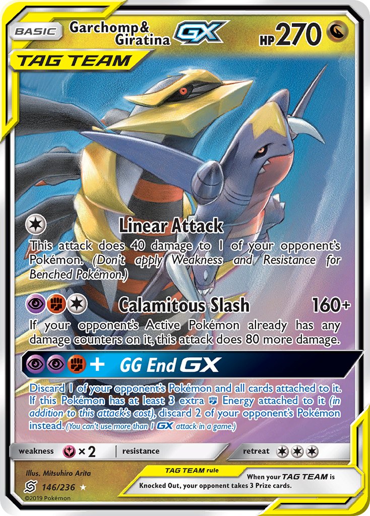
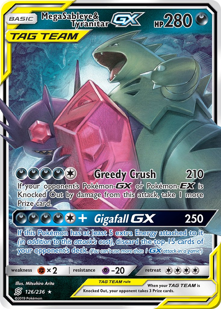
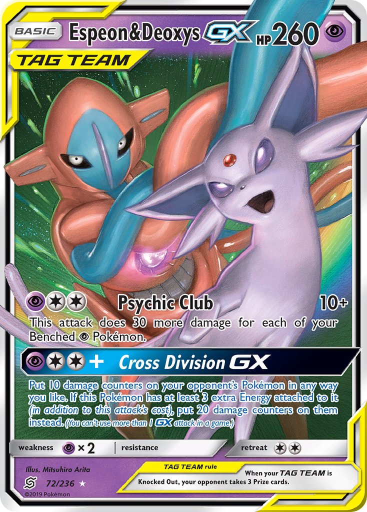
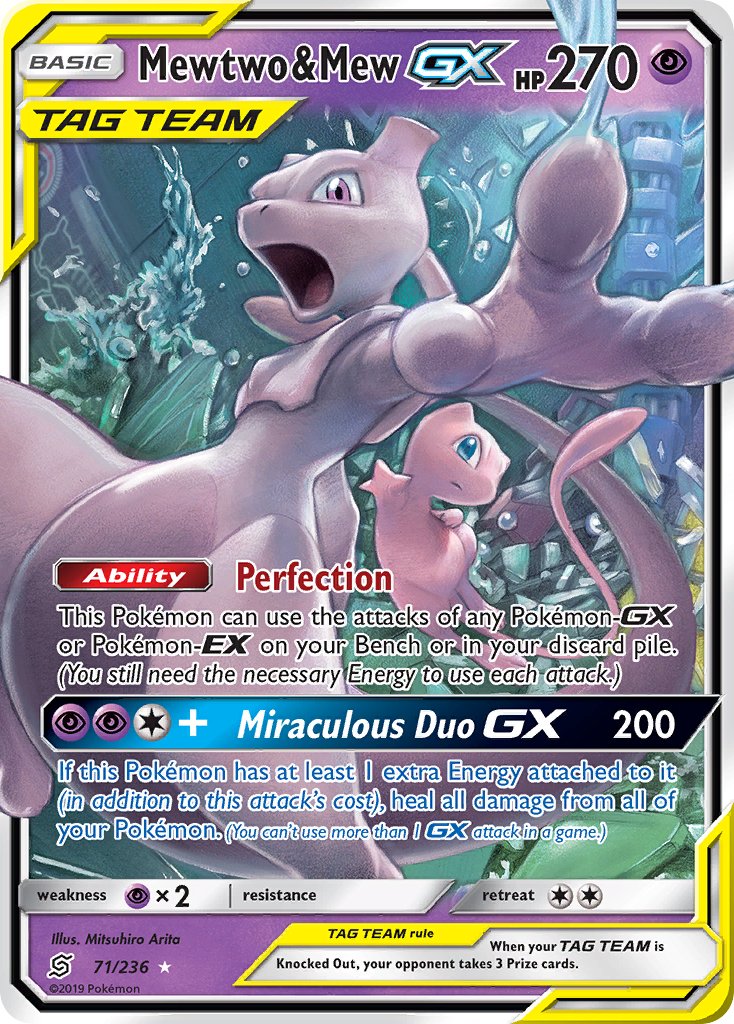
By this era of Pokemon, the cards are dominated by the flashy, hyper-dynamic action pose GX EX whatever cards with characters popping out of, or even outright destroying the frame borders. Arita could easily have been overshadowed in an era where his type of cool action cards have become commonplace.
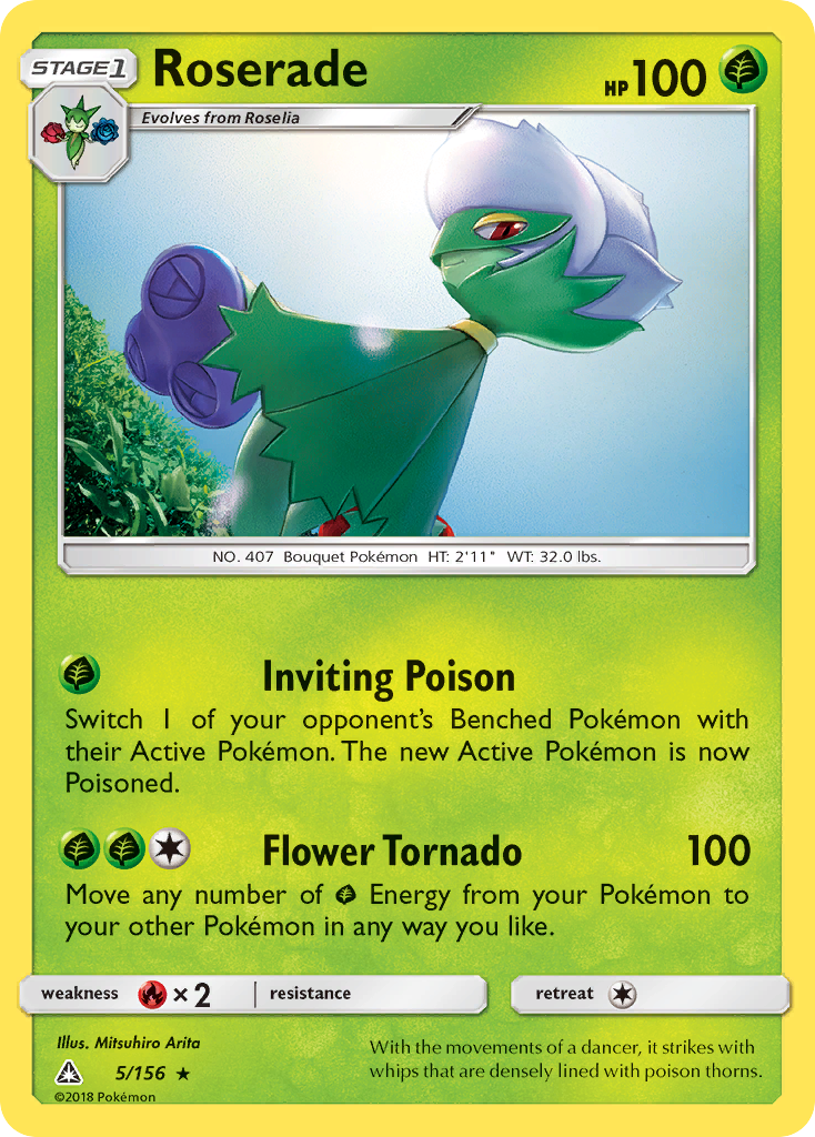
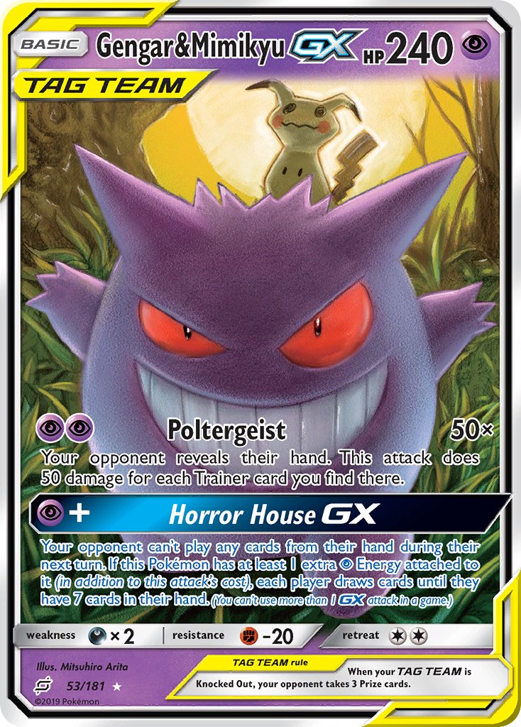
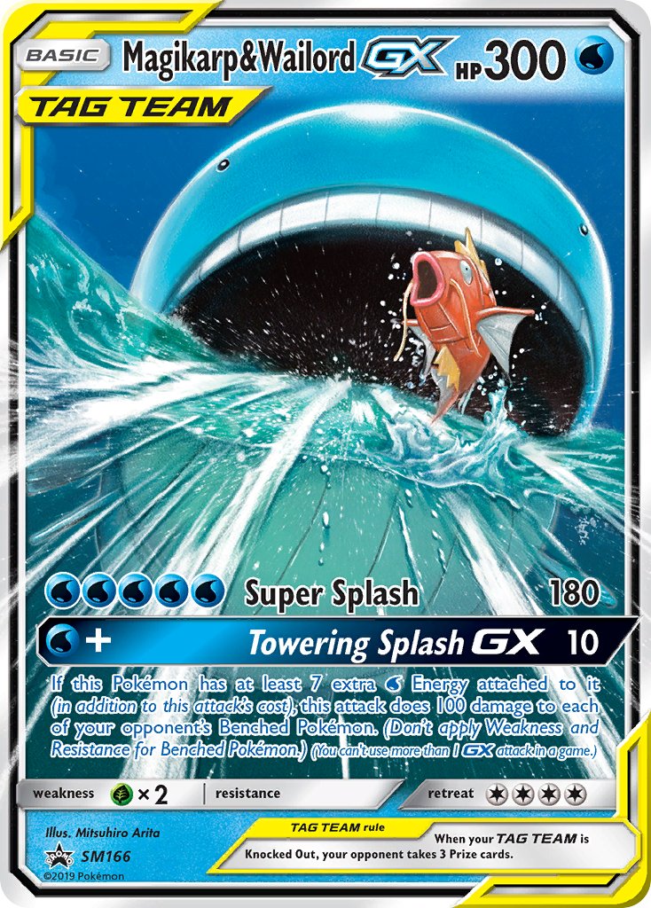
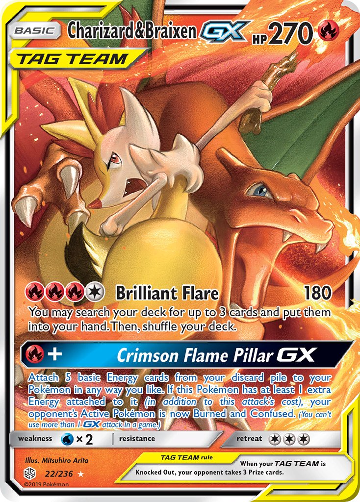
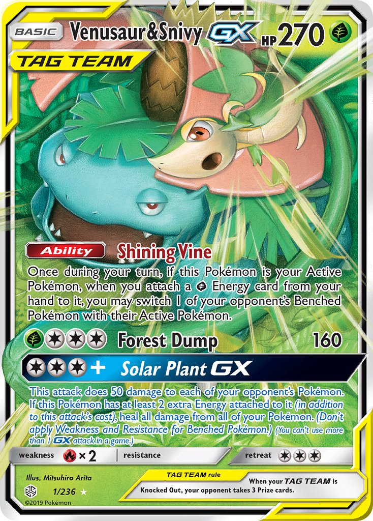
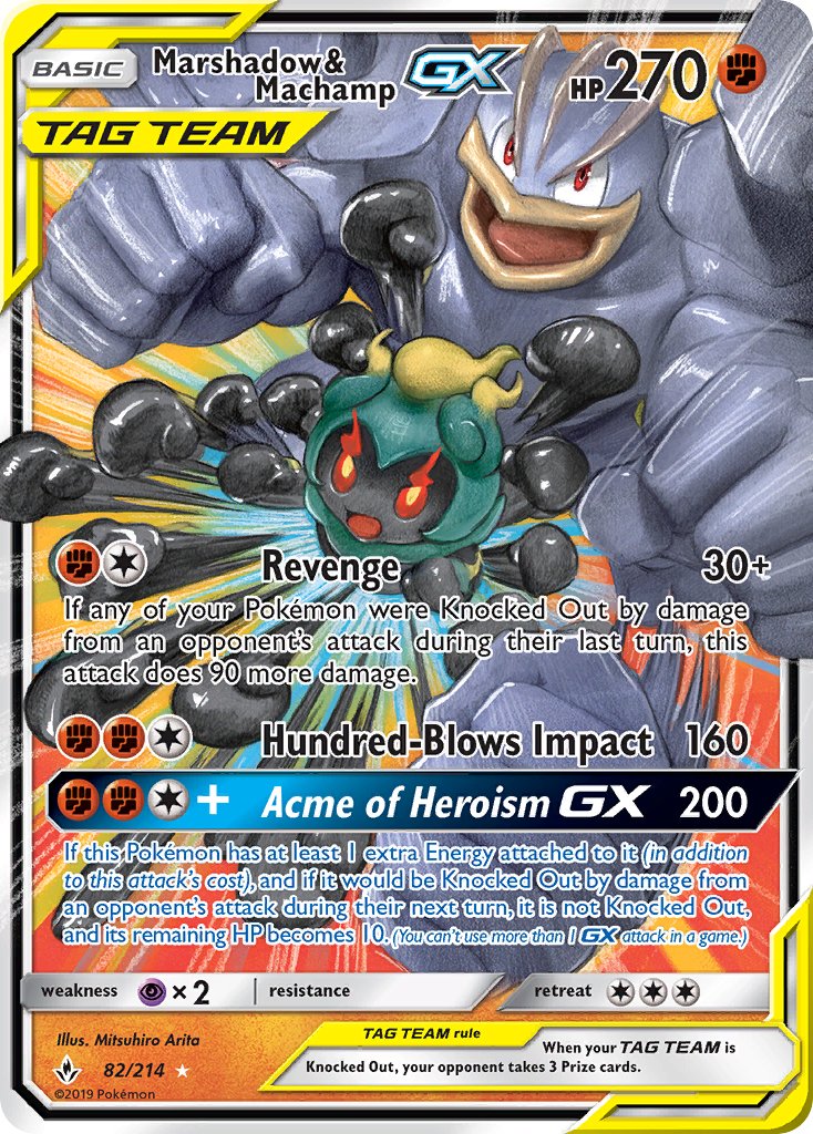
Nope. Instead, he delivered an even greater series of cards. Honestly, some of the best work in the entire Pokemon Trading Card Game, in my opinion. And that’s the Tag-Team cards.

He did almost all of them, with other artists supplying alternate art variants. A lot of the variants are fantastic, but the originals capture the essence of Pokemon perfectly.
Look at this stuff!


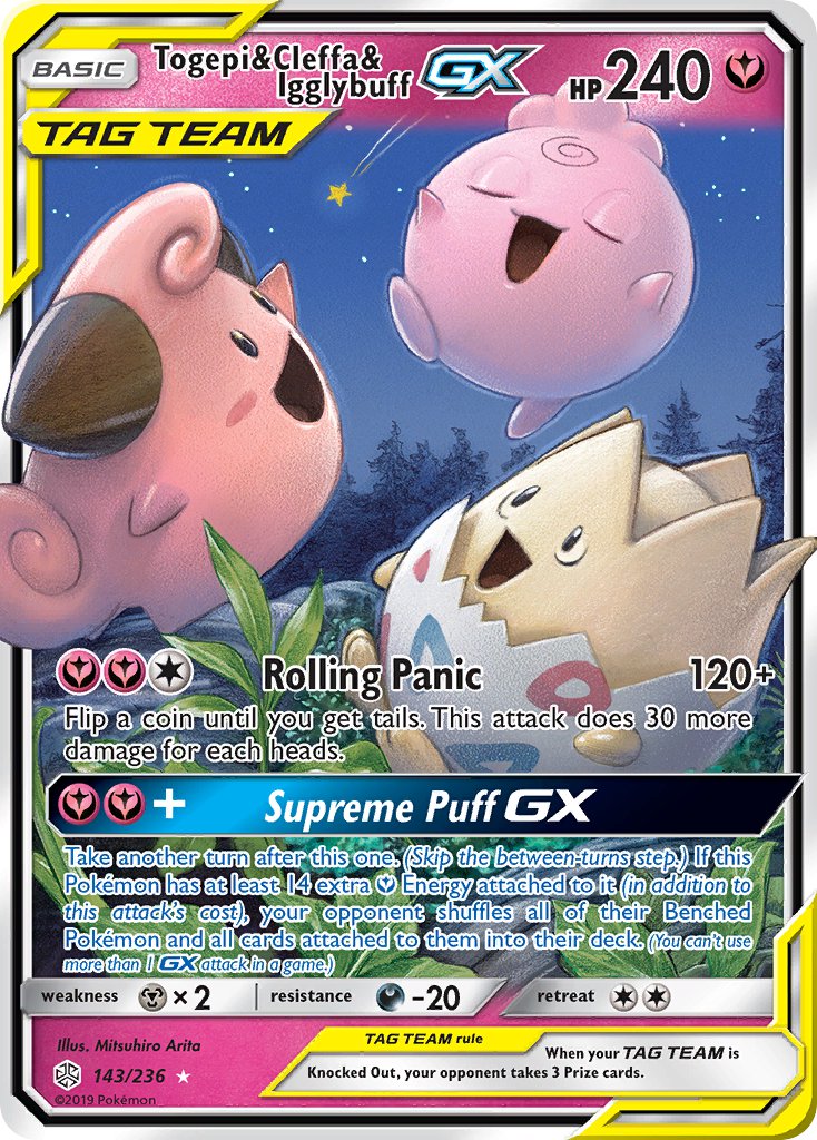
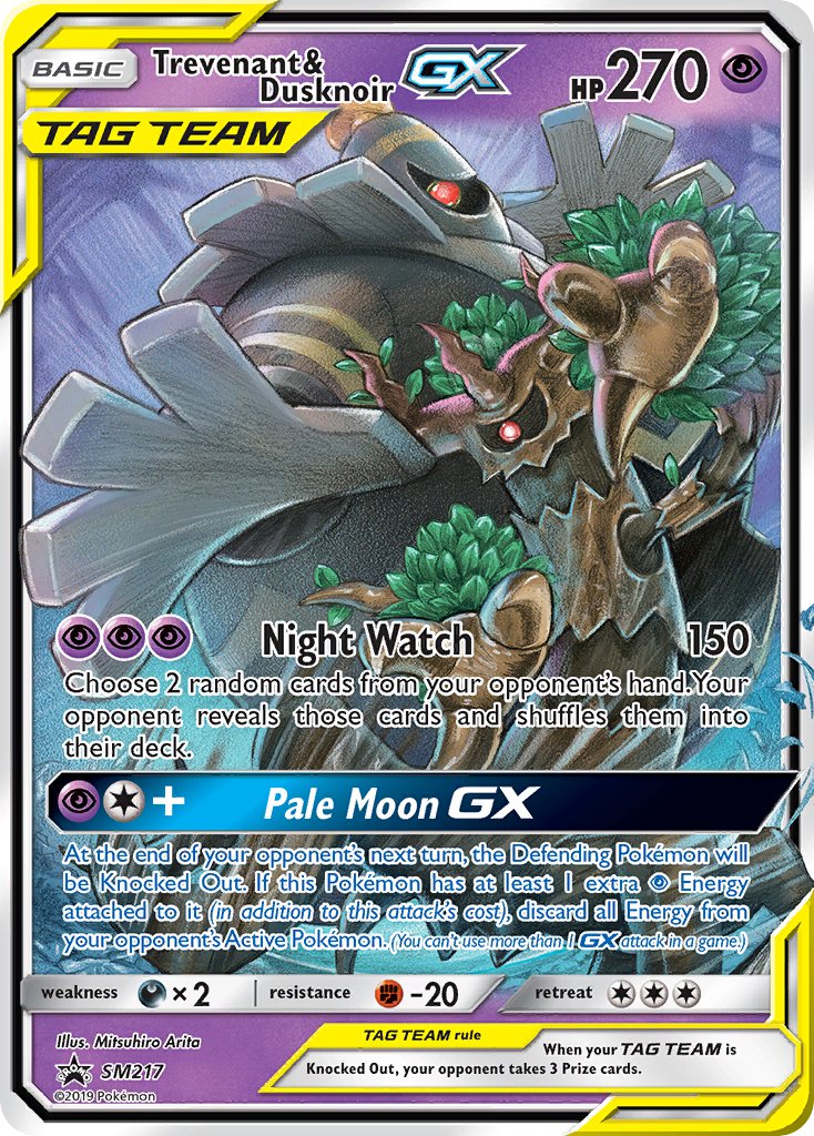


Let me spotlight one in particular:

Three baby Pokemon, the cutest little dudes in the universe, dancing in a field at night, singing and having fun over a falling star. Peaceful critters of nature having a fantastic time.
These cards show that Arita Mitsuhiro UNDERSTANDS Pokemon. He knows what makes the franchise so appealing, what draws us to these nigh-on-1000 monsters in our pockets. The cool, the cute, the wondrous. Awesome creatures that love to battle, but also exist in a fleshed-out yet endless world of fun games.
His newest cards have some of his best work, too:


If his early work was about the awesome colors and dynamic poses, and his middle work was all about the dynamic poses and realism, then his latest work is all about dynamic poses and the sheer wonder that these awesome Pokemon evoke. That’s what I feel, anyway.
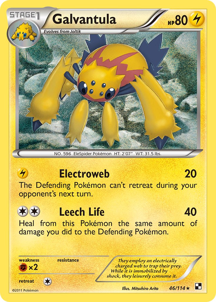
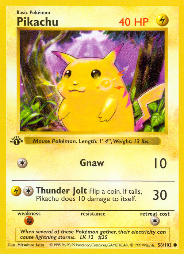
Remember that updated Pikachu from before? Well, he did yet another one for the 25th anniversary, and it’s leagues more interesting.


I love seeing artists going back to reference their roots, to show how they’ve changed. Here might be the clearest example of them all.
Oh, also, I noticed a couple more references while writing this article.


I have no idea why Arita made a direct callback to an older card, or if he’s done it in other places too that I didn’t notice. It’s weird, but welcome.
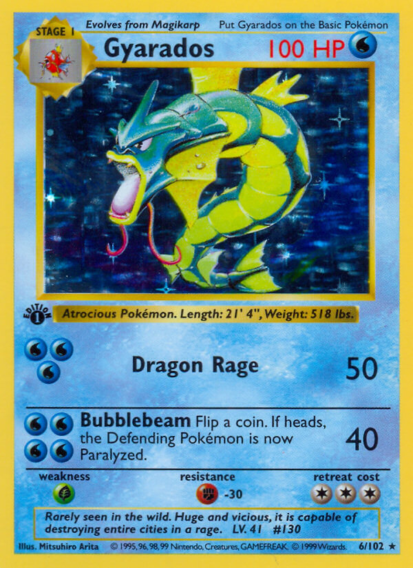
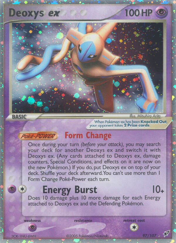
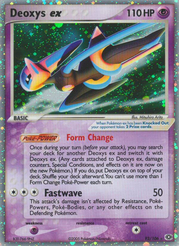
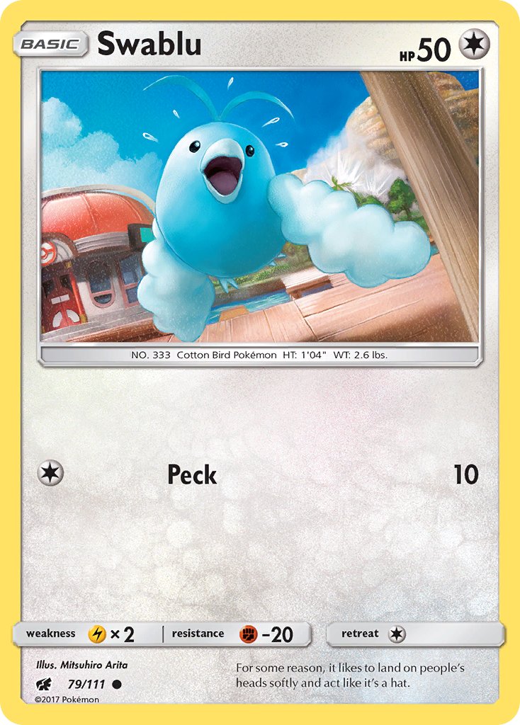
Arita also had a card reprinted and updated recently… A very weird one, too!


Turns out there’s an entire set, Celestial Storm, filled with updated reprints that have new stats to keep up with 20 years of power creep. Do they do this often? Am I just out of the loop in the card game now? Anyway, an extremely bizarre choice for a reprint, and the colors aren’t as cool in the new one, but it’s still highly appreciated anyway.
OK, now I must say: Please enjoy Arita Mitsuhiro’s art. I love it, and so should you.


5 thoughts on “Arita Mitsuhiro – Pokemon Card Art Spotlight”