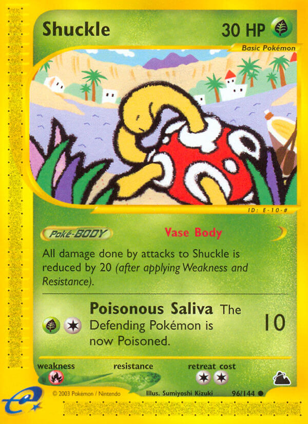
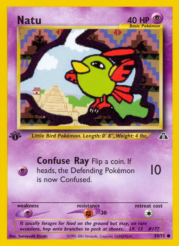
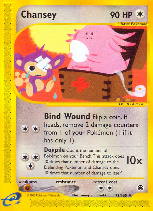
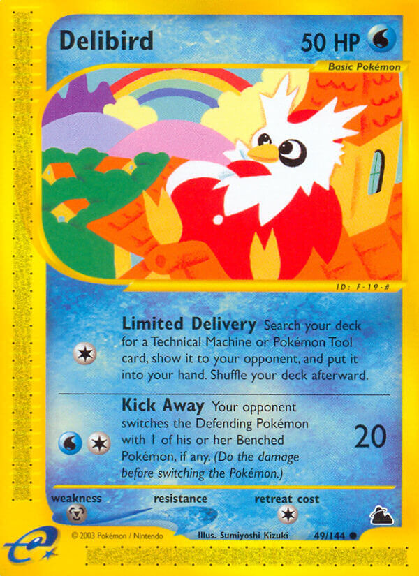
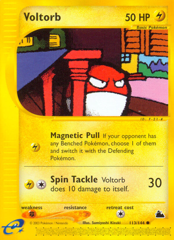
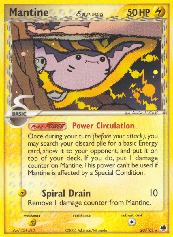
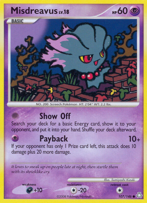
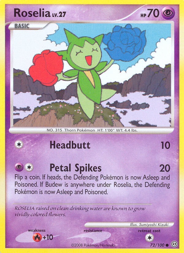
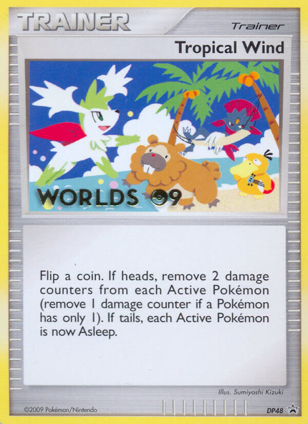
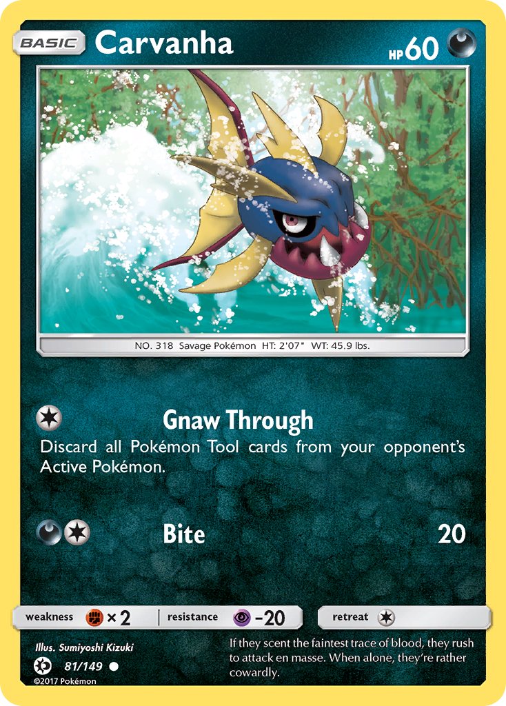
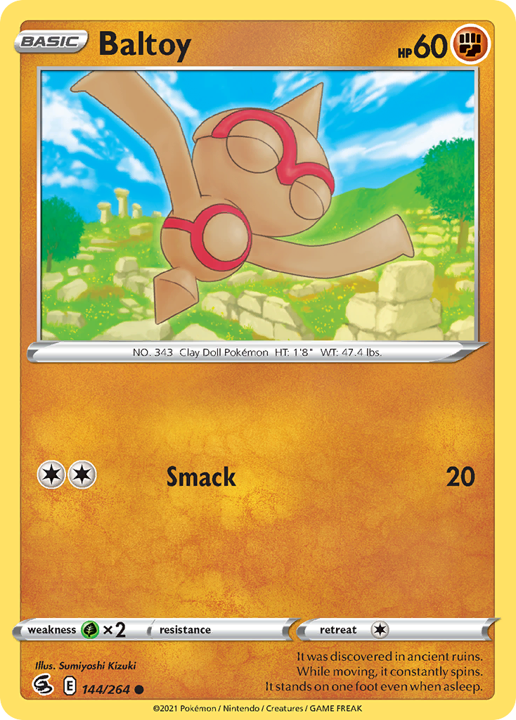
Another blog, another spotlight, this time on Kizuki Sumiyoshi. She’s yet another long-time artist, but one with an absurdly interesting artistic path. She’s an absurdly good artist even outside Pokemon. But her mainstay artist status means we can follow her career with tons and tons of cards.
So let’s give Kizuki Sumiyoshi a warm Pokewelcome for the latest card art spotlight.
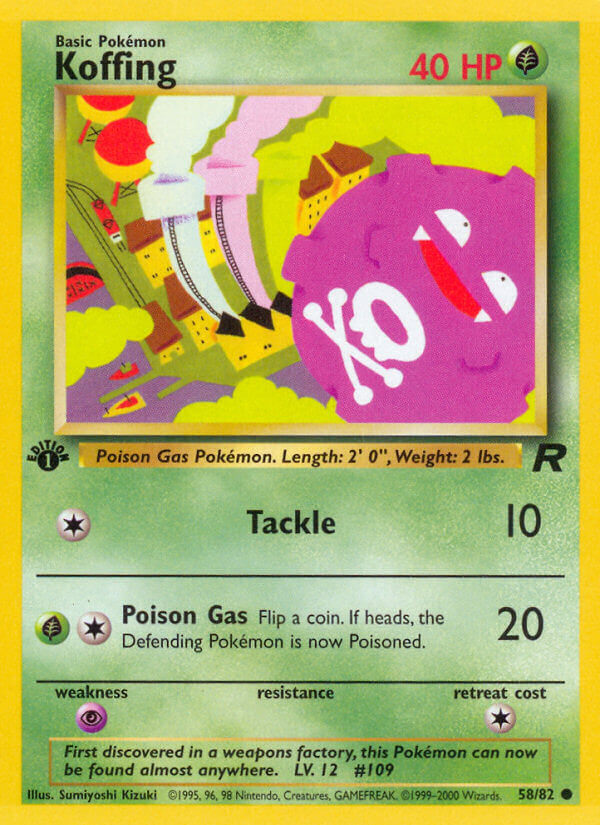
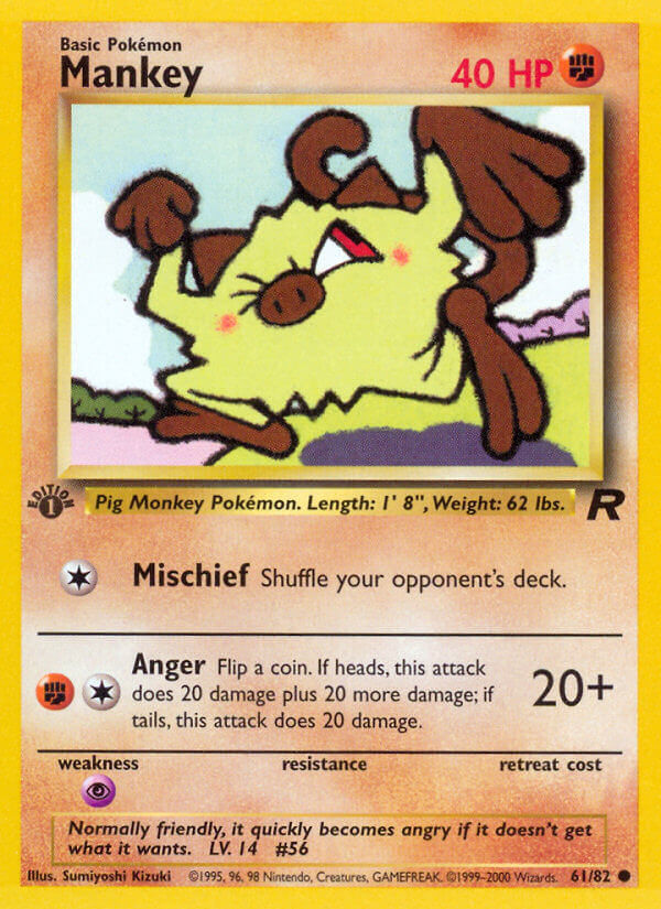
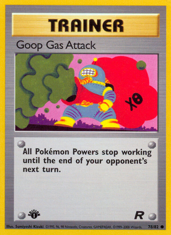
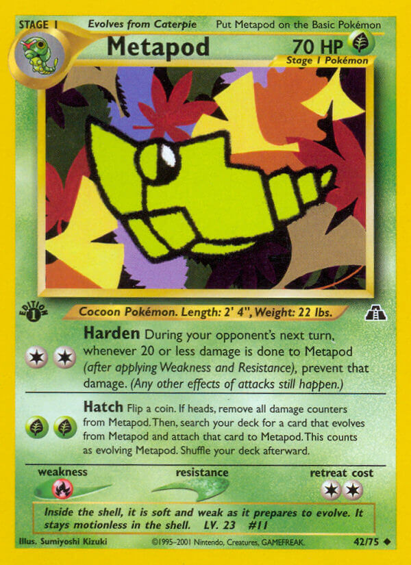
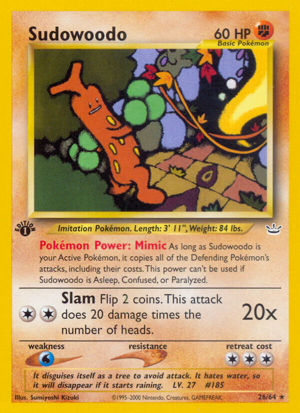
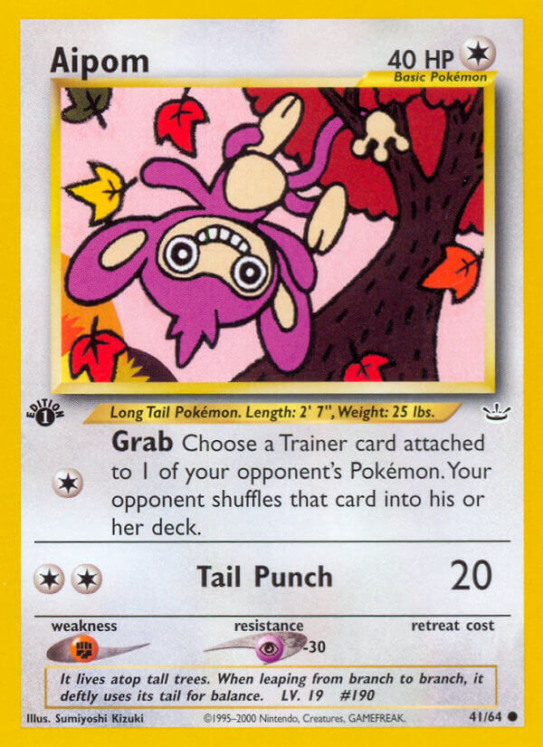
Her first set was Team Rocket (the fourth set if your memory is dry). And she came out swinging, with a bunch of Pokemon cards with really different styles.
I like how different these cards are. To an untrained eye like mine, if you told me they were by three different artists, I’d certainly believe you.
To simplify things a lot, Kizuki Sumiyoshi would continue developing these “three styles” throughout her career in Pokemon card art. “Style A,” as I’ll clunkily refer to it, has thin outlines, detailed backgrounds, and realistic poses. Style B has no outlines, and more abstract backgrounds and color use. Style C has thick, sketchy outlines and an overall flat look. According to someone more knowledgeable than me, Style C is an homage to old Romanian art styles, and is the style Kizuki has refined most in her non-Pokemon original art.
I really like all three of them as they appeared in Team Rocket, and all three styles would continue to appear thoughout the next twenty years.
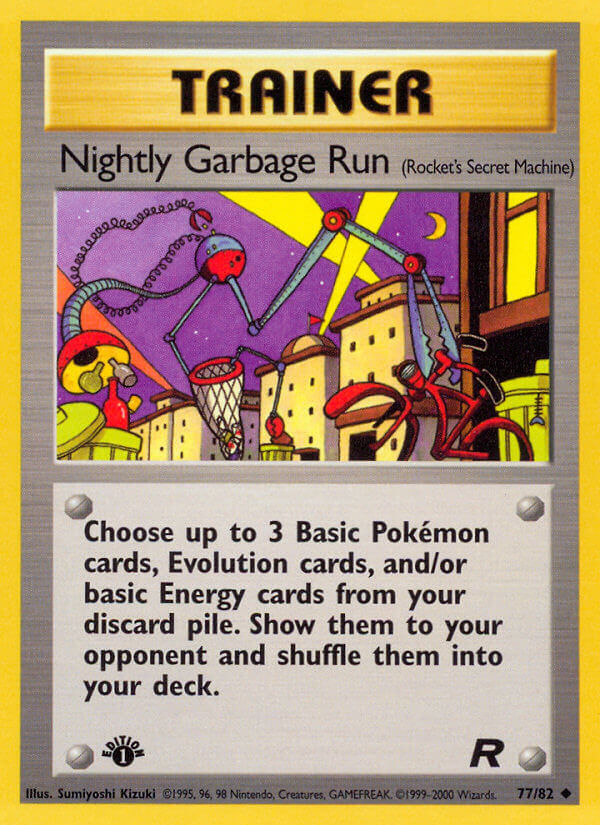
Kizuki is also responsible for all those early Rocket’s Secret Machine cards. They were trainer cards with kinda nasty or mean effects, perfect for the bad guys…
As we moved into the Gold & Silver era, we got more good cards of some of my favorite dudes.
Style A didn’t get much love in these times, but that’s OK because I love this other stuff.
I’m particularly fond of this Natu/Xatu combo! Extremely flat artwork that is super abstract and has awesome color palettes. I’d get a poster of that Xatu in a heartbeat.
You can see Kizuki Sumiyoshi keep on trucking through the e-reader days and the early EX days.
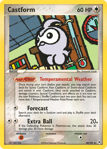
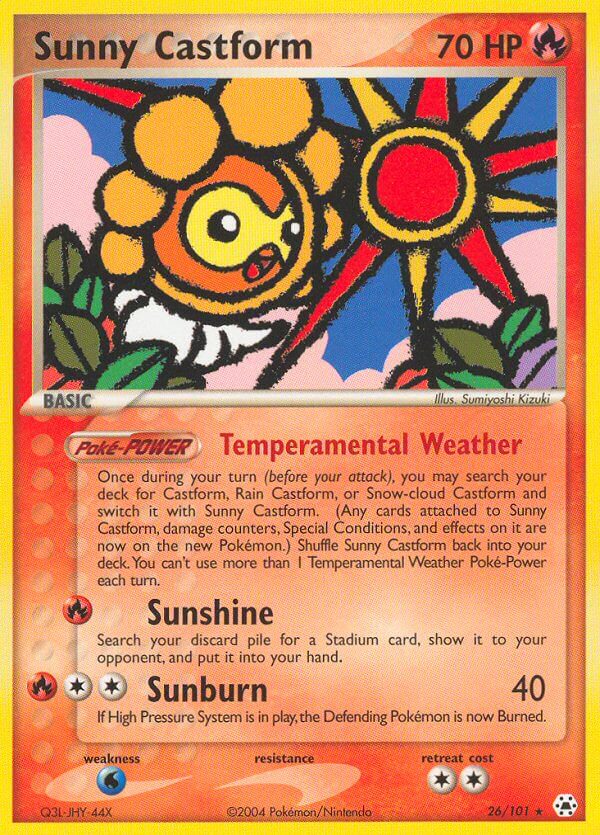
She was responsible for the original Castform cards that are kinda wonderful!
Even sketchier than ever, with very simple designs and bold colors. The childlike wonder of weather bursting through each card.
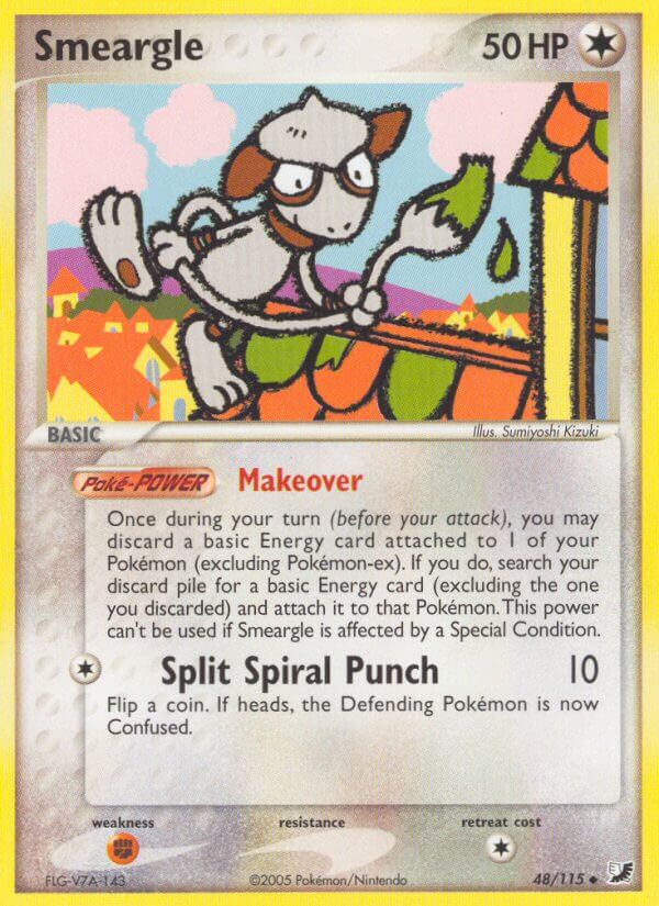
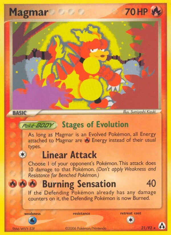
Some of the EX-era cards are downright funky. Almost Komiya-esque at times. As always, I really love that Smeargle. All Pokemon artists should be forced to draw at least one Smeargle in their career.
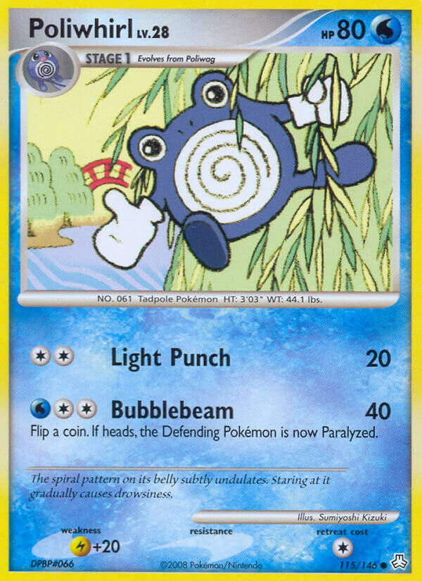
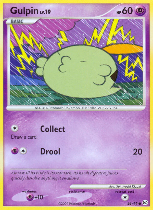
Then, as the Diamond & Pearl era started, Kizuki shifted her art style in a pretty big way.
You’ve still got a flat, mostly unshaded look, but with thin outlines, less abstract environments, a lot cleaner. I adore the backgrounds in a lot of these Diamond & Pearl cards, even if they are dramatically different than what we were getting before..
And the experimenting with styles didn’t stop, just slowed. Kizuki still had tons of variation.
I miss the Style B cards; only one promo card in the entire Diamond & Pearl run used it. And nothing beyond that so far.
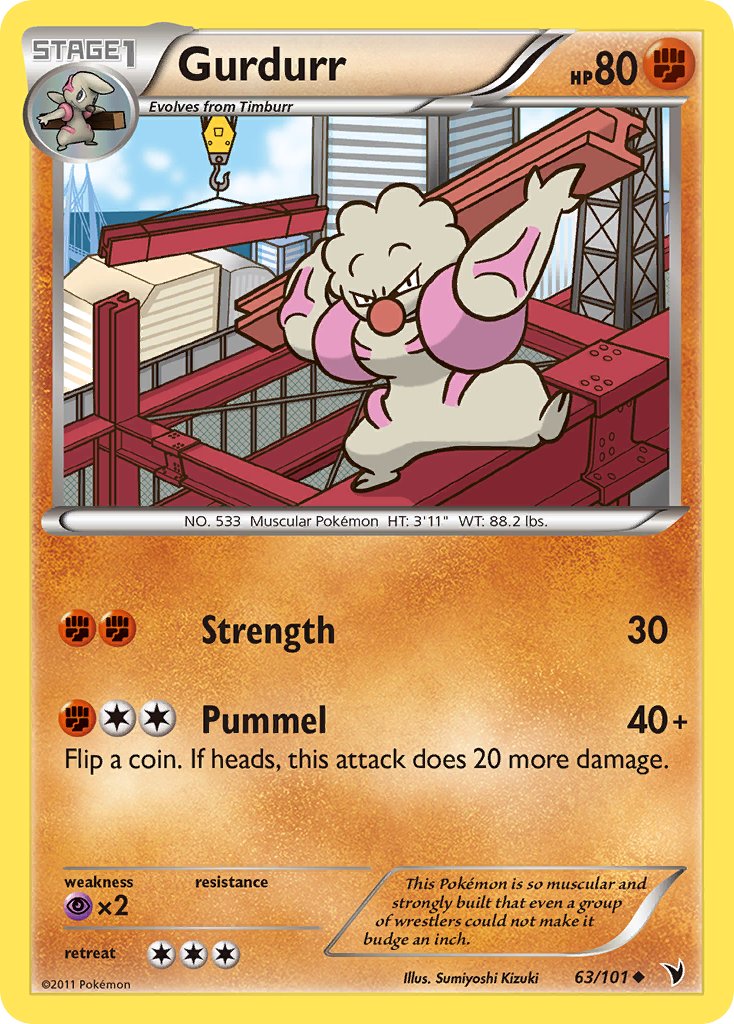
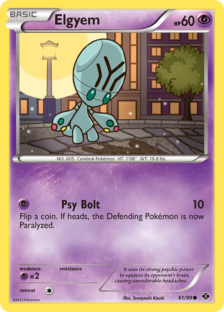
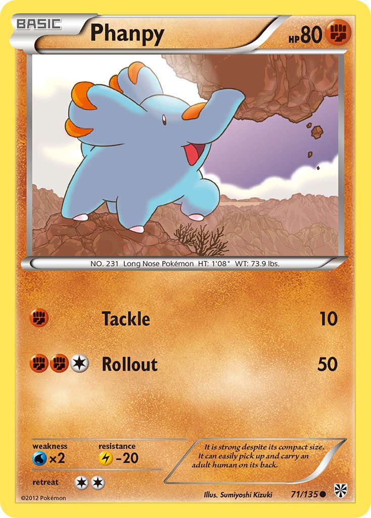
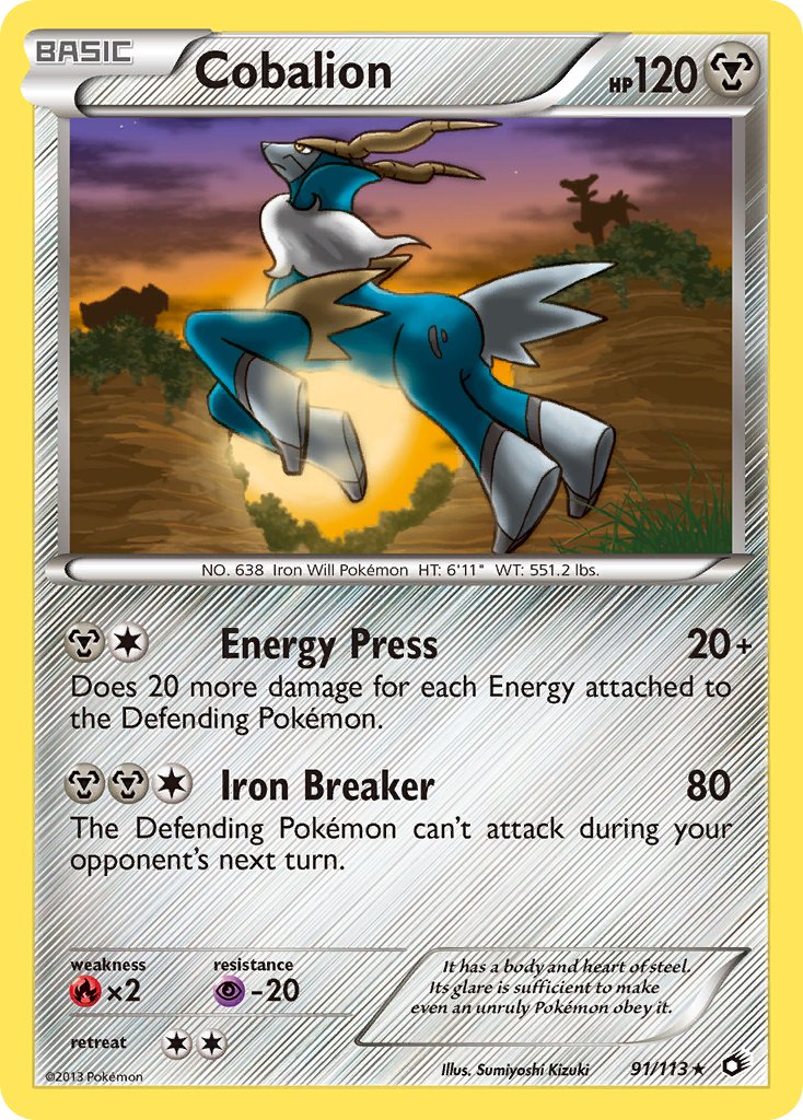
Because, once Black & White started, Kizuki Sumiyoshi changed up her style EVEN MORE. Just like many other artists I’ve covered so far, there was definitely a house style convergence in the late 00s, where art style experimentation was less and less prevalent. But Kizuki’s shift was much more dramatic.
That’s right, for the first time ever, Kizuki started shading all her characters. The outlines got a lot thicker, while the backgrounds were a bit more abstract. It’s a really big shift from just a year or two prior.
And it just kept changing.
Kizuki shows a willingness to adapt and change her art style way more than anyone would expect. It’s kinda crazy.
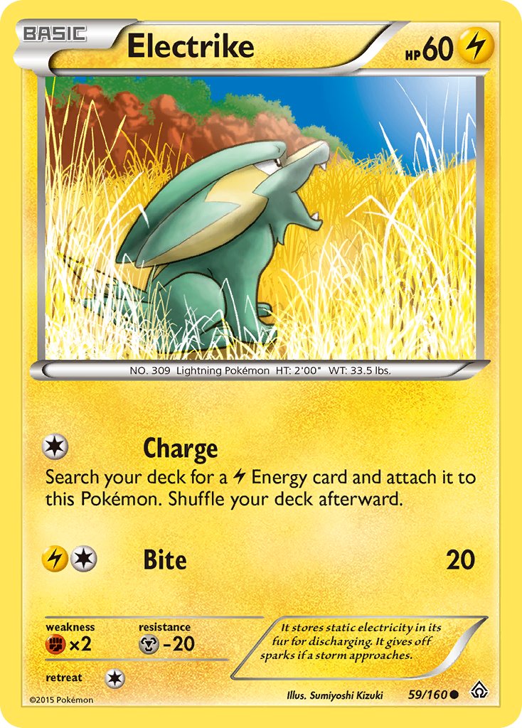
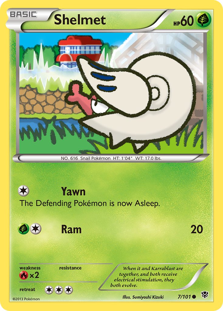
She also had an increasing tendency to really go into digital effects like blurs and glows, which I’m not particularly fond of to be honest. If she recolored the inks here in the Diamond & Pearl style, I think these would look much better, whereas here they’re just pretty good.
So we have entered an era where Kizuki’s art is almost entirely an evolution of Style A. Styles B and C still show up occasionally, but it’s increasingly rare.
It’s kinda crazy to me that these are even by the same artist.
The clearest example to me is two recent cards with a very similar pose, one in Style A and another in Style B:
There’s nothing wrong with Kizuki’s most recent cards, but I was a huge fan of the sketchy bold outlines and the flat outlineless stuff, and that’s not what she’s doing anymore. Or not allowed to do? If this was still 2013 or 2014, I’d say that she’s being held back by Pokemon’s art style streamlining. But this is 2024 now, where Pokemon cards are getting wilder and wilder with each passing set. Maybe this is just easier?
One thing’s for sure: Kizuki Sumiyoshi needs to get her own full-art illustration cards. She hasn’t had the opportunity yet, unlike most other early set artists like Arita, Komiya, Morii, and Himeno. I don’t know if anyone at the Pokemon Company will ever read these articles, but if they do, this is my biggest request. Give Kizuki some full-art illustration cards!!
Read more of my Pokemon Card Art Spotlight articles:
