Another Pokemon Card Art article, this time on Nishida Atsuko. Another artwork titan there since the beginning–she literally designed Pikachu, Bulbasaur, Squirtle, Charmander, Vaporeon, and several other wonderful characters. She worked at Game Freak until recently and has been credited as a designer on every single generation. Absolutely incredible stuff.
She’s also famous for lots of non-Pokemon work, including the video game Hometown Story, and the mascots for, uh, whatever the heck Organ Rooms is. It’s all just as cute as you might expect. But this isn’t about an artist’s whole career! Only the Pokemon! And we have tons of Pokemon cards to look at.
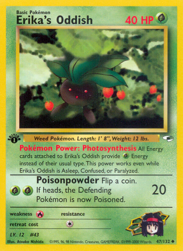
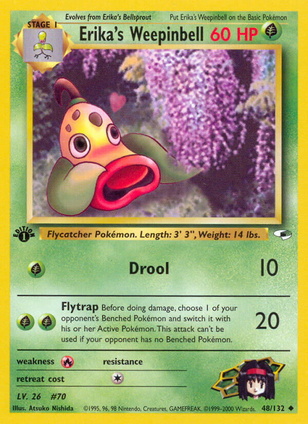
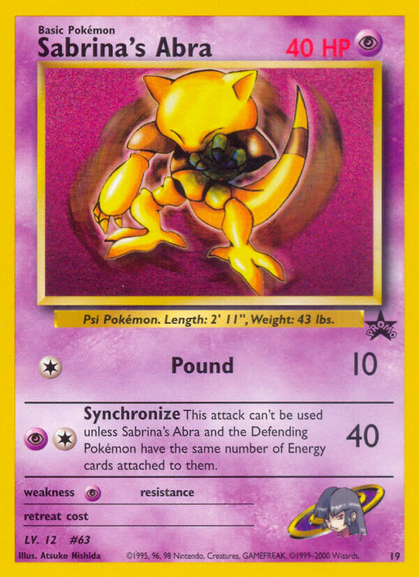
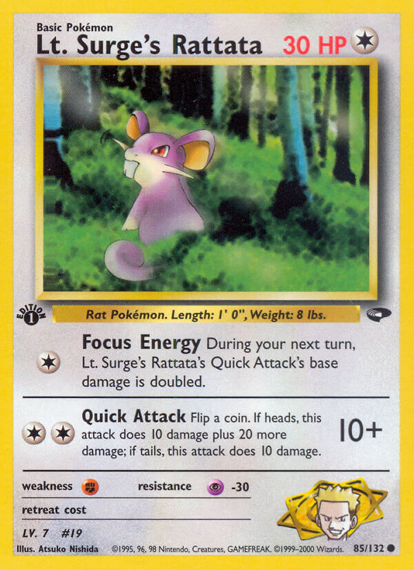
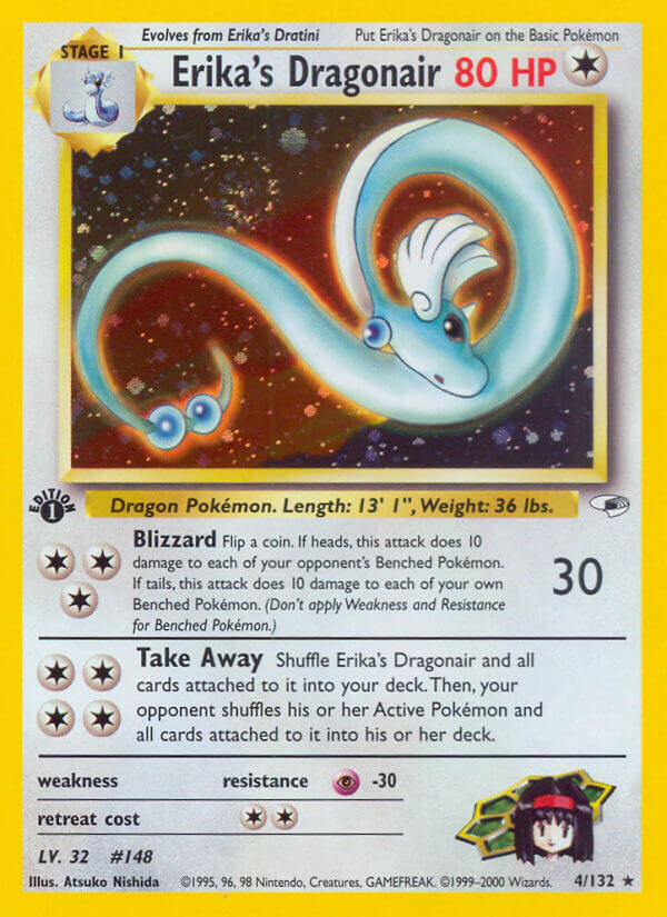
Her first card work was on the Team Rocket set, almost the beginning, and she continues to make art for the game to this day. Let’s take a look…
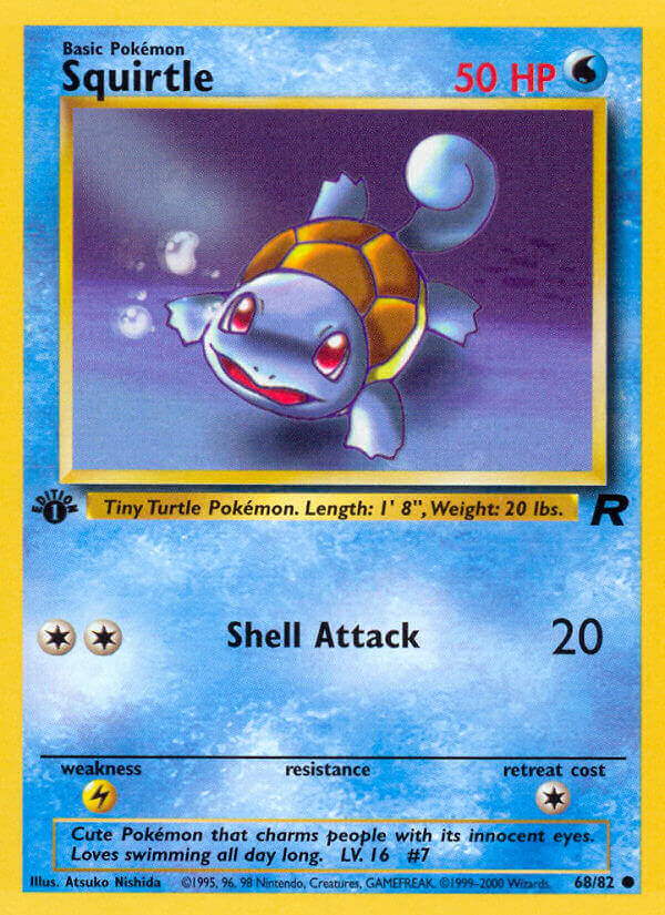
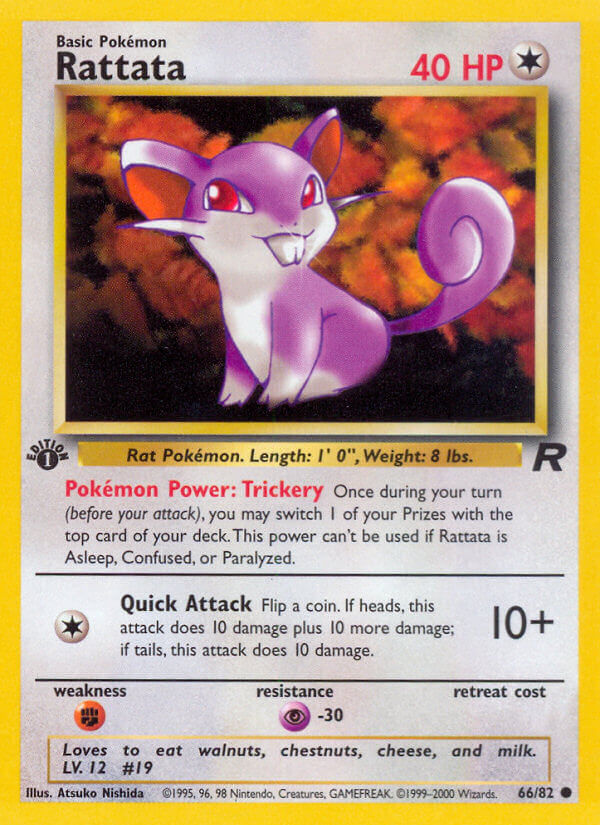

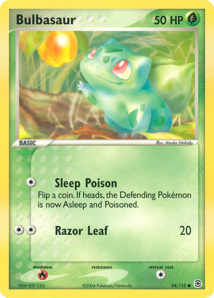
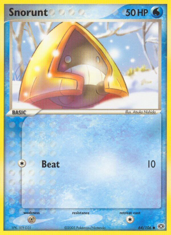
A fine first few card arts! It’s clear from the start that Nishida Atsuko’s main focus is on the cute small Pokemon, and that’s a great place to focus. Soft light, blurry weird color backgrounds, it’s a nice style.
I can’t say I’m a fan of her early forays into digital art, though. Mixing the cute, presumably hand-drawn characters with blurry photo backgrounds and other effects has a very weird end result. It’s funky, though, which means it’s at least very interesting to look at.
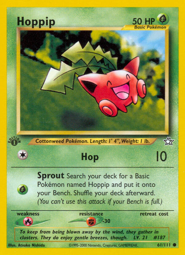
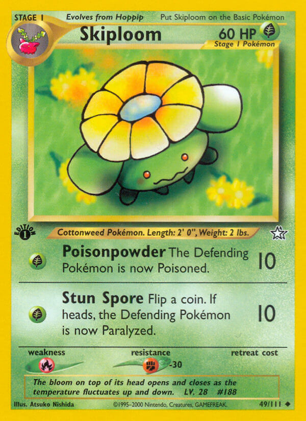
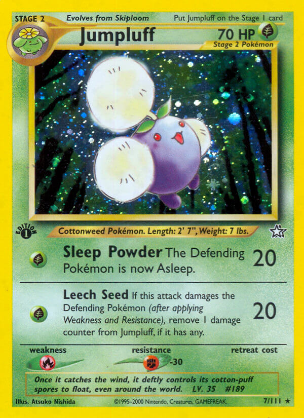
One highlight in the Neo sets is the Hoppip line. The digital backgrounds blend better with the Pokemon, and the watercolor shading feels timeless.
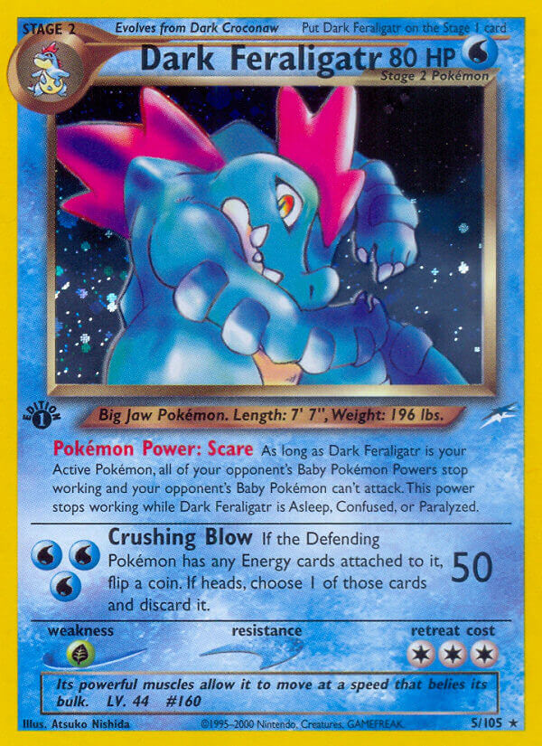
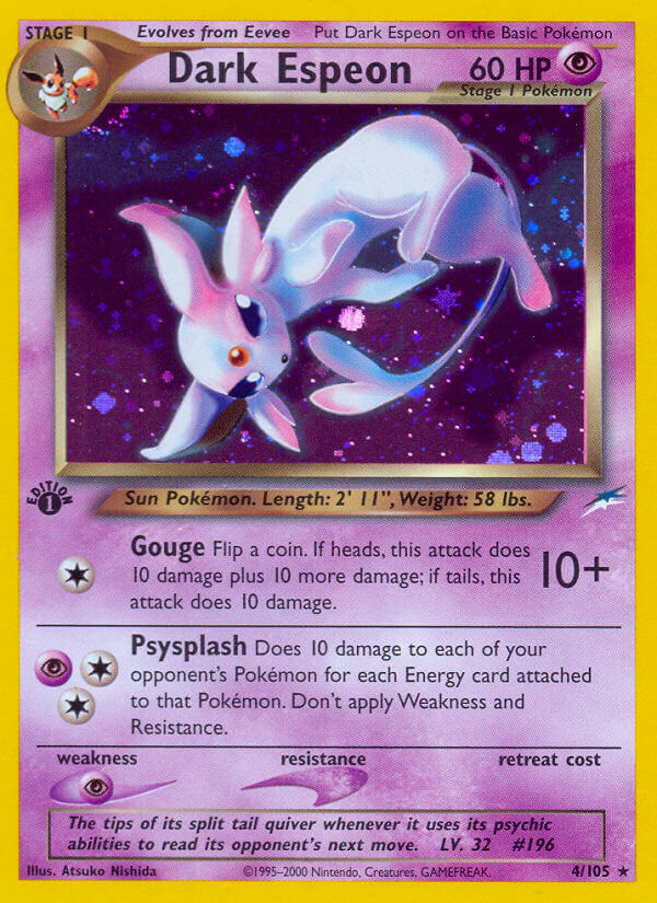
I’m also a fan of how Nishida Atsuko does these Dark Pokemon. They’re the fiercer, more intimidating versions of their normal Pokemon counterparts, but still cute and shiny.
The style is almost too shiny, as the same Neo sets’ Light Pokemon show…
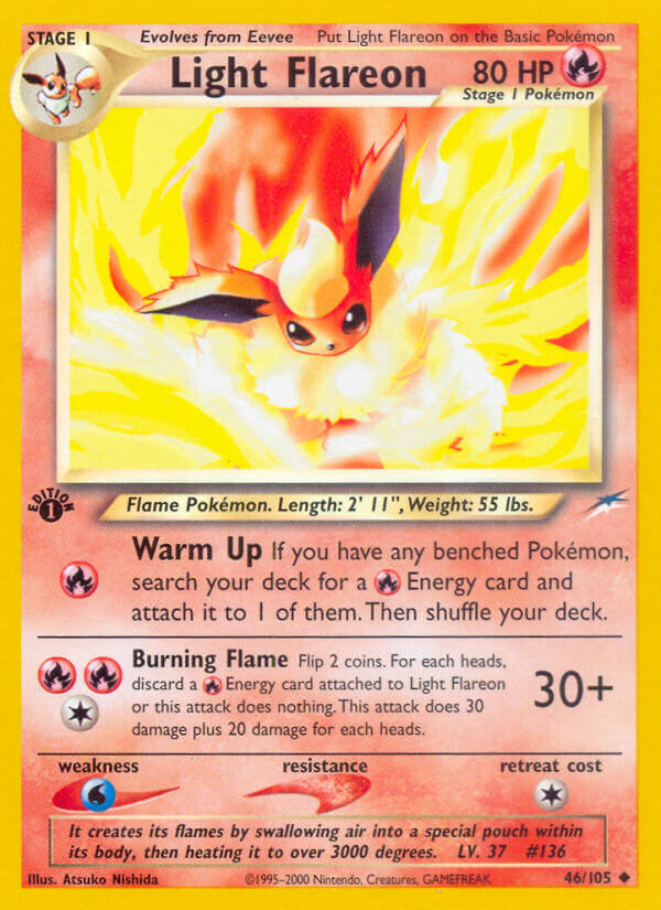
That Flareon is almost blindingly bright! Ouch! Almost too bright, honestly. Luckily, she’d find a balance there pretty soon after.
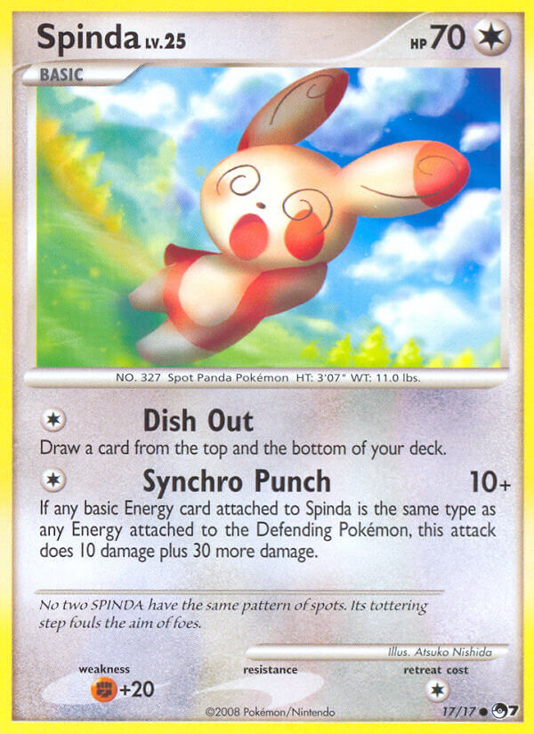
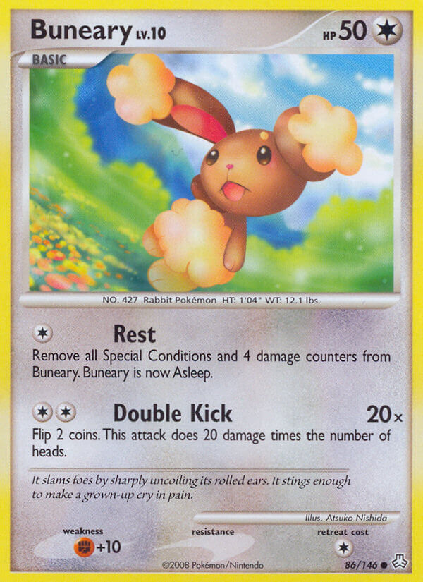
Well, that brightness would really stick around in Nishida’s cards for the next while, and they worked surprisingly well:
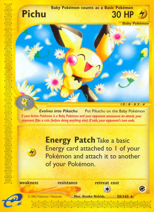
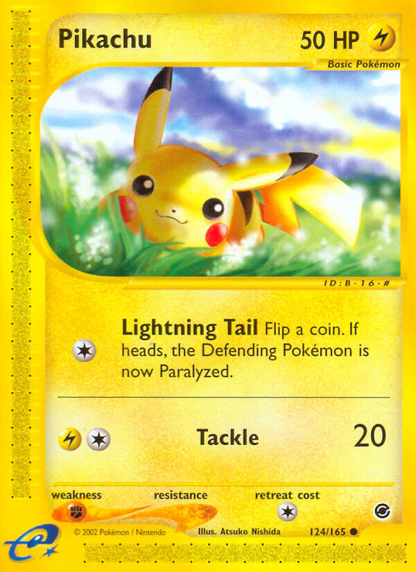
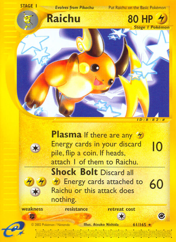
They’re so cute. Of course, she’s always best with the cute ones, probably because she designed so many of the danged critters.
The poses are simple, the colors are pretty standard, but it’s all rendered in the cutest way possible, and I love seeing the way her digital artwork gets more and more 3D-rendered-feeling, what with all the shininess.
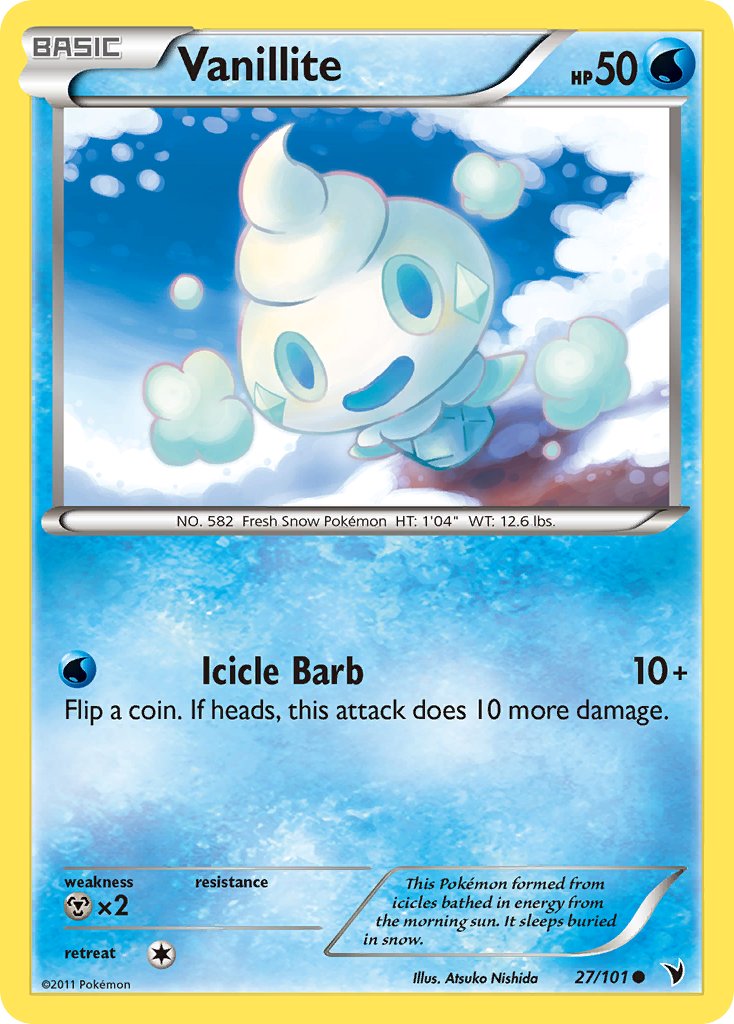
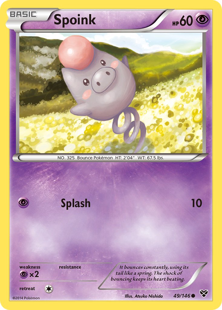
So many of my favorites! She did Spoink AND Vanillite, what a total winner.
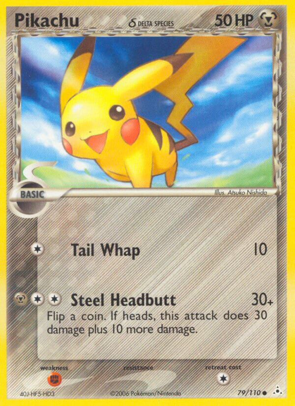
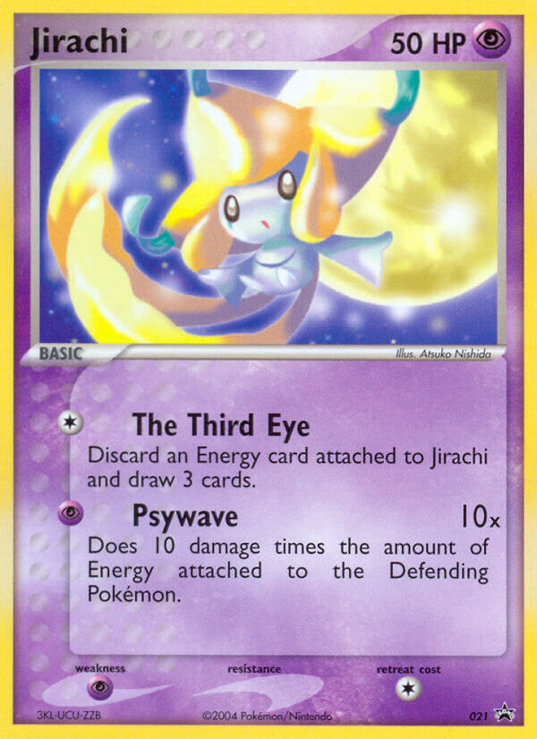
And I think her art style just gets better and better with each set to the point that, by the late 2010s, it’s almost unbelievably good.
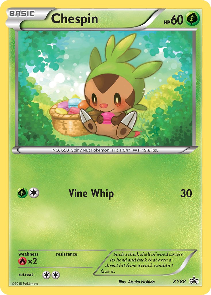
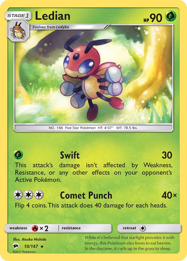
Chespin and Ledian are already two of my favorite cute Pokemon, but rendered in this style is almost too much for me to handle…
And Nishida Atsuko has gotten a few chances to make full-art illustration cards in recent years, too. As you might expect, it’s not easy for my heart. Or yours, perhaps, so steel yourself…
Here it goes:
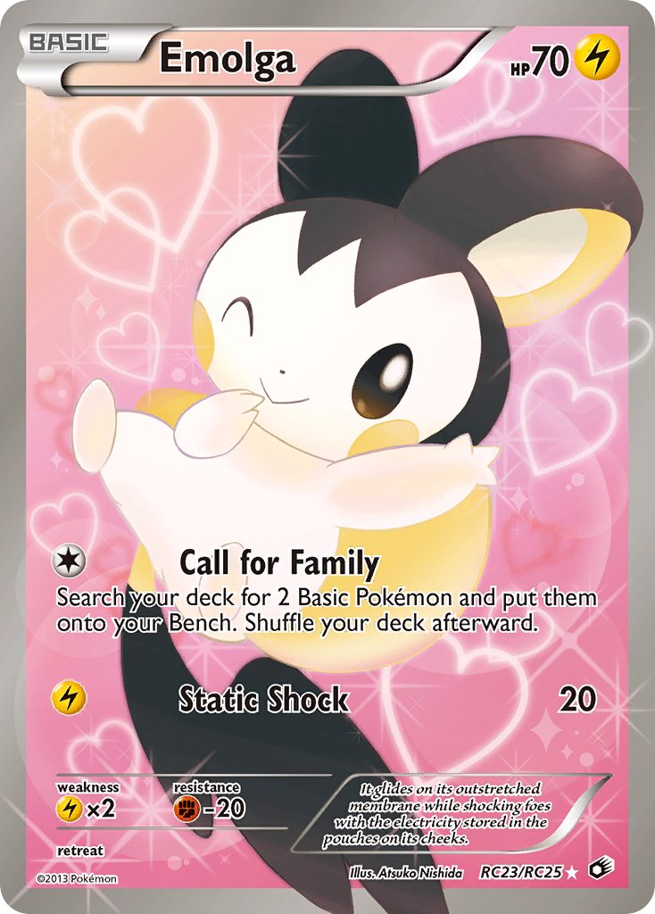
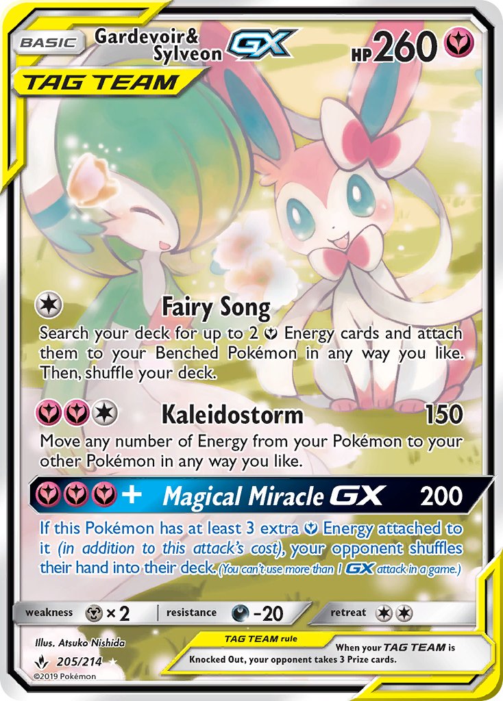
They’re so cute I want to explode. Every bit of these cards has enough adorable points to completely knock out your opponent. They will just stand up and hand you all their prize cards.
Nishida Atsuko may not have the most dynamic cards, nor the most experimental. Her work isn’t memorable in the same way as so many other of Pokemon’s best artists.
But it is extremely unbearably cute. And that counts for a lot.
Read more of my Pokemon Card Art articles.

One thought on “Nishida Atsuko Pokemon Card Art Spotlight”