So, as a tangent from my normal Pokemon Card Art Spotlights, where I feature various awesome artists and their best Pokemon cards, today I’d like to show off some Pokemon card alternate art.
What is Pokemon card alternate art, you ask? Uh, simple. It’s when they make two versions of a card, and one of them looks completely different than the main one. They’re usually way more rare but also way more visually interesting. And, honestly, I gotta say, that’s really cool.
It’s not always good. Sometimes it makes the basic versions feel like an artistic afterthought, even when they’re not. Sometimes Pokemon card alternate art is gaudy and visually annoying, too. But I think the experimentation is very welcome. Magic the Gathering has been going all out on “Booster Fun” and “Secret Lair” since 2019, and Pokemon has quickly followed suit with all sorts of wacky cool new stuff.
As you already know, I’m not too on top of the card game scene these days. I just like looking at the cool art. But just from my casual perusing, we’ve got stuff like “Trainer Gallery Holo Rare,” “Special Illustration Rare,” “Rare Holo GX,” “Shiny Ultra Rare,” “Double Rare,” “Holo Rare V,” “Ultra Rare,” “Rare Secret………” Please, Pokemon Company, stop, this is insane
Also, Pkmncards, please fix the Pokemon card alternate art page which lists like 10% of the actual amount. It would have made this article easier lol
As far as I can tell, the concept of alternate art really began with the introduction of Ultra Rare in 2011, along with Black & White. Before that, some cards would get alternate promo art, or alternate art in reprints, but it was sparse and not particularly interesting.
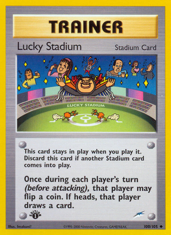
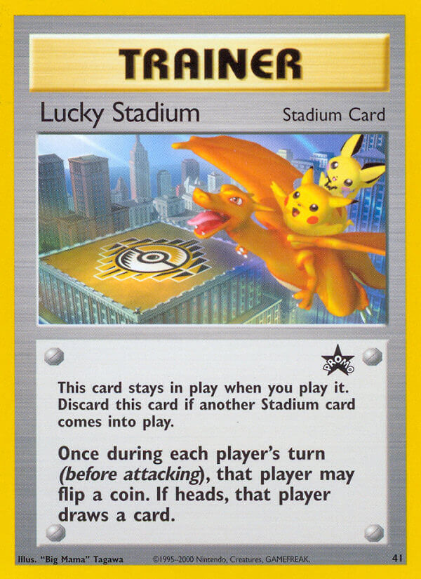
(In a shocking twist, the Imakuni card is the normal print. Wow.)
(Also, in Japan, Lucky Stadium released multiple variants at the same time based on different regions of Japan. Pokemon Pal City also did this a few years later. So this is an early version of Pokemon card alternate art!)
Unlike Magic: The Gathering, though, most promo cards were totally original designs. Why not just reprints? I’m quite unsure. I hear Yugioh did the same thing, which really messed up the balance early on. Most promo cards were useless, but for the ones that took off, it messed things up big time.
But by the Ultra Rare days, we were finally getting these secret cool art styles in normal sets! A bonus for people desperate enough to gamble on booster boxes. (Don’t buy booster boxes just to open packs…)
Again, not a ton of reprints. Pokemon seems to shy away from that aside from nostalgia celebration sets. When they do real reprints, they often reuse the original art, but change the text! That’s the reverse of what the fans want! But whatever.
At first, the main alternate art styles went pretty much like this: Full art, or border break.
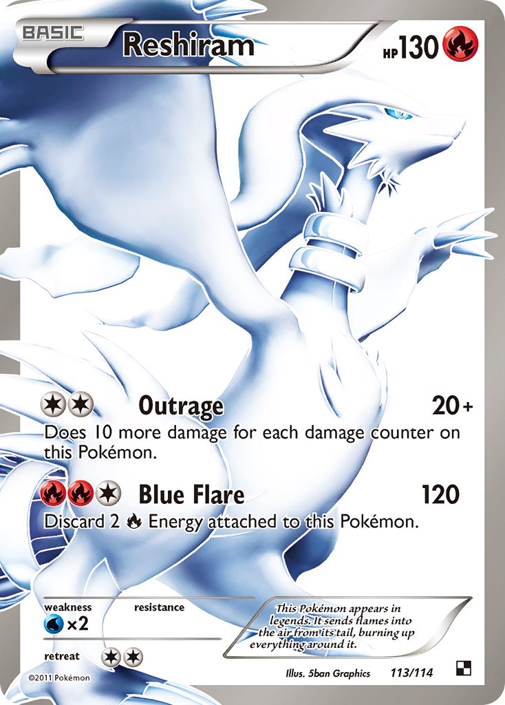
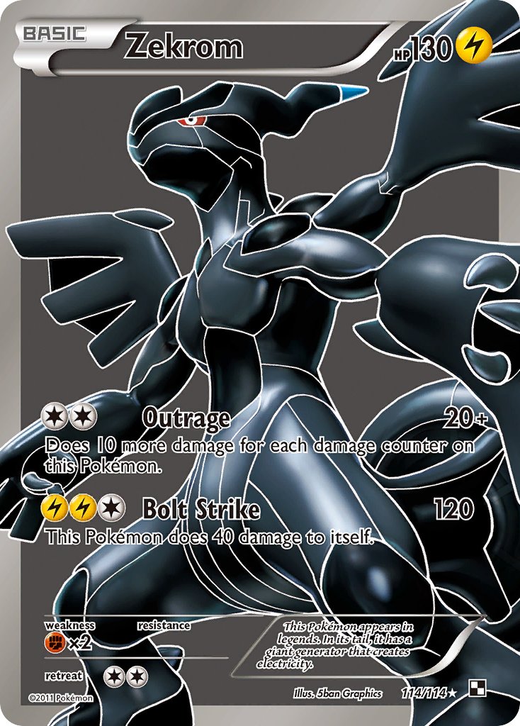
Full art.
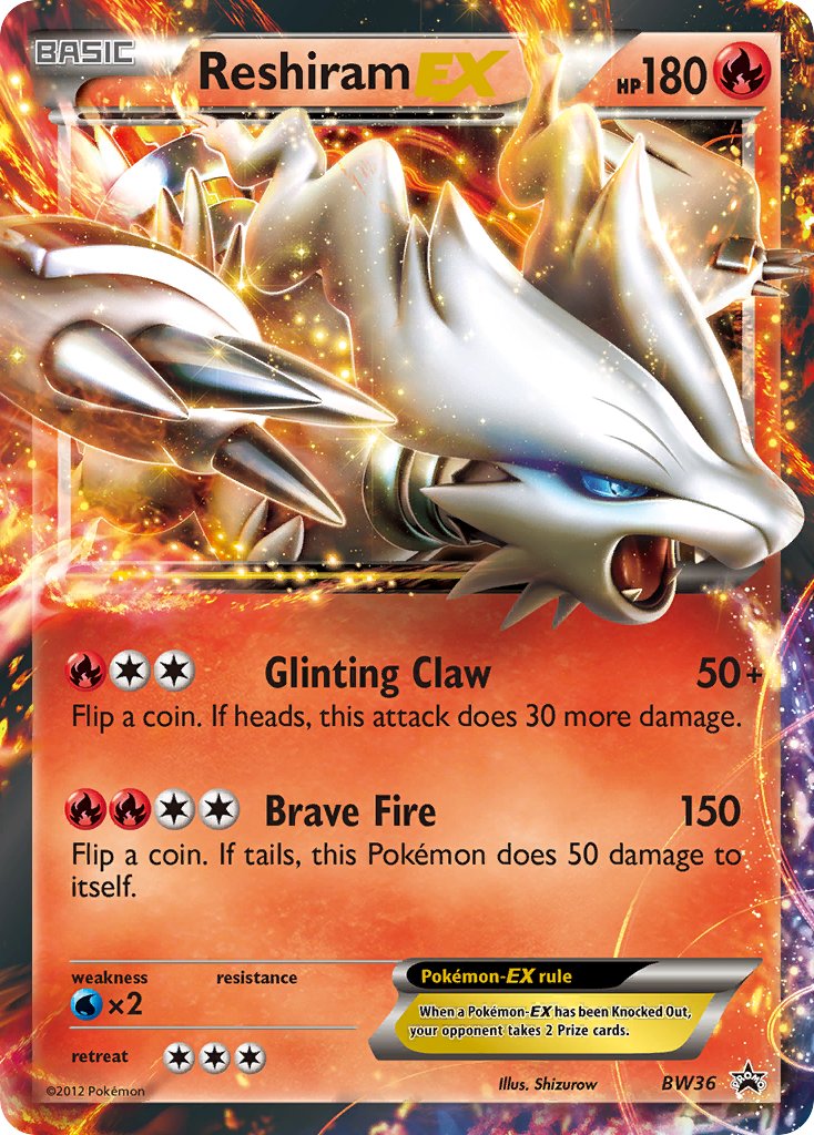
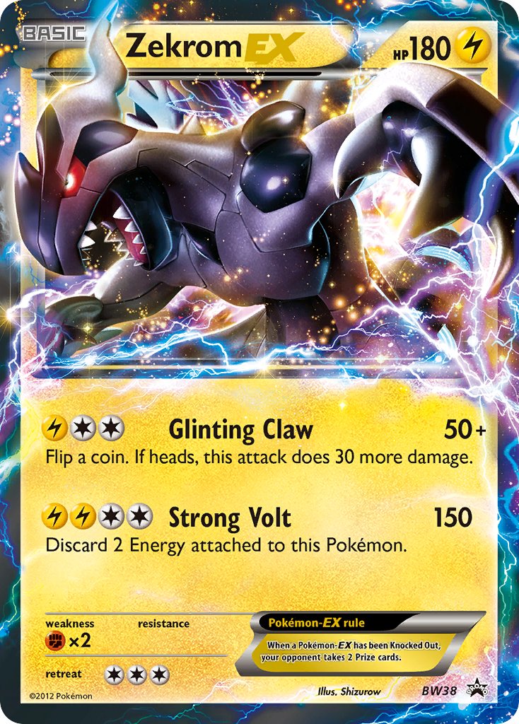
Border break.
They’re very simple tricks, but both of them look pretty nice.
The border break style would continue to develop and get more and more insane, to the point of absurdity. The full art one would mostly continue as-is, but start including some weird color variations too. Although I guess if some cards are really breaking the border so much, they end up just becoming full art cards themselves…
That’s the world of Pokemon card alternate art.
Who can forget endeavors such as…
BREAK cards?
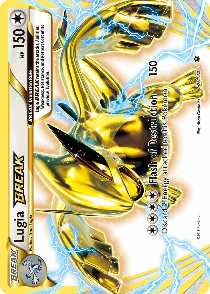
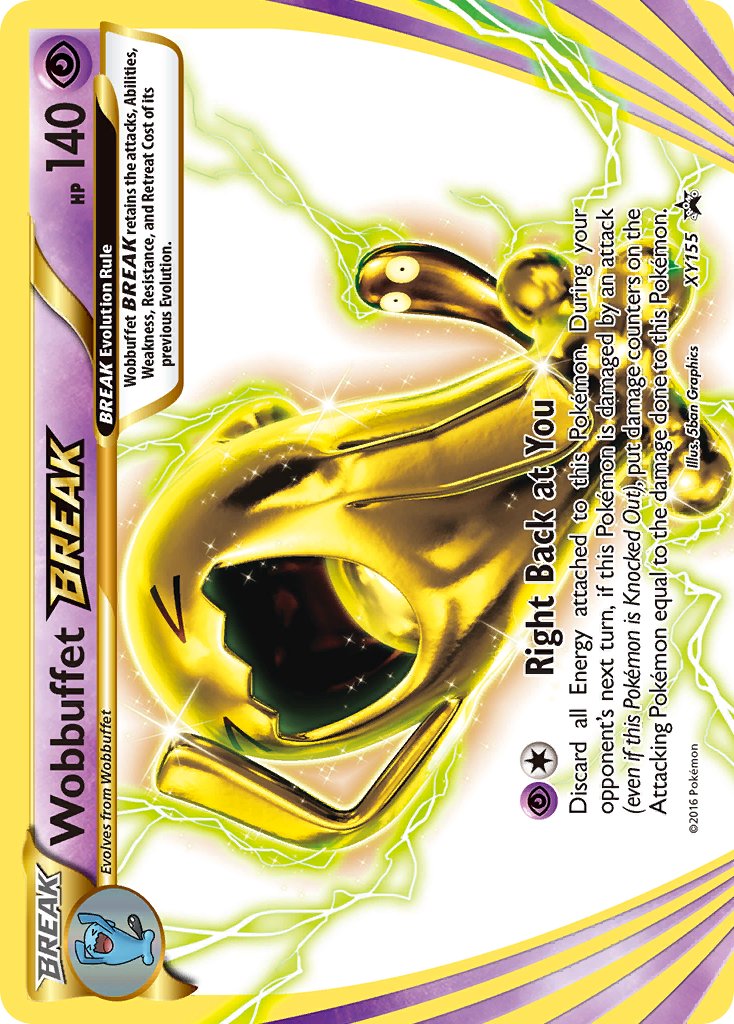
Rainbow rares?
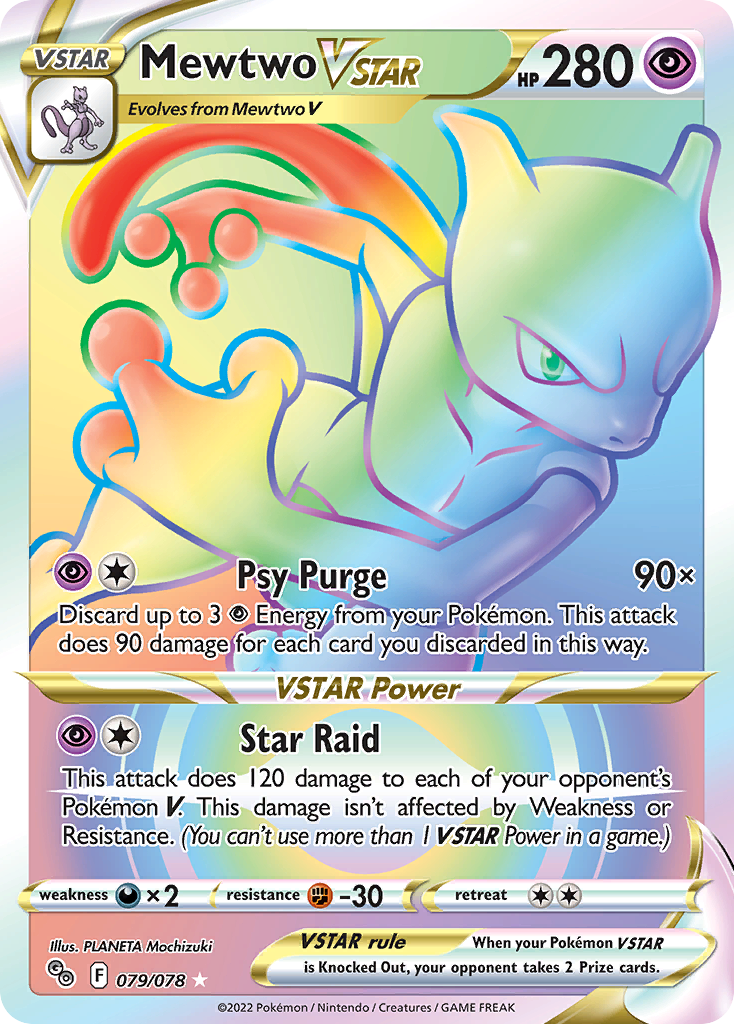
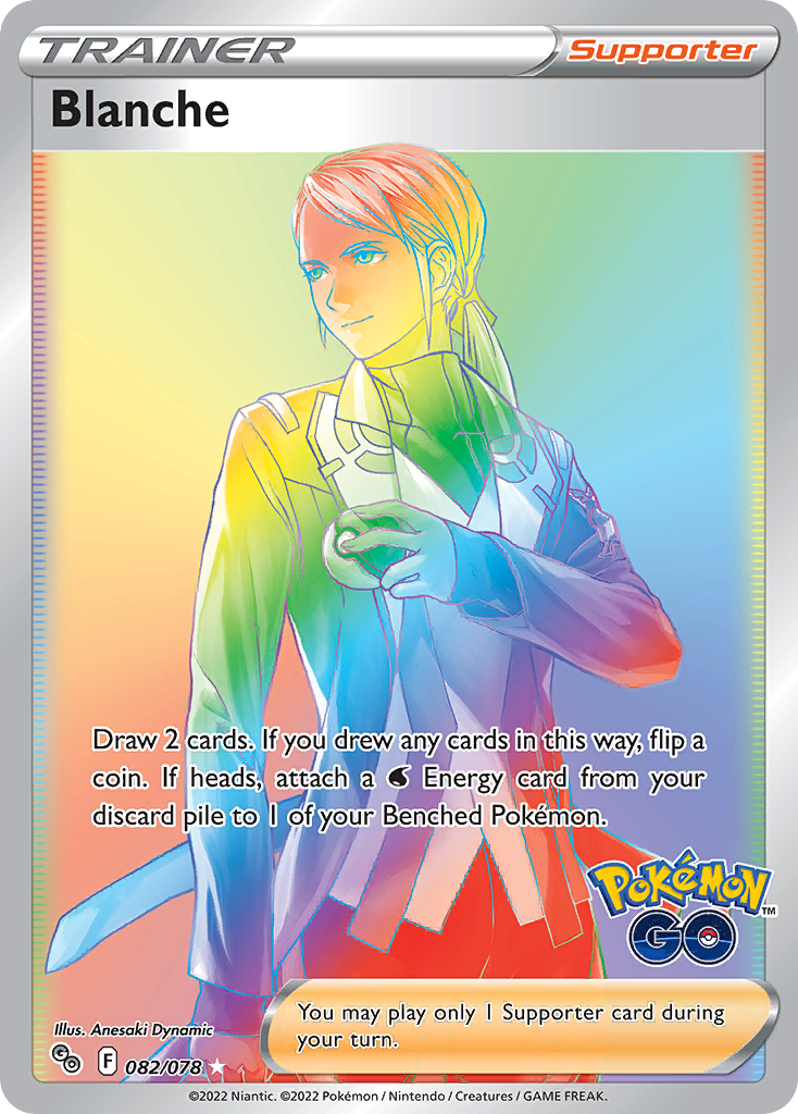
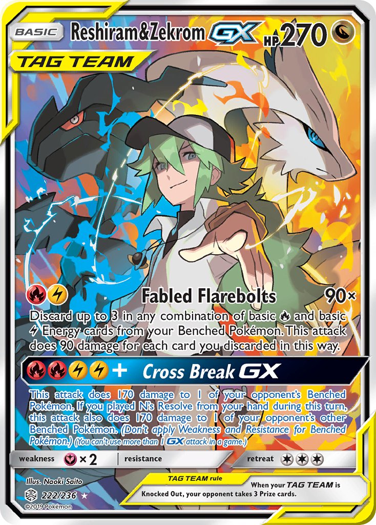
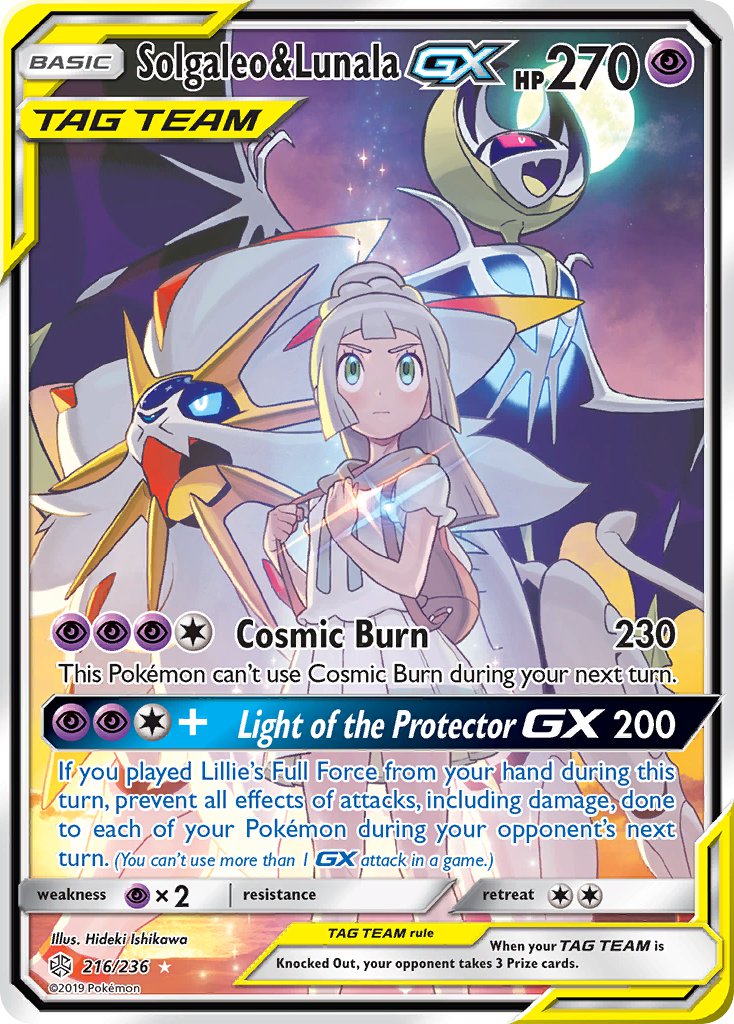
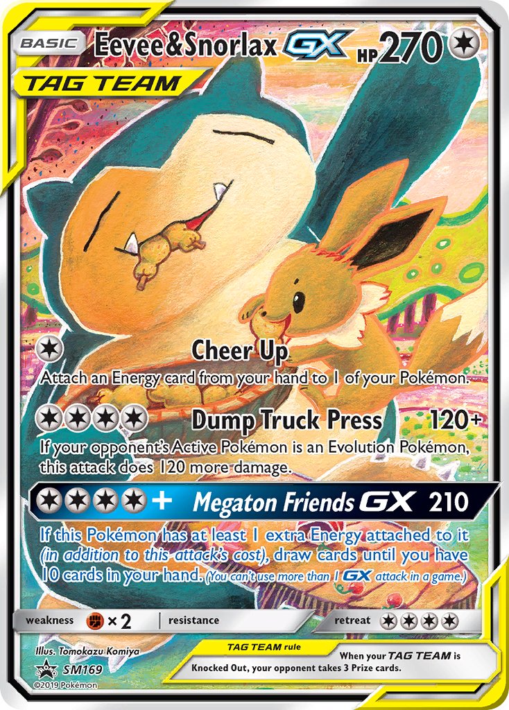
Tag Team cards?
I don’t even know what to call this…
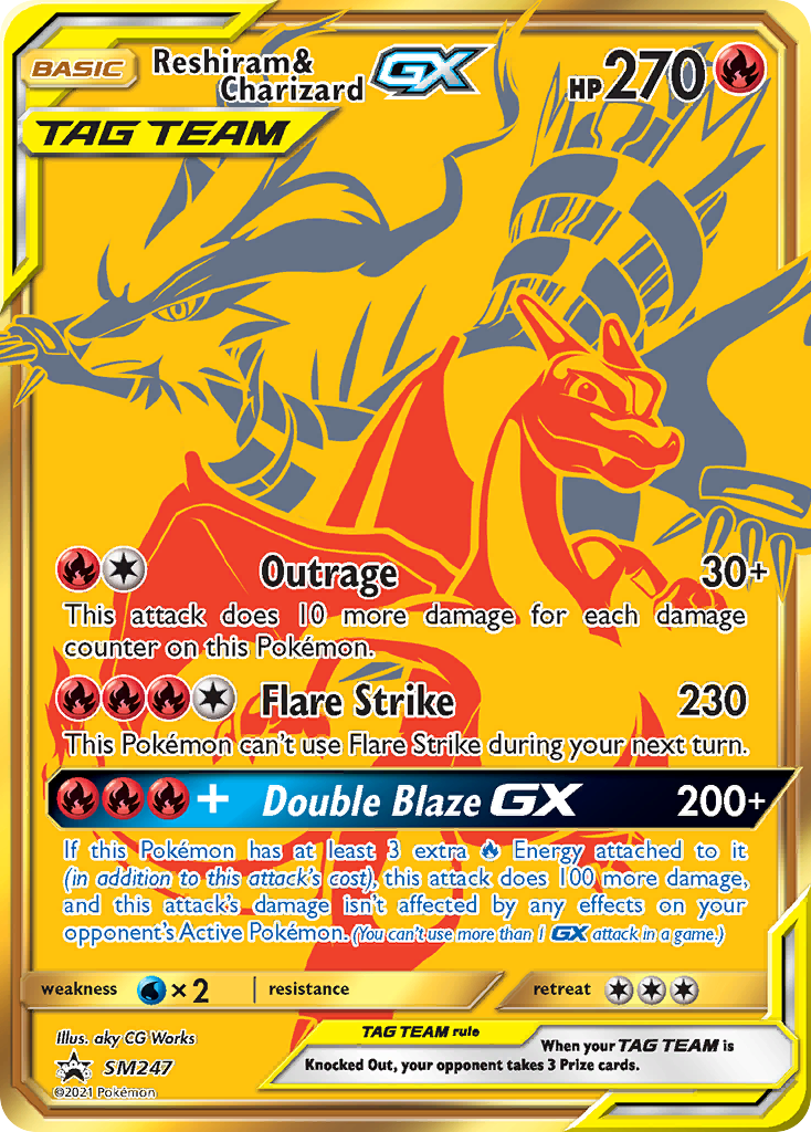
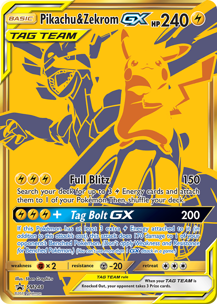
Weird yellow outline EX cards?
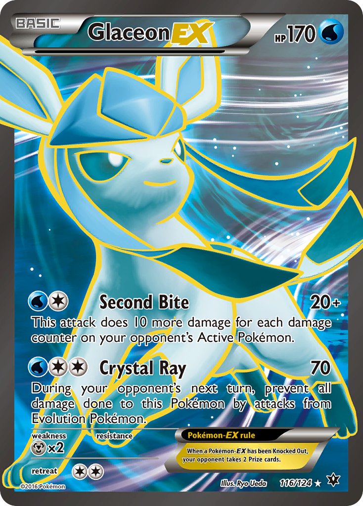
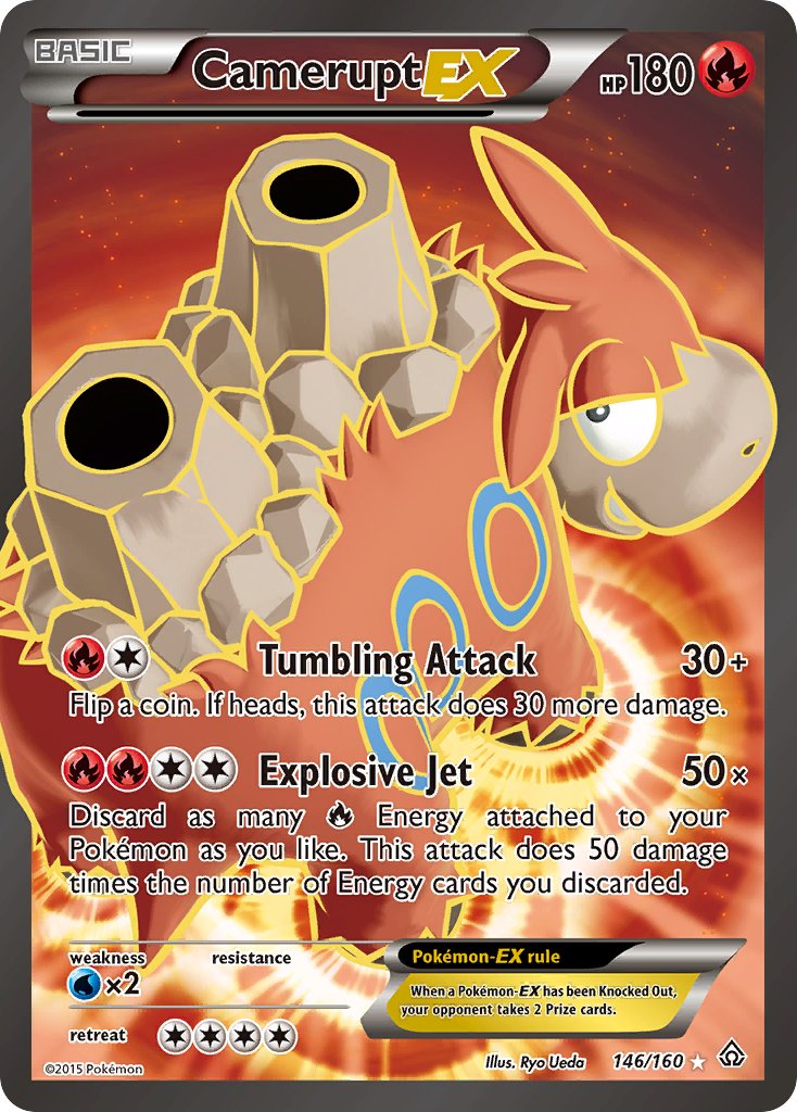
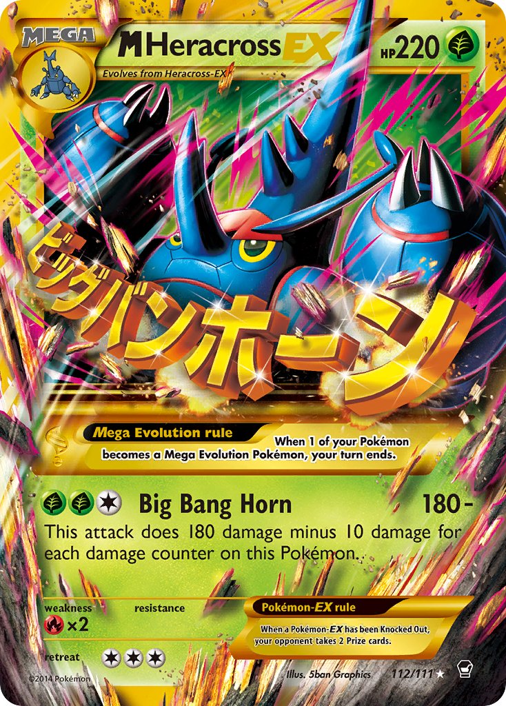
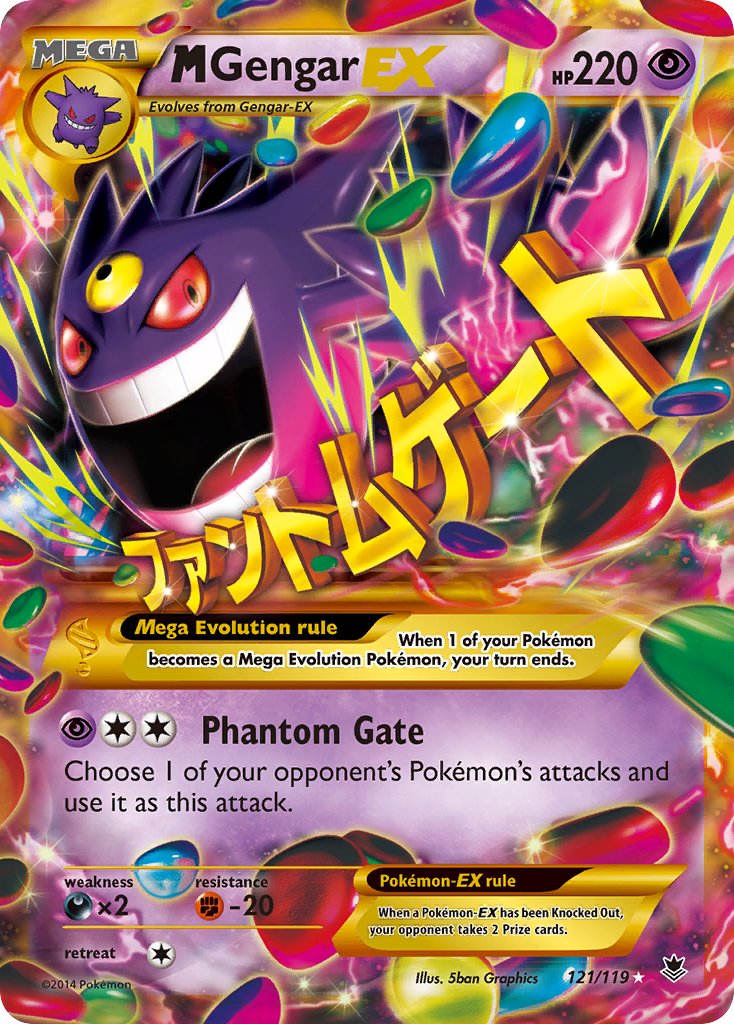
Weird yellow outline MEGA EX cards with huge katakana attack names?
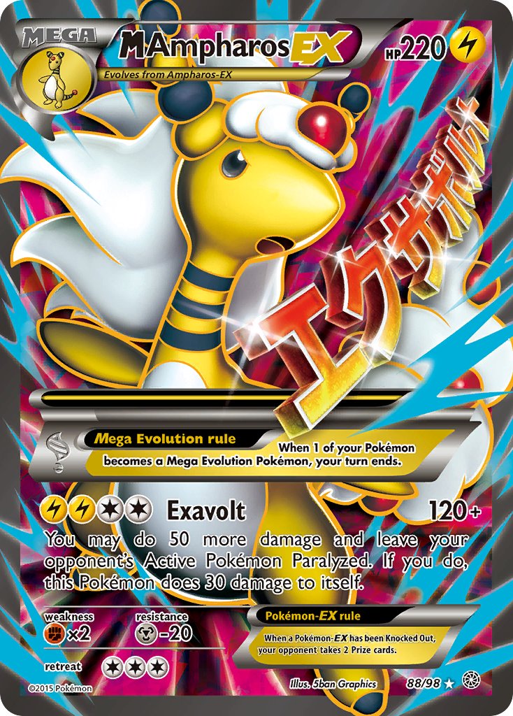
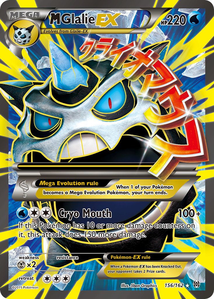
Yellow? I guess these are just yellow now?
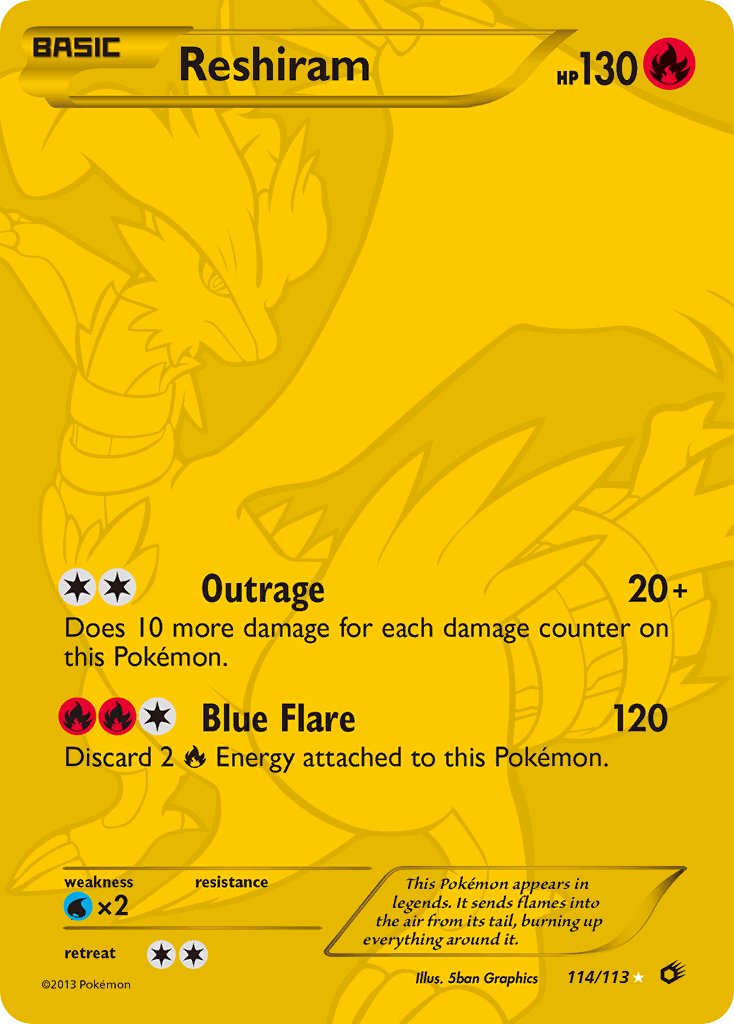
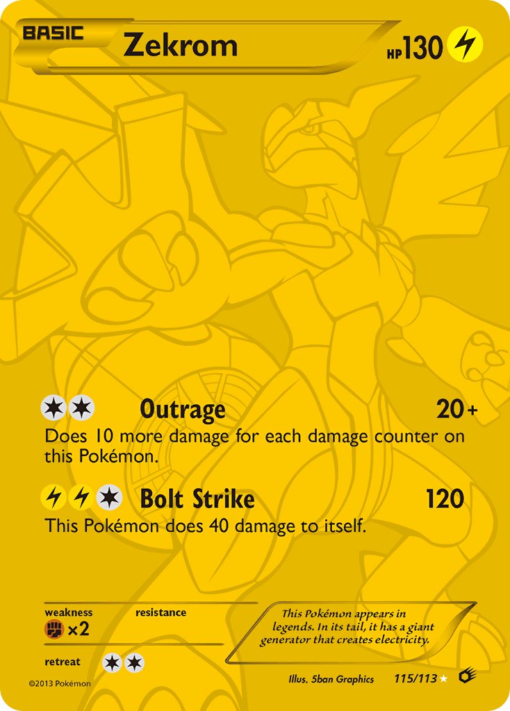
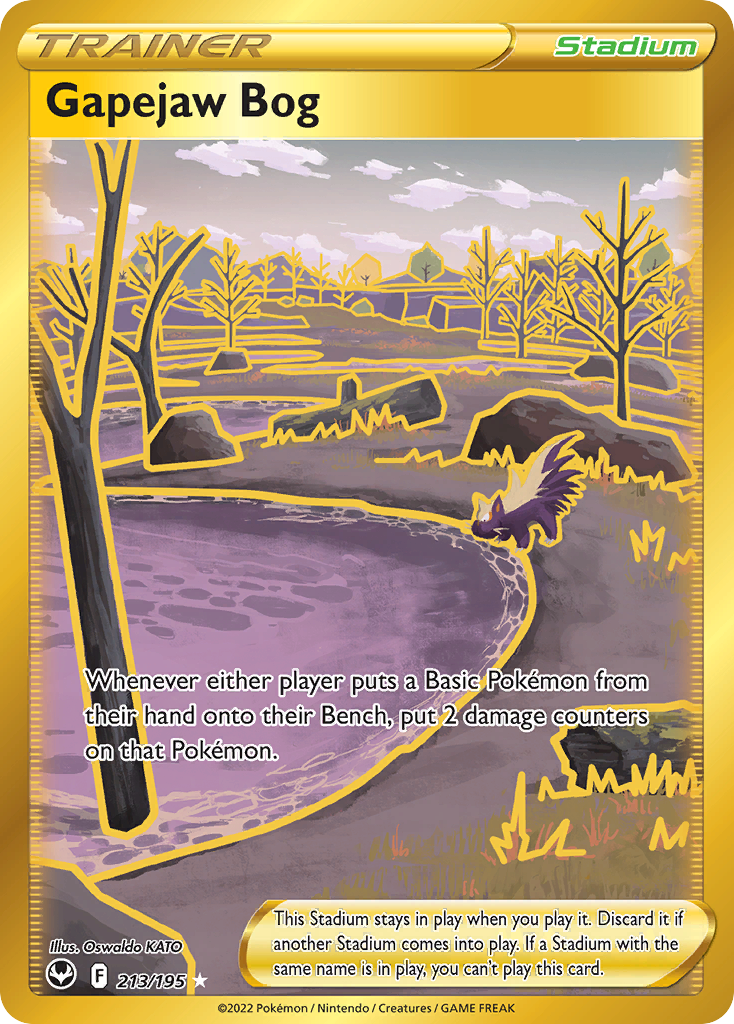
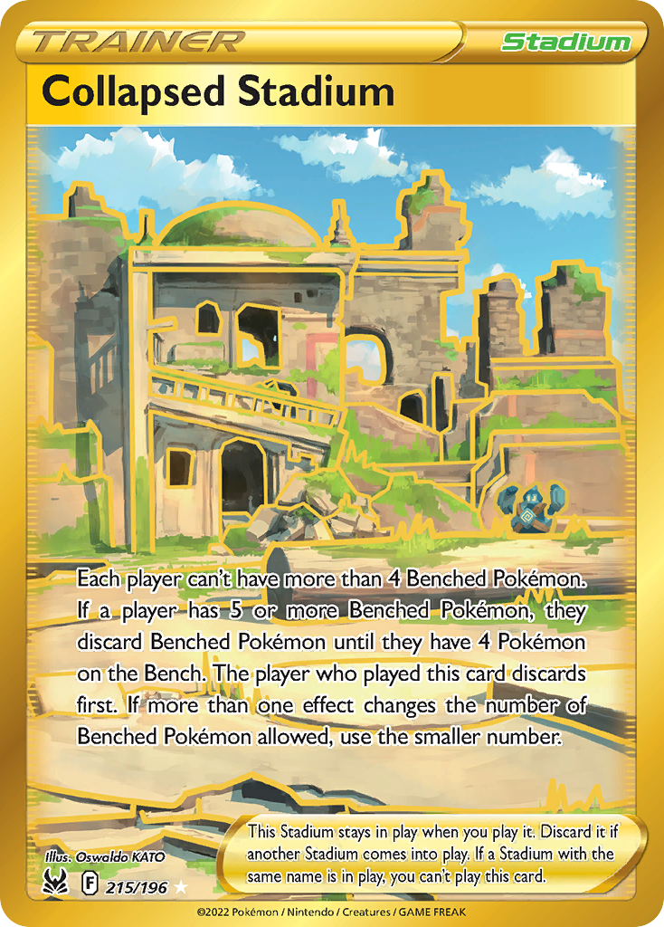
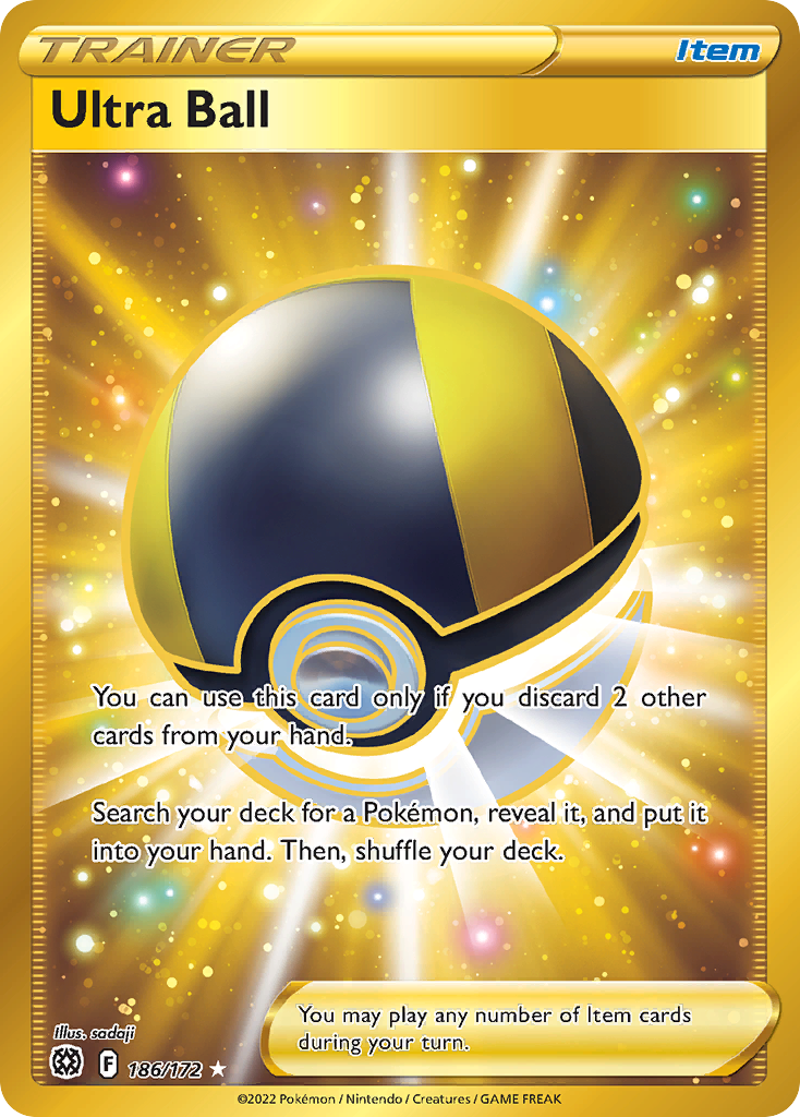
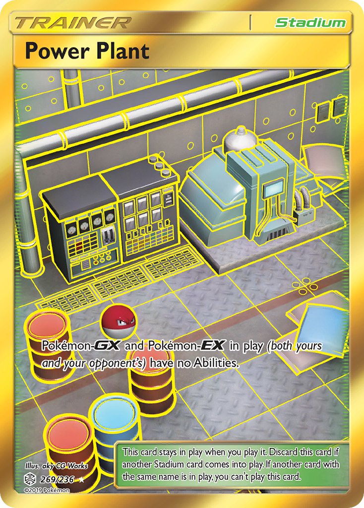
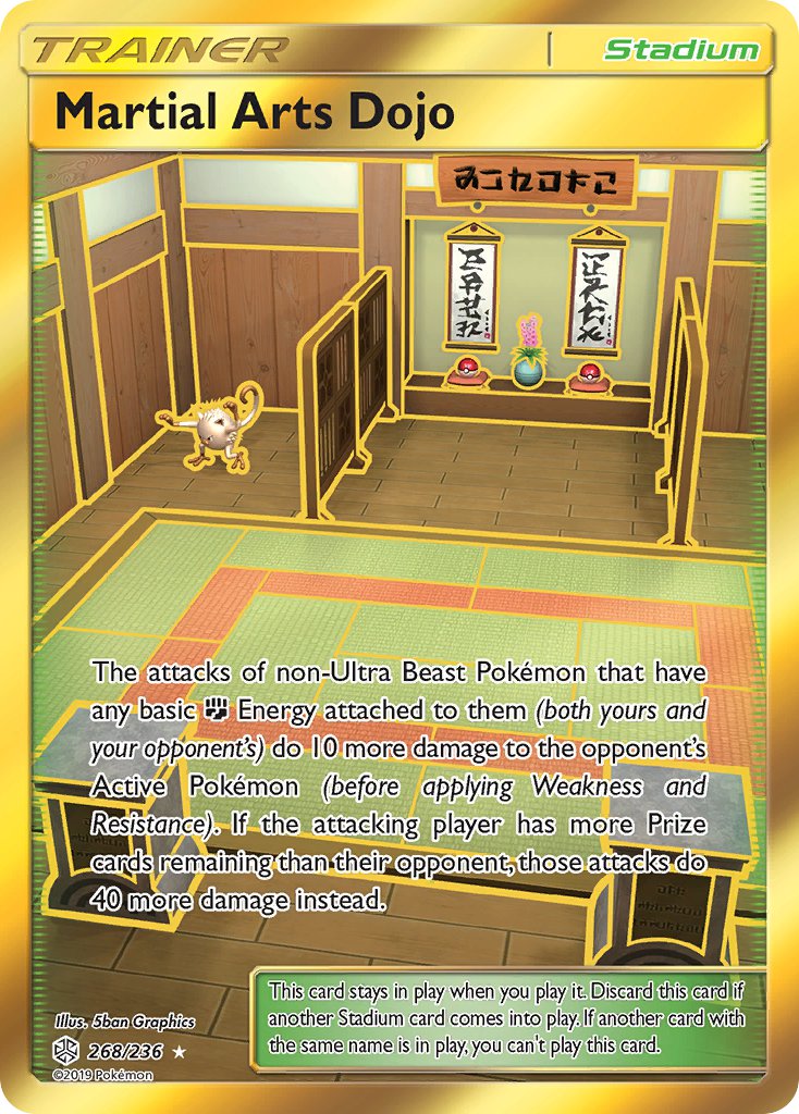
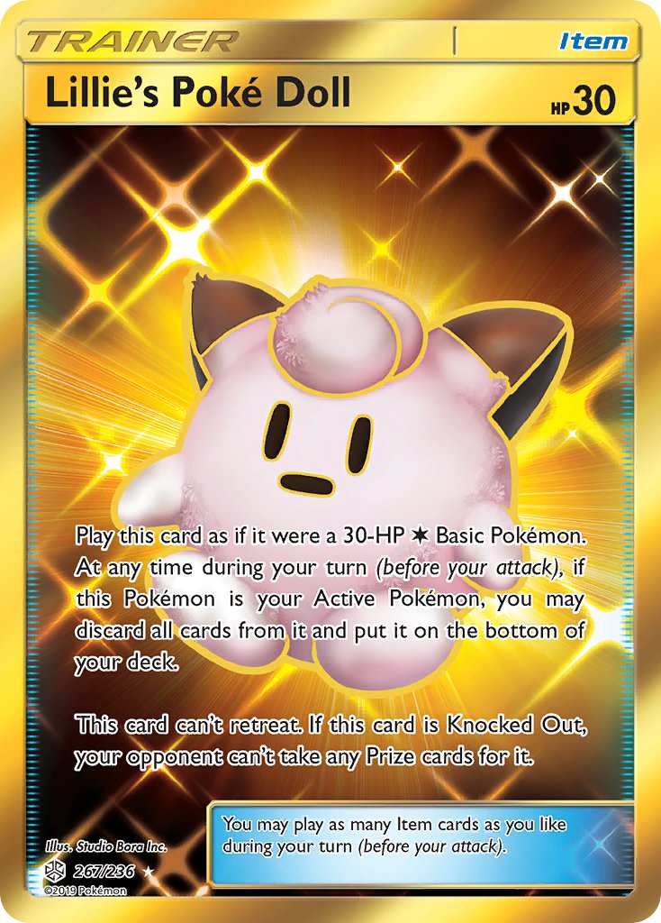
Golden yellow outline shiny stadium and item cards? (Actually these look so cool except I’m not huge on the yellow outlines)
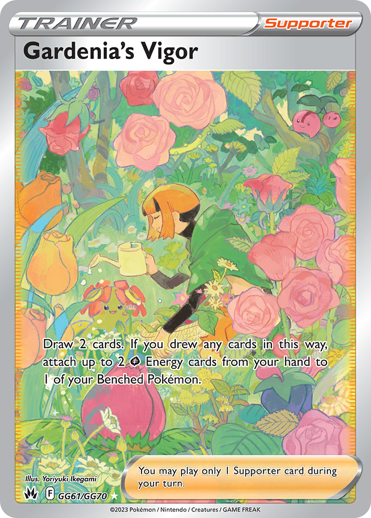
Full art trainers?
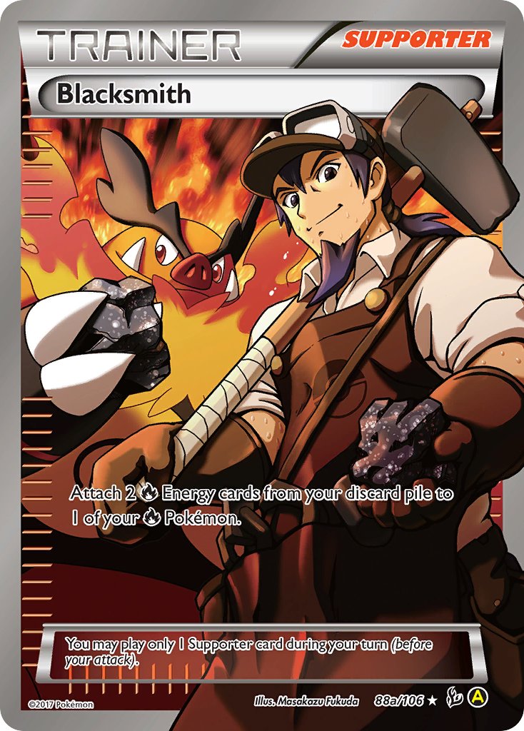
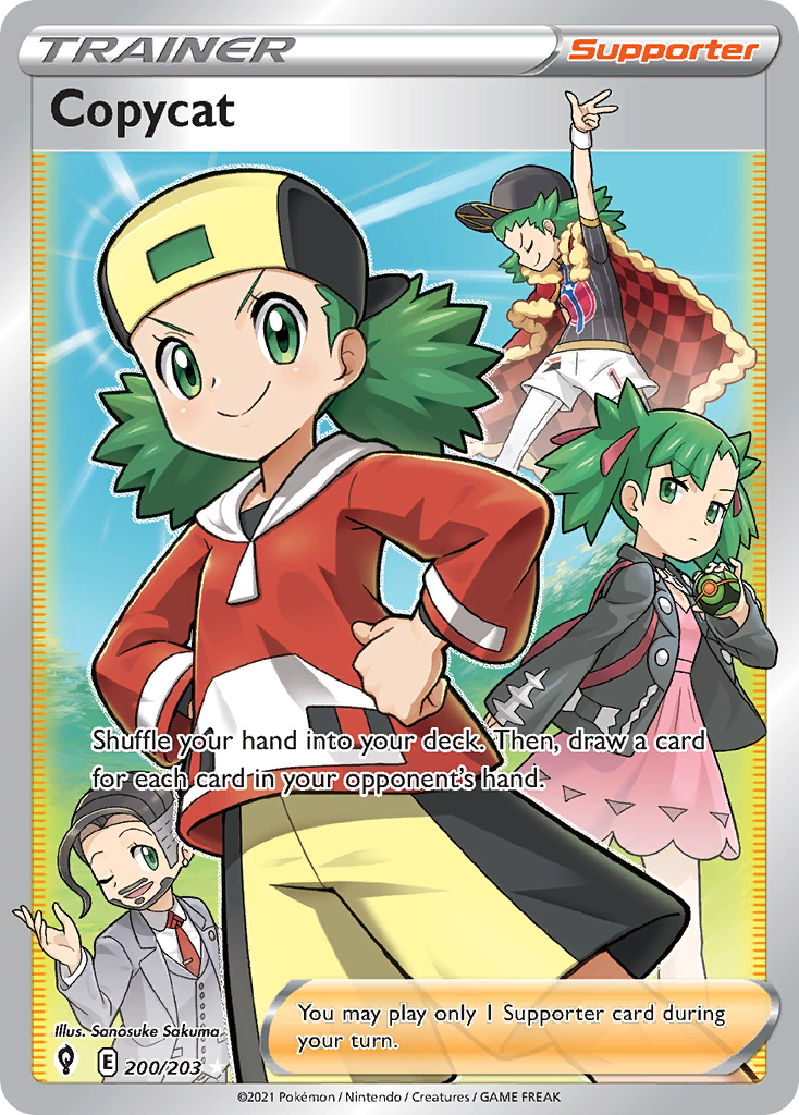
Tag Team Full Art trainers?
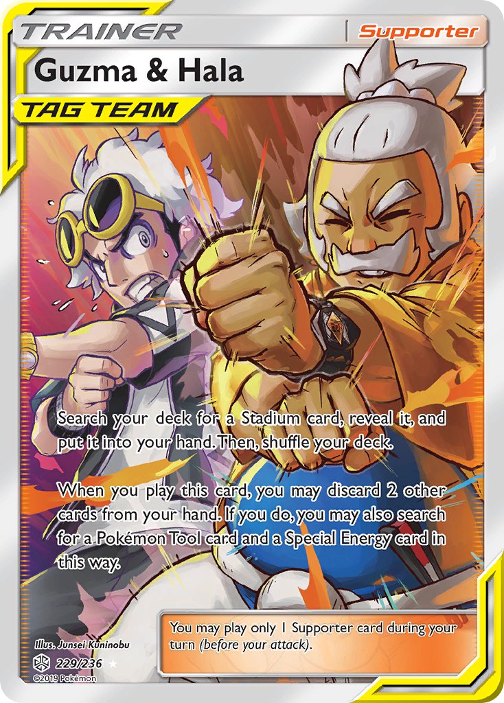
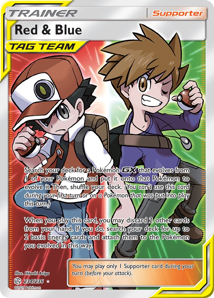
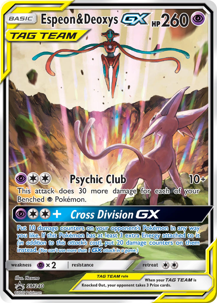
Tag team Pokemon WITH trainers?
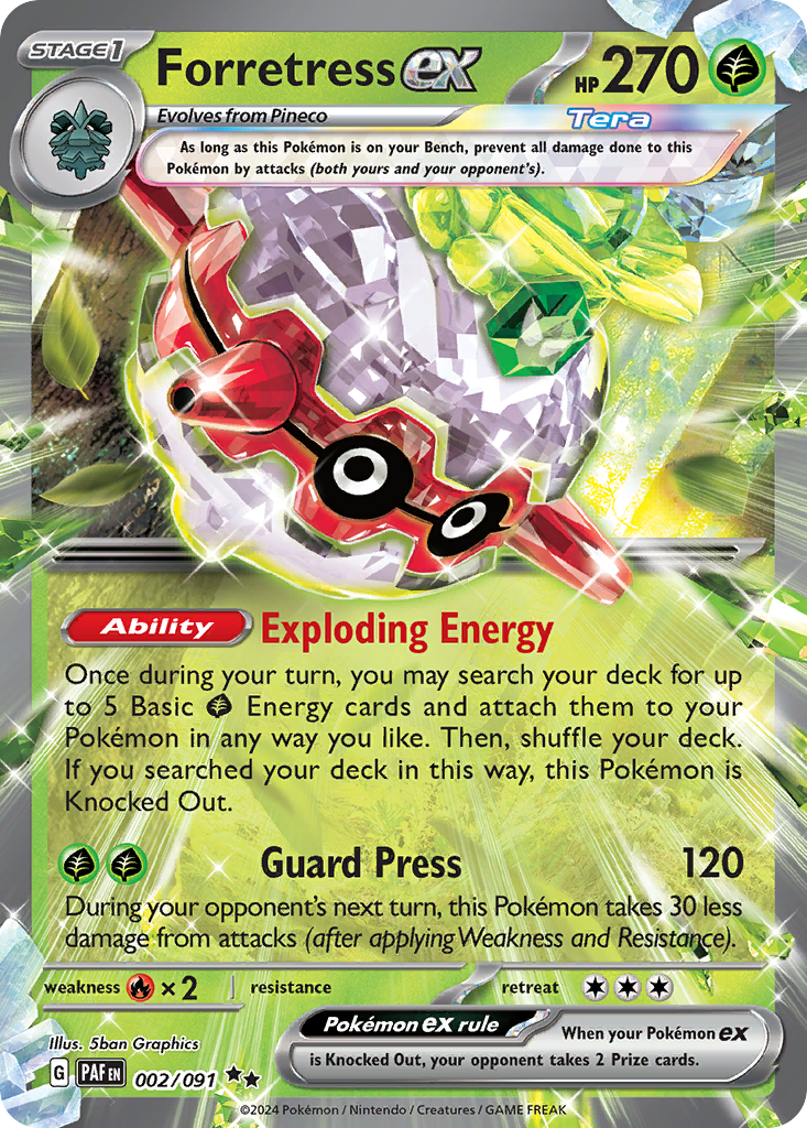
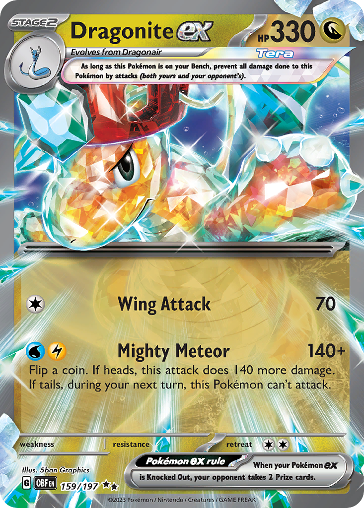
Ful Art Crystal Pokemon? (what the hell is this)
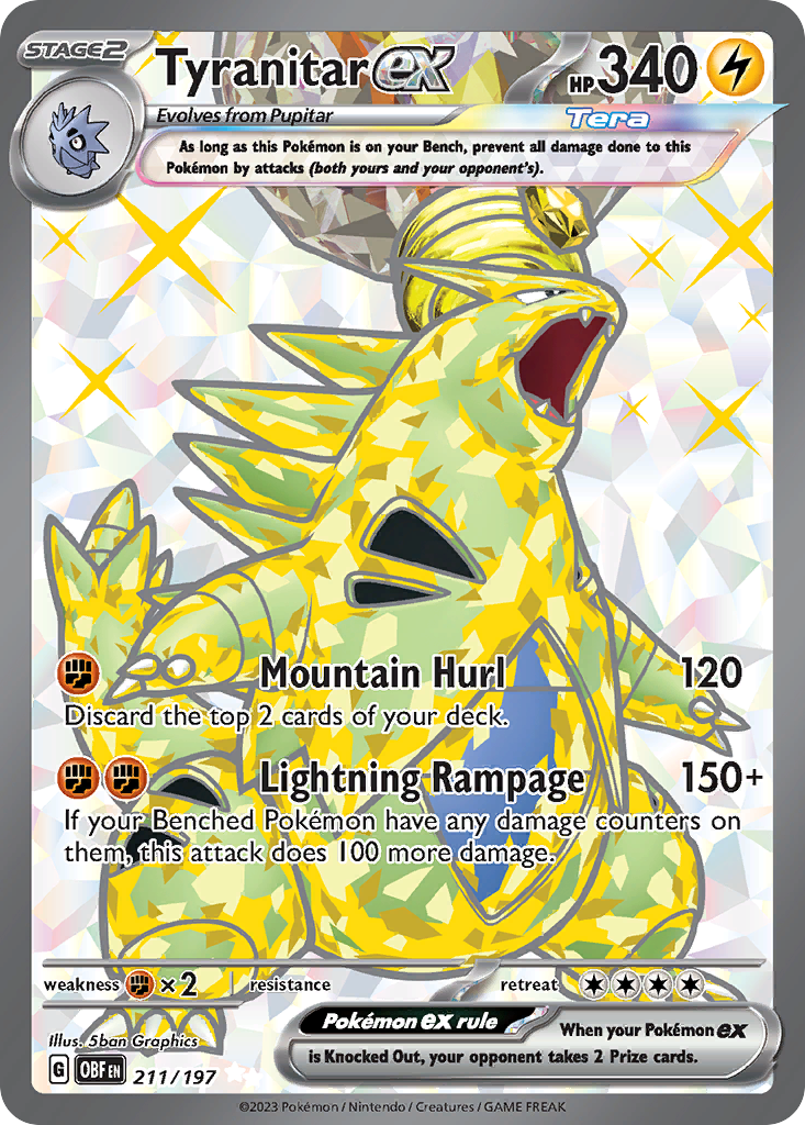
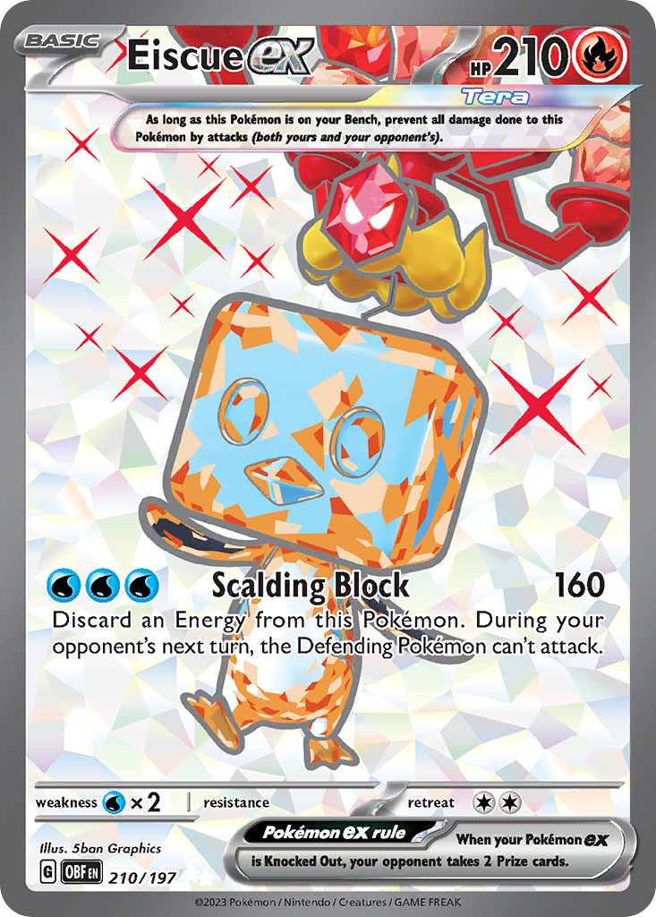
SHINY full art Crystal Pokemon?
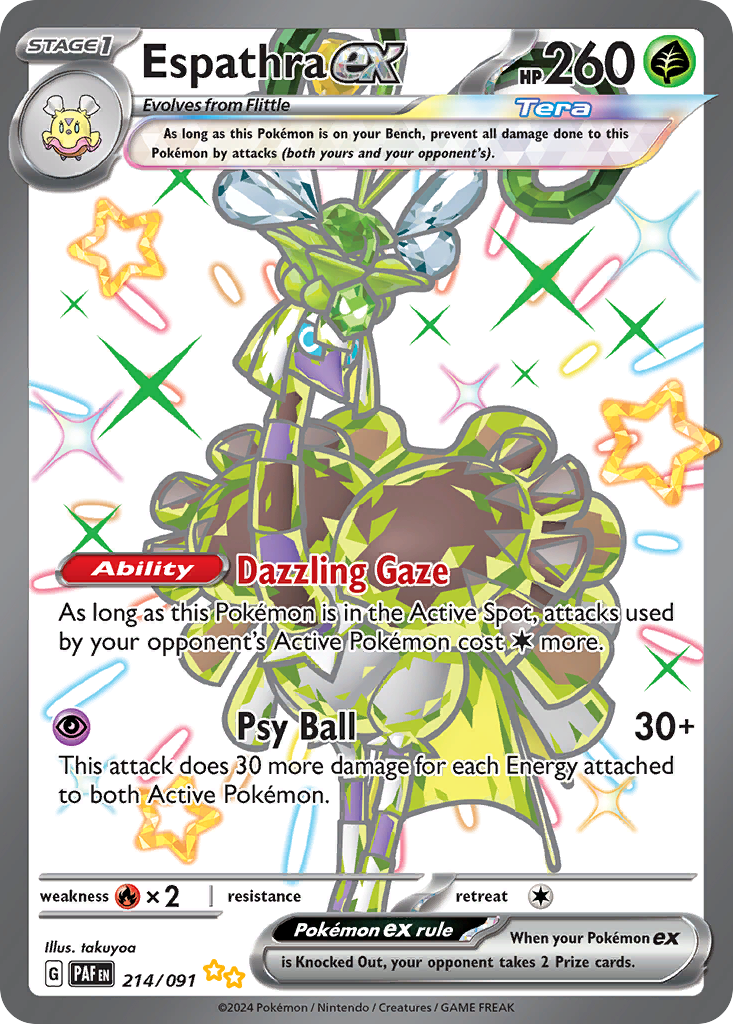
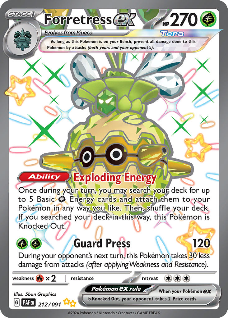
Border break Crystal Pokemon? (seriously, what the hell is this crystal stuff)
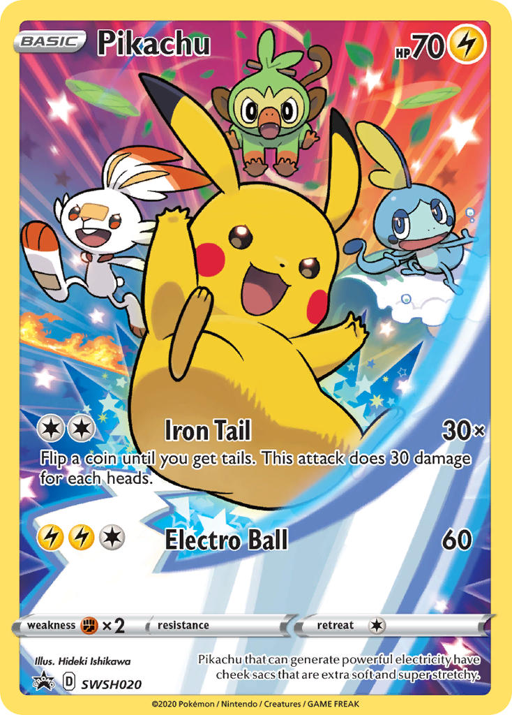
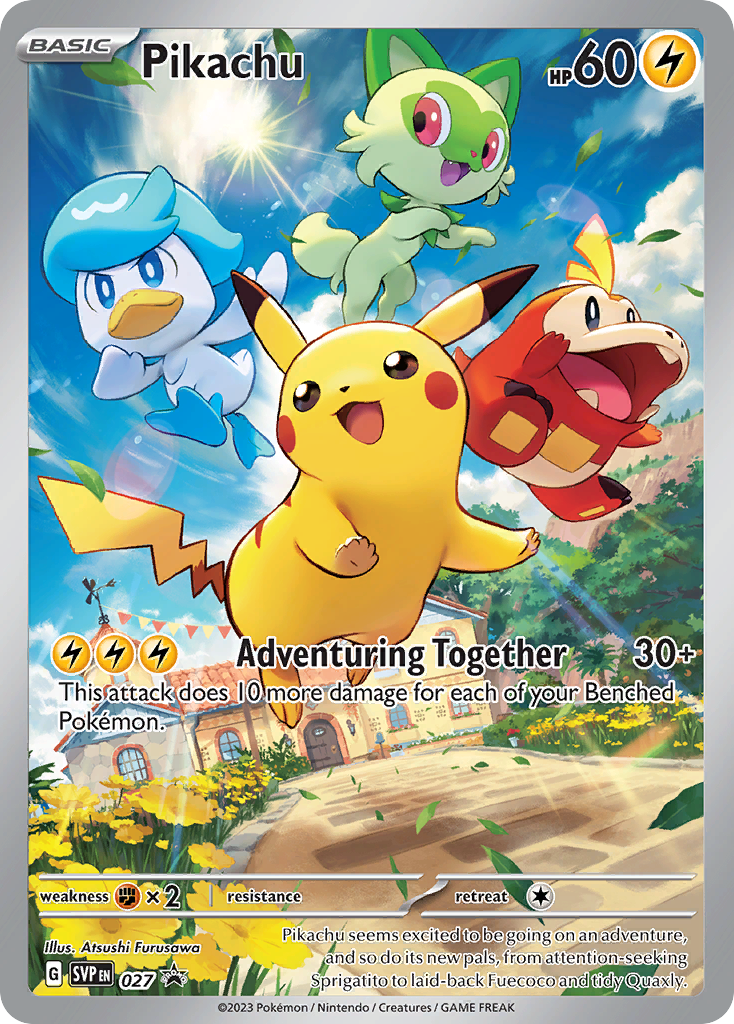
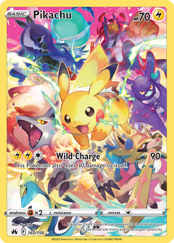
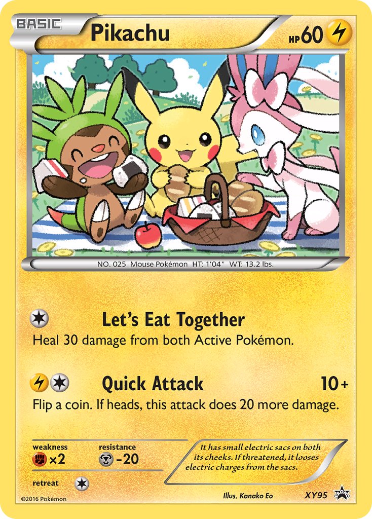
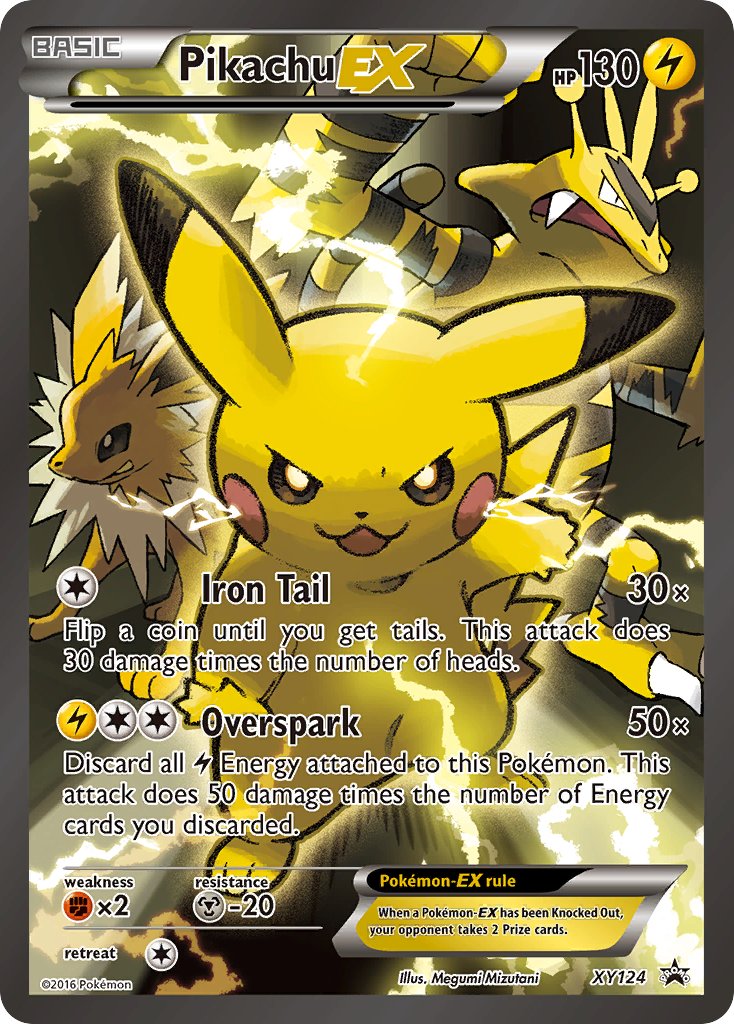
Cards named Pikachu featuring a bunch of Pikachu’s friends?
Cards that LITERALLY ASSAULT THE VIEWER?
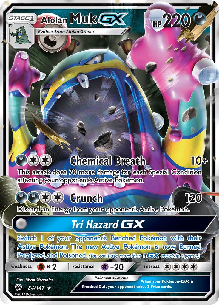
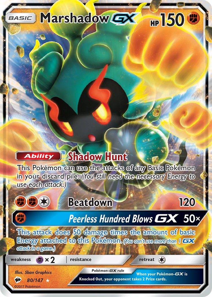
Mega EX gold-bordered katakana attack Pokemon that SMASH through the border and send a fury of sensory overload colorful explosions right at you?!
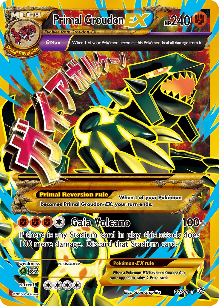
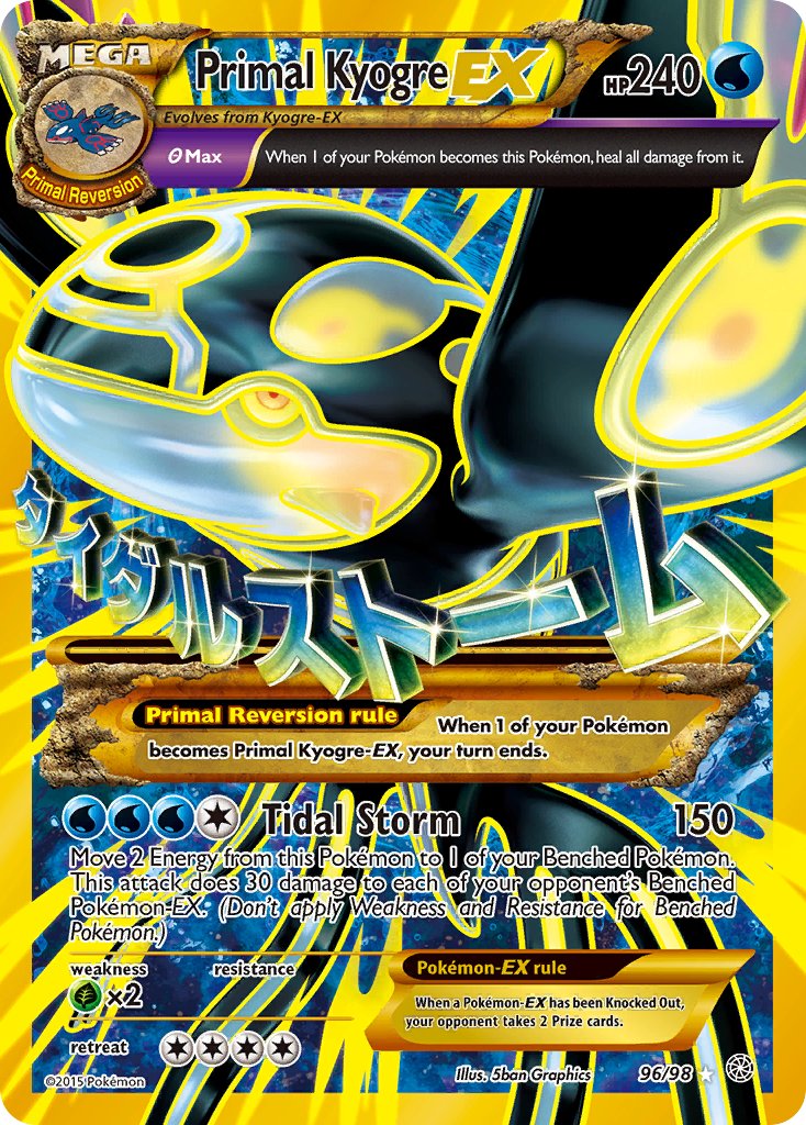
Primal EX glowing full art border SMASHING BEHEMOTHS with KATAKANA ATTACKS and YELLOW OUTLINES, RAGING AT THE CONFINES OF THE CARDSTOCK THEY ARE TRAPPED IN?!
And, whatever the heck this thing is?
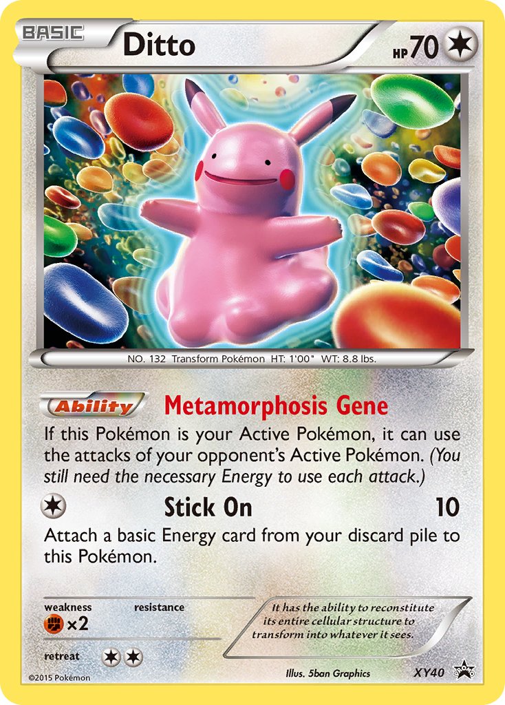
…So, in short (or, I guess, in extremely long), there are a LOT of types of alternate art these days, each more audacious and ridiculous than the last.
Some of them (rainbow rares) are kind of awful, but some of them are also absolutely fantastic.
And, I realized this article was so utterly long that I didn’t even get to the part I was most excited about this entire time… the full-art illustration cards.
So I guess I’ll have to cover that in another article!!!
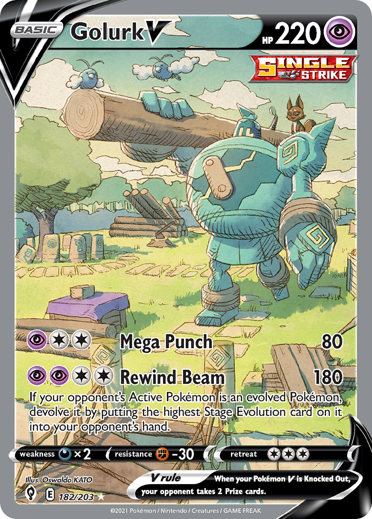
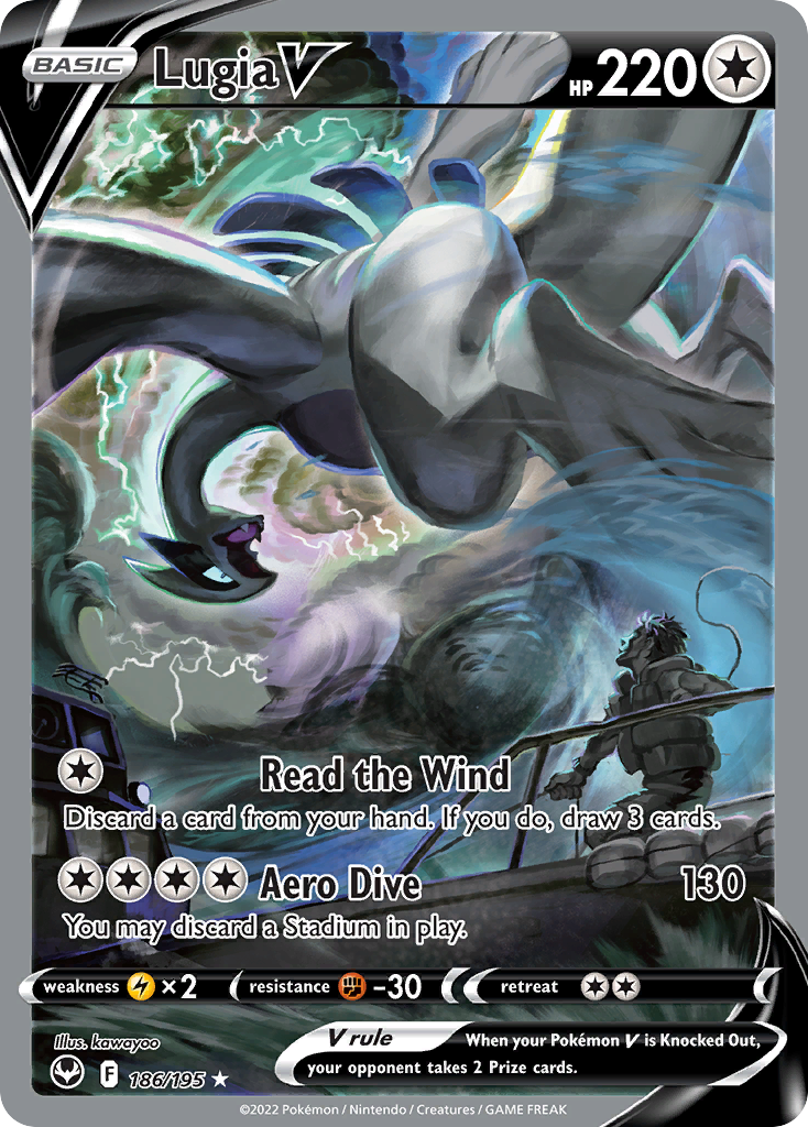
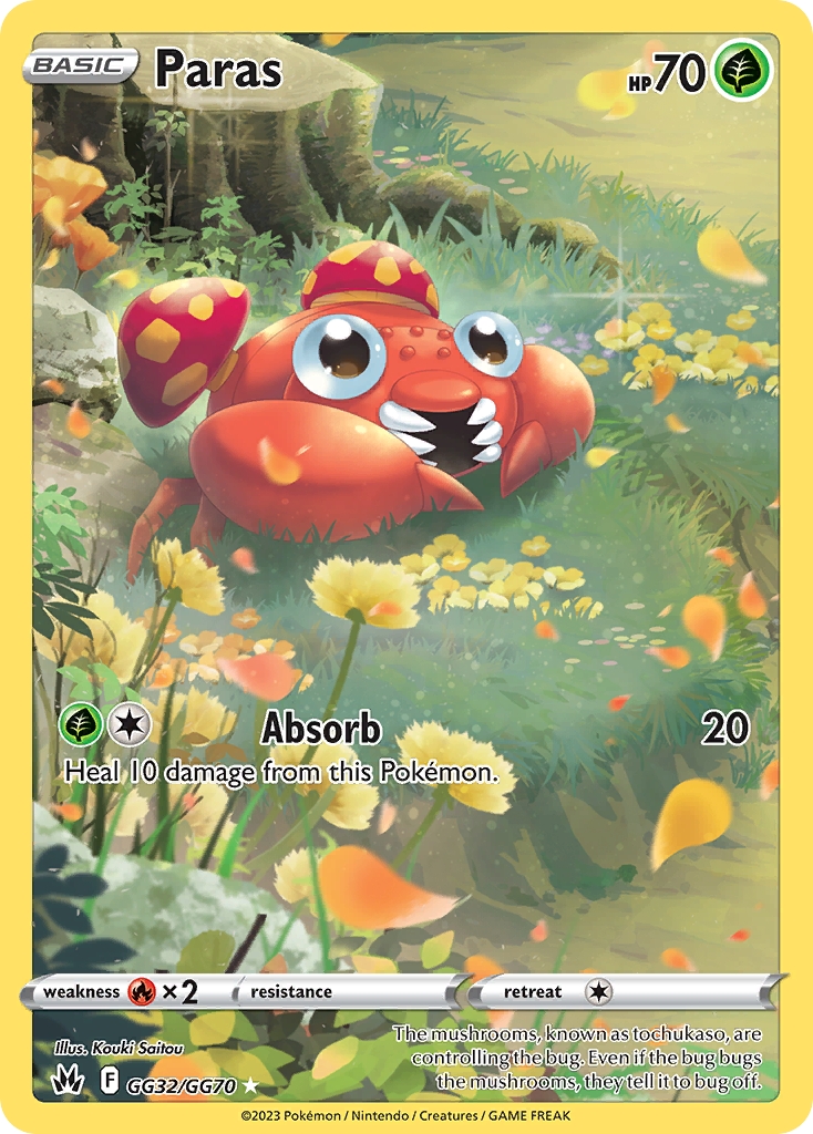
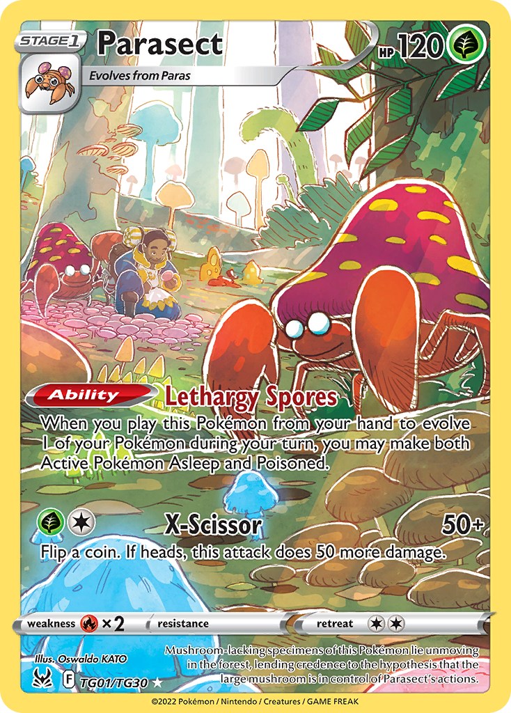
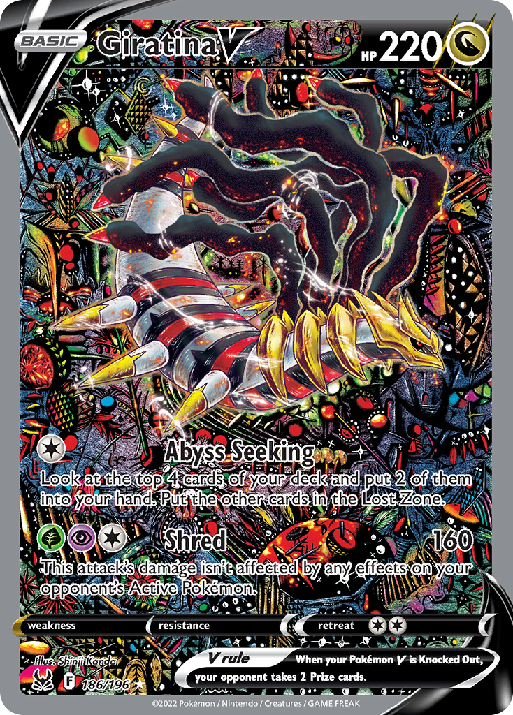
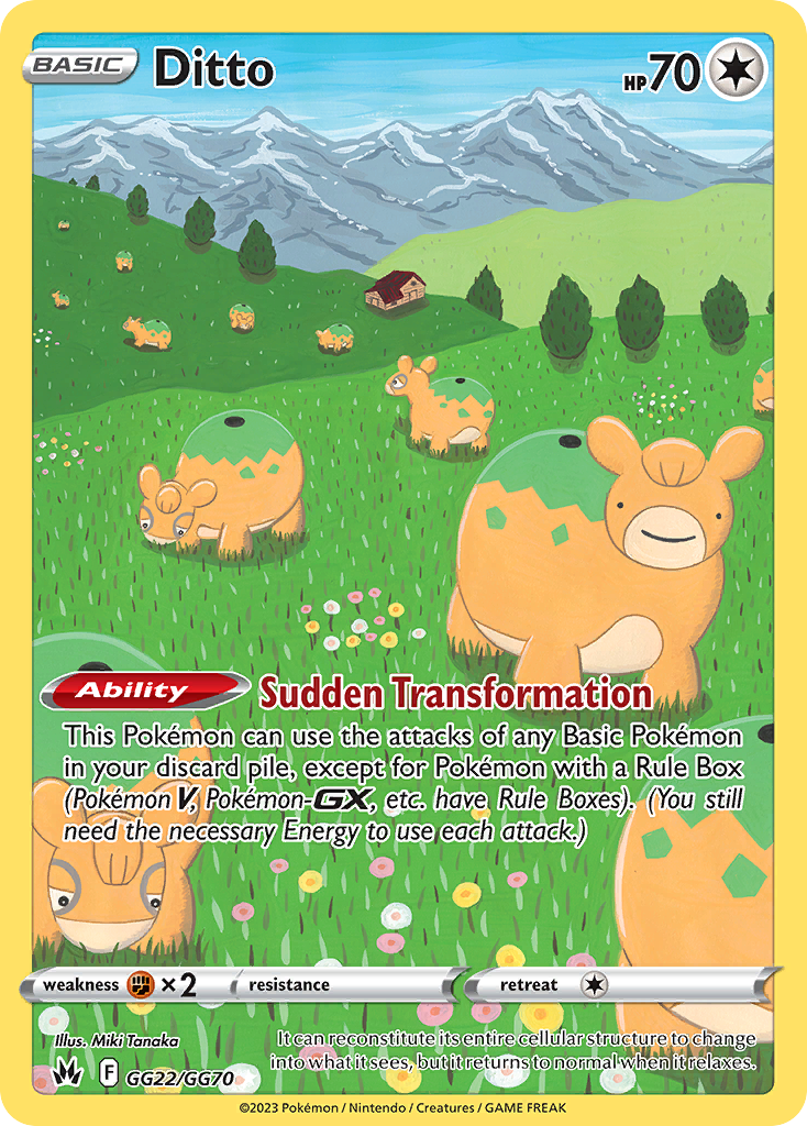
There are some absolutely gorgeous cards in recent years thanks to the full-art illustration style. It takes the same philosophies of normal card design, just gives them a much wider canvas to work with. Paintings covered up by rules text, basically.
So I’ll cover that a lot more next time.
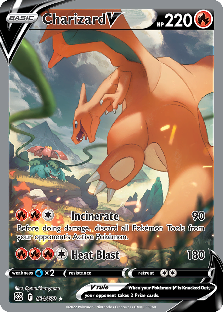
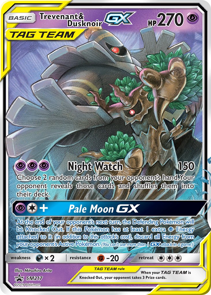
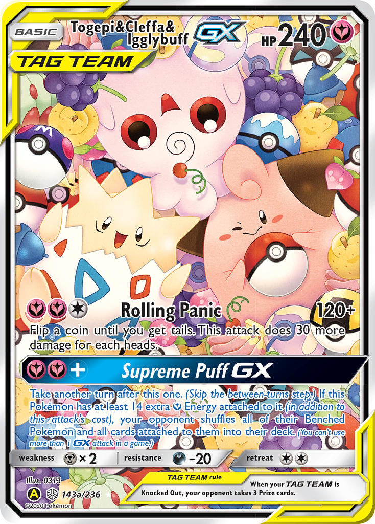
If the next Pokemon card alternate art post is up, please click that! But in the meantime, read more of my Pokemon card art spotlights:

3 thoughts on “Pokemon Card Alternate Art”