When you think old Pokemon cards, your first image is probably Arita Mitsuhiro, but your second is probably Kinebuchi Keiji. He’s the subject of today’s Pokemon Card Art Spotlight!
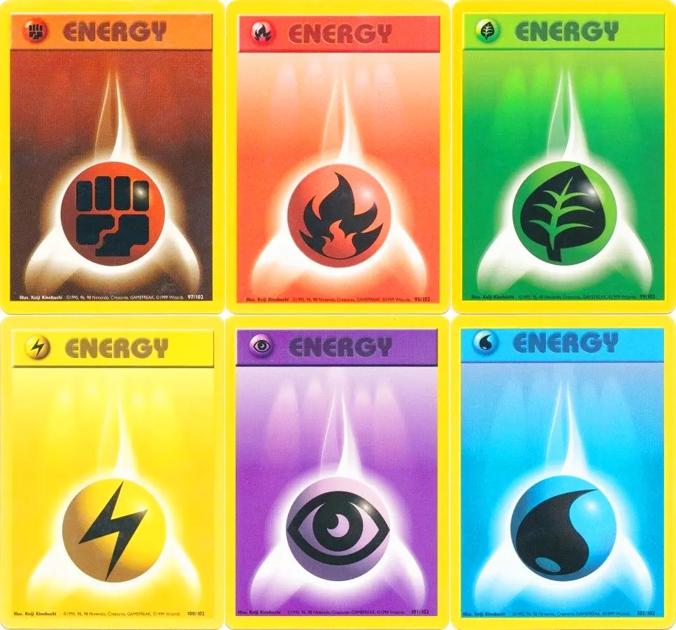
This guy made some of the most foundational, important aspects of the entire Pokemon Trading Card Game. He designed the energy cards. Did most of the early 3D cards. Gave the franchise that pre-rendered CG vibe that gives people of a certain age mega-nostalgia every time they see it.
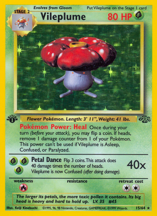
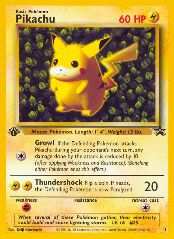
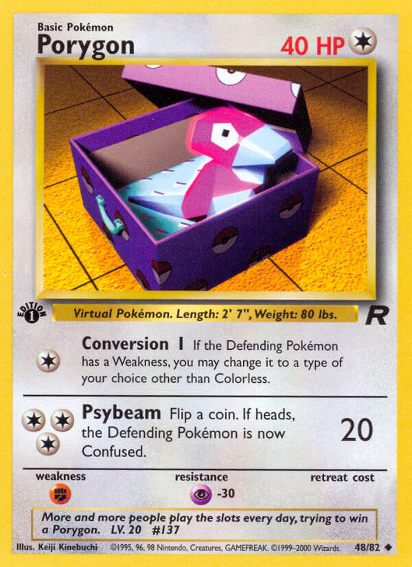
Get ready for some nostalgia here. Because we’re about to examine some Kinebuchi Keiji cards!
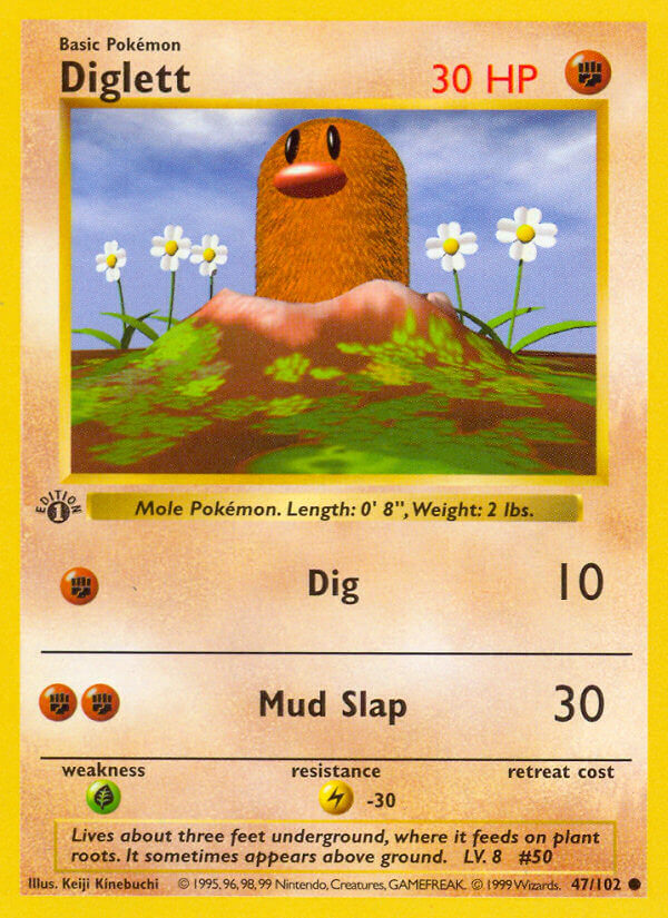
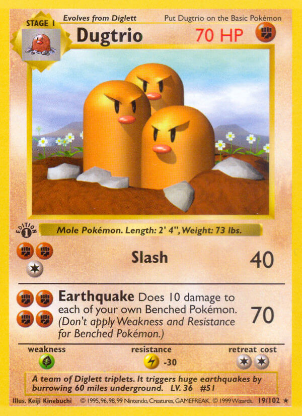
Ugh, just instant nostalgia every time I see these shiny plastic 3D models. Also, I am noticing for the very first time that Diglet has fur???? What??? I’ve had that card for like 22 years and I never noticed??
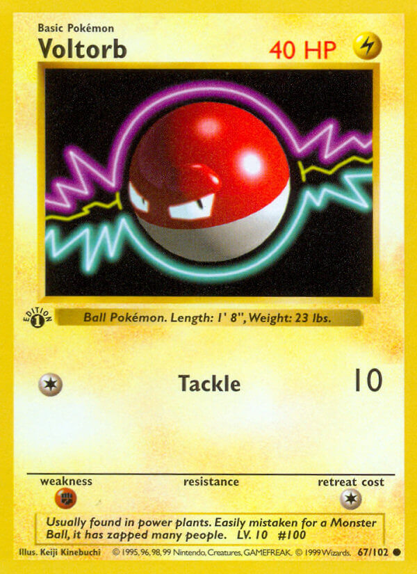
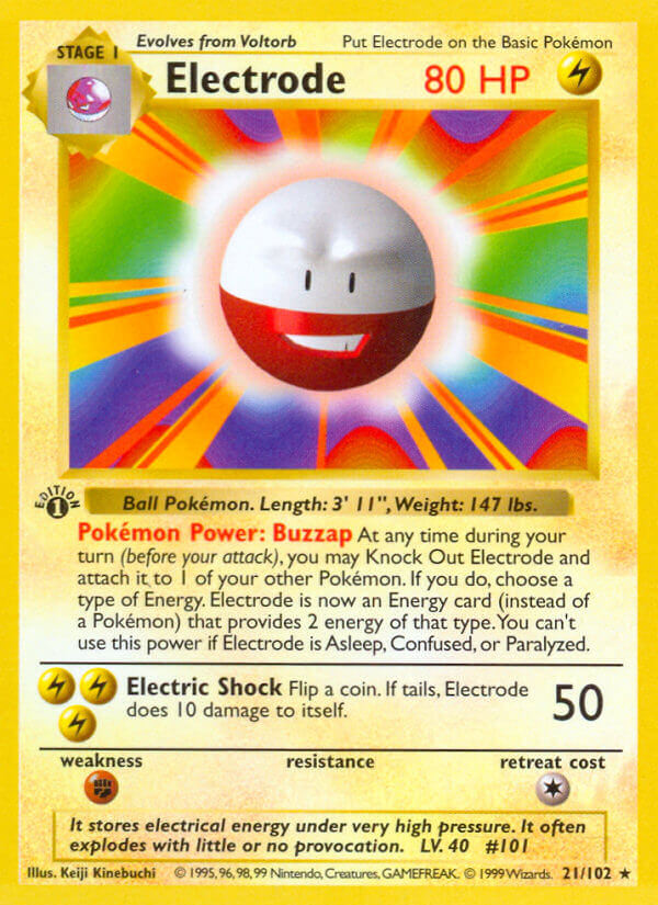
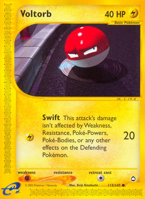
Voltorb and Electrode are also memorable forever. The simple character designs are met with fantastic backgrounds that pop like the best of pop art. Poppin’.
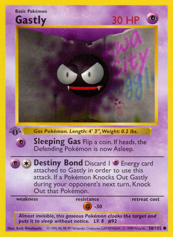
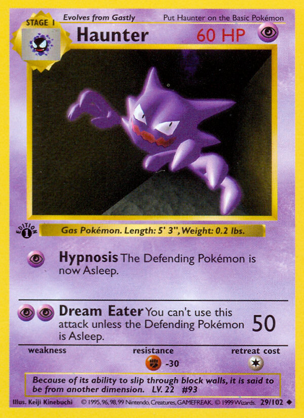
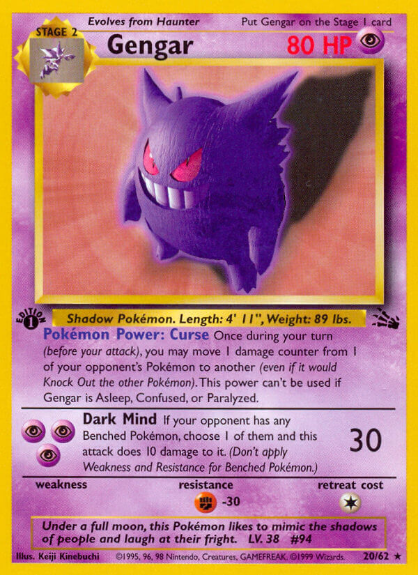
The Ghastly evolution line is also amazing. Ghastly in particular has that cool punk grafitti in the background, while Haunter and Gengar get super sinister poses.
It’s primitive, it’s plastic, but it depicts a fantastical digital world you can’t help but want to explore for yourself. We never did get the chance for a real 3D Pokemon game during this age of primitive graphics; Hey You Pikachu came the closest, but it wasn’t free-roaming. Pokemon Snap and Pokemon Stadium were both highly contained, highly on-rails affairs. So it’s stuff like Pokemon cards that depict that weird original world, before graphics got really good and everything sorta got streamlined.
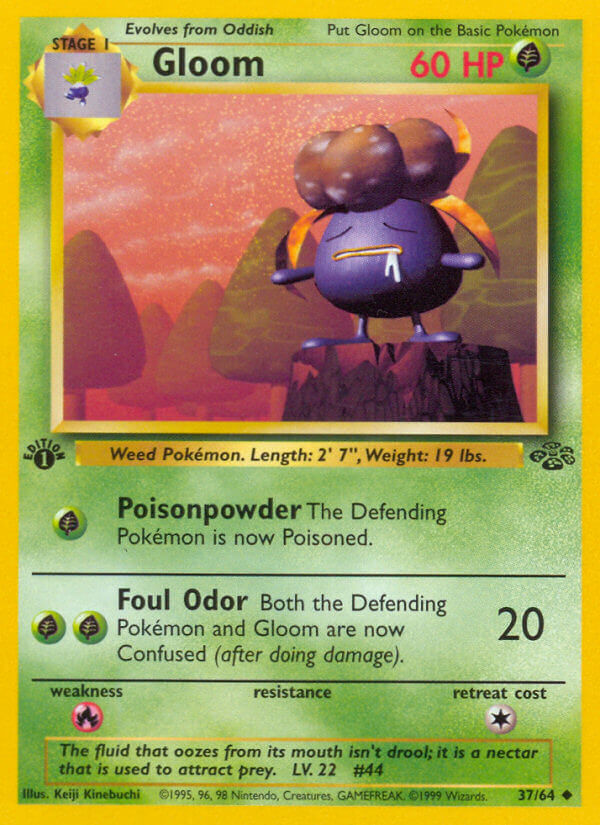
A lot of younger people probably don’t get the appeal, I imagine. Seeing that Gloom and the bizarre looking trees in the back reminds me of stuff like Donkey Kong Country promo art. It’s kind of magical even when it’s so basic today you can render it in real-time.
That’s the real appeal of Kinebuchi Keiji art to me.
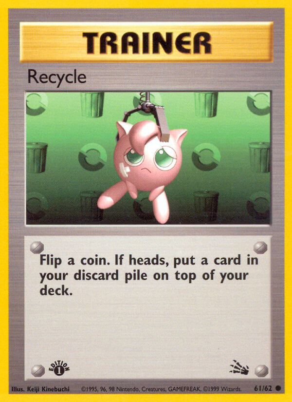
I already covered that Jigglypuff in my original Pokemon card art blog post. But I still really love it.
…But I’m burying the lede here with all this Pokemon talk.
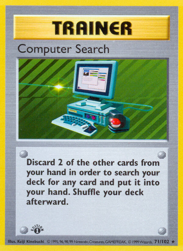
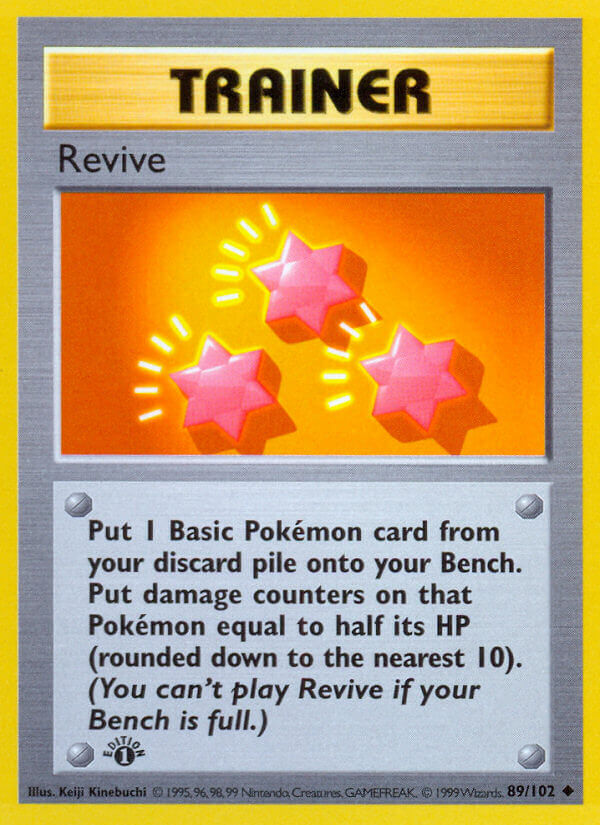
We all know Kinebuchi Keiji isn’t famous for these Pokemon cards. He’s famous for the trainer cards. For giving us major visual depictions of some of Pokemon’s most famous items. His cards did some of the heaviest worldbuilding lifting the card games ever gave us, at least in the Base-Neo era.
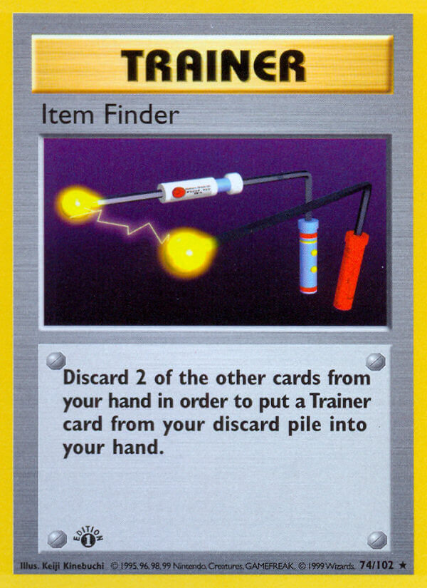
Like, dude! We get a Pokeball shaped computer mouse. We get that gust of wind that knocks a poor Weedle into the dang sky. We get the confusing Item Finder nobody knew how to use as a kid!
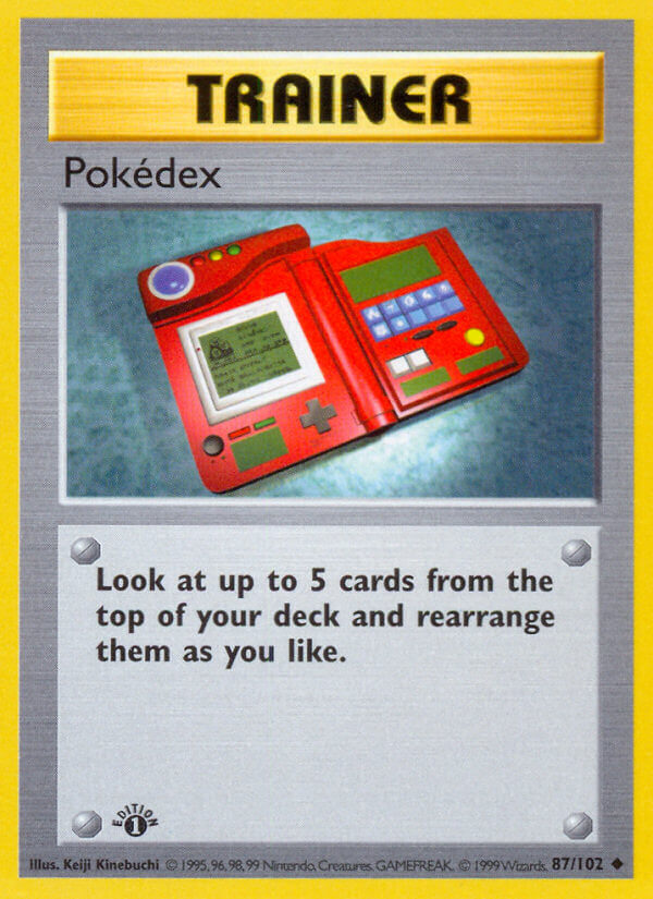
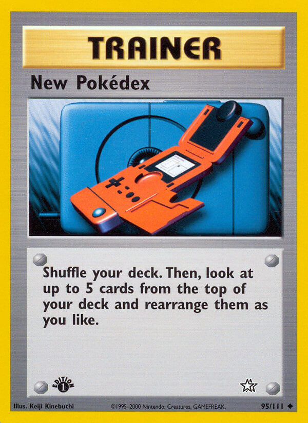
The Pokedex, THE Pokedex. The one so cool it got a toy spinoff. It was in the anime too, but a full 3D render like this is way cooler.

I also don’t know if potions appeared anywhere else visually before the card game, but I love that the Japanese is kept because there was no easy way to edit it out, and I love the white-and-purple design so much. What a weird thing to call “potion.”
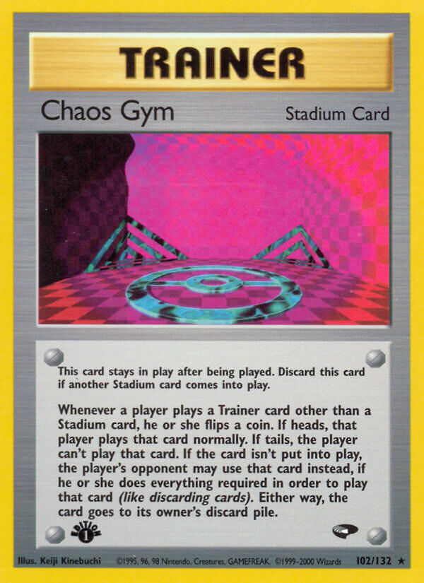
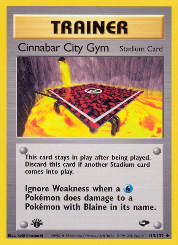
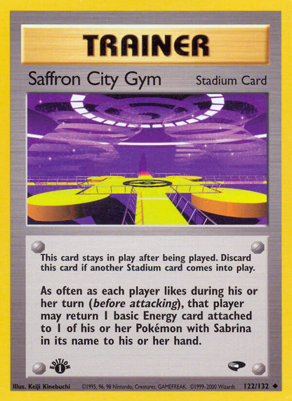
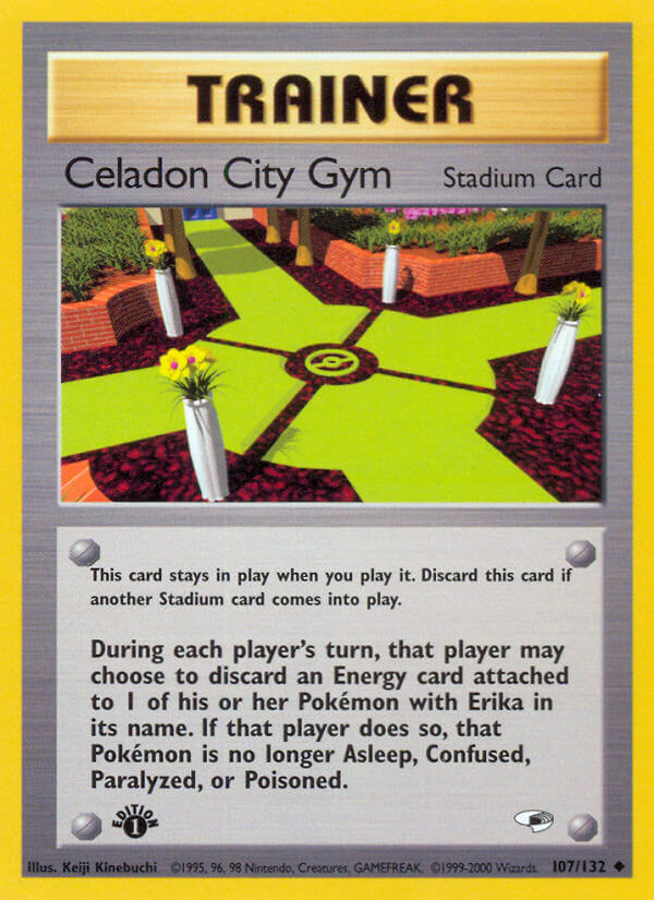
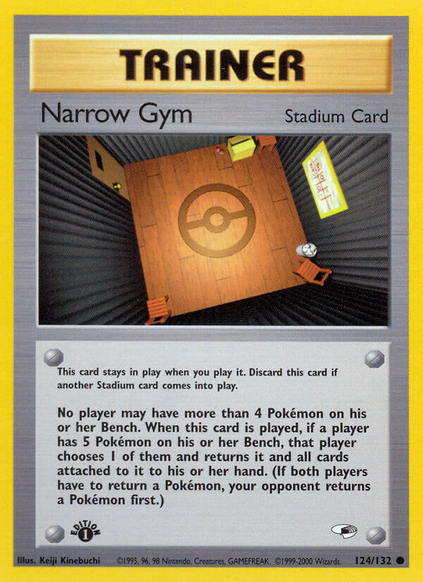
In the Gym Leader sets, Kinebuchi Keiji became very well known for Pokemon stadium cards, too. Stadiums were kind of on-and-off in the early sets, but they seem to make really common appearances in more modern sets. And the new ones have really cool designs, but I love how the low-poly look in these pushes them into unreal abstraction.
They just feel like awesome places you really wanna go in a virtual world. That’s sort of the appeal of Kinebuchi Keiji cards, really. They’re like items in a retrofuturistic metaverse. Ready Player One if it were cool.
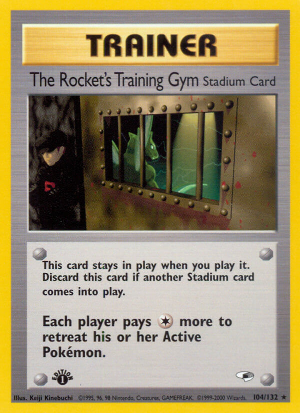
Oh, and, uh… Well… That sure is a brutal and not very kid friendly card…
Let’s just move onto the Neo sets, where Gold & Silver came out and Kinebuchi got to make a whole new round of item cards:
I love ’em! Awesome items that expand the worldbuilding for our extremely strange Pokeplanet.
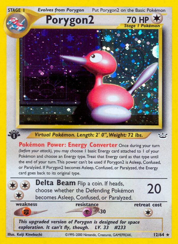
Unfortunately, the e-card series of sets would also be Kinebuchi Keiji’s last. Here were his final Pokemon:
That Grimer is so plastic it’s a little off-putting, but I love it more for that.
Sadly, it seems that Kinebuchi Keiji passed away soon after these cards were released. Somewhere between 2002-2004, but there’s no good public information about it.
It’s extremely sad to know this, and sadder how it went completely unacknowledged for years that one of Pokemon’s most important early designers was gone. It’s a sad ending to know all this about these mega-nostalgic cards, but I’m glad that the game continues to honor him through keeping so many of his original design elements alive, from the energy cards to the logo itself.
Maybe one day we’ll get some intentionally low-poly throwback card designs. Considering the meteoric rise of artists like mushbuh and Louie Zong, it’s more than likely.
….
Liked this article? Please enjoy some of my other articles on cool retro art:










One thought on “Kinebuchi Keiji – Pokemon Card Art Spotlight”